Making paragraph formatting changes
When it comes to working with paragraphs of text in InDesign, there are a number of formatting options that apply to whole paragraphs rather than individual characters. These options allow you to align your text in a particular way, configure spacing between different paragraphs, create interesting effects with drop caps, and even turn hyphenation on and off. In this recipe, we will have a look at applying these paragraph formatting options.
Getting ready
In order to complete this recipe, simply open InDesign on your system and create a new document with 12 pages, as shown in the Creating a new document recipe in Chapter 1. You will also need to add a text frame large enough to contain a few paragraphs of text, as shown in the Creating text frames and adding placeholder text recipe. Finally, you will need the Control panel set to show paragraph formatting rather than character formatting options, as shown in step 1 of the Adjusting character formatting recipe.
How to do it…
In order to use the paragraph formatting options in InDesign, follow these steps:
- Select some text in one of the paragraphs within your text frame. You don’t need to precisely select the whole paragraph, as the paragraph formatting tools will affect any paragraph that you have selected even a single character within.
- With your text selected, you should see an option on the left of the Control panel to set the horizontal alignment of the text. On the top row, you have the option to align the paragraph to the left (A in Figure 2.21), center (B in Figure 2.21), or right (C in Figure 2.21). Alternatively, you can justify your text with the last line aligned left (D in Figure 2.21), with the last line center-aligned (E in Figure 2.21), or with all lines together (F in Figure 2.21). In our case, we will align the text to the left (A in Figure 2.21):
Note
Justify is when InDesign attempts to align the text to reach both sides of the frame; as a result, there are no ragged edges to the lines, which all line up.
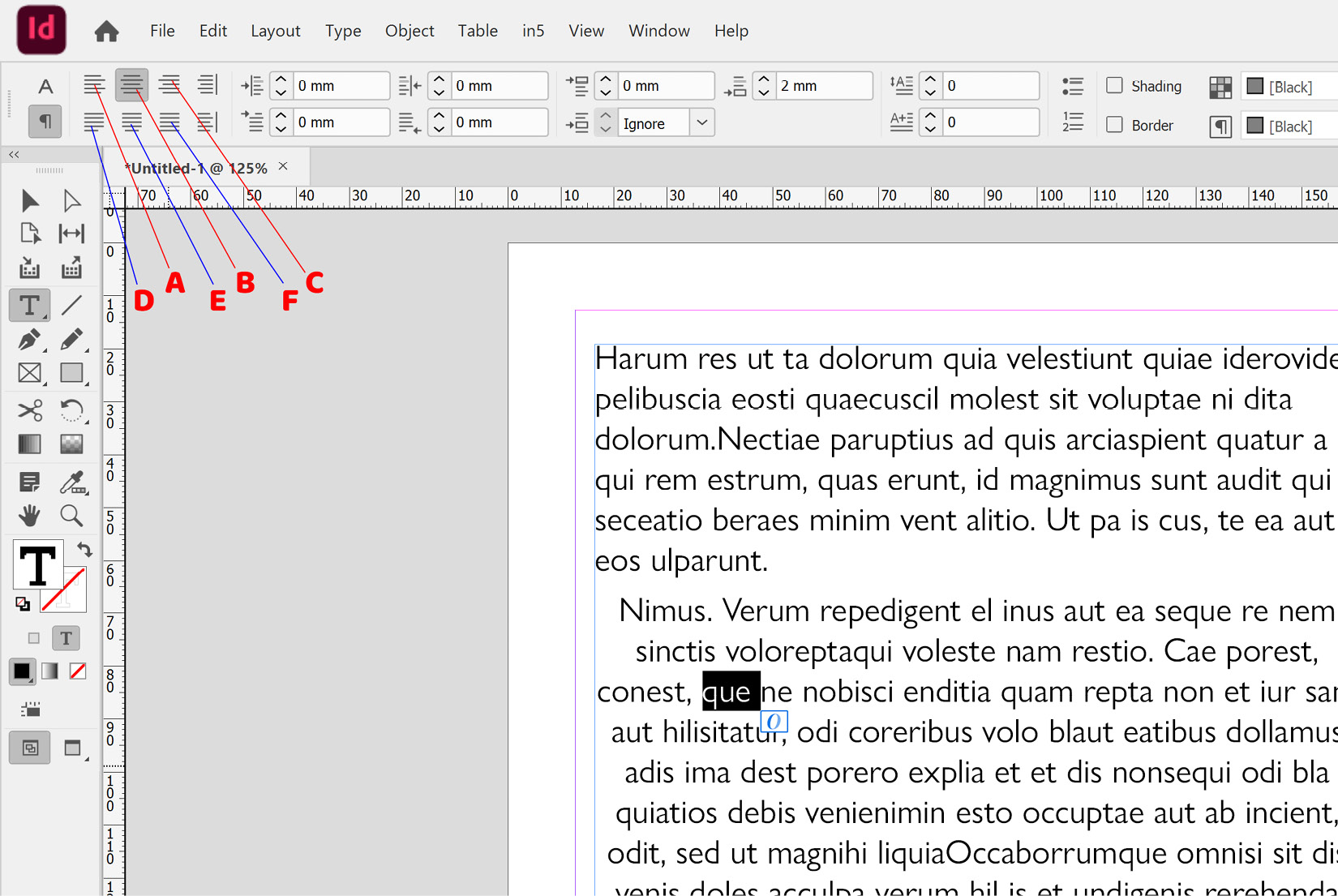
Figure 2.21: Justification options in InDesign
In addition to the preceding options, there are two more justification options that you should be aware of, albeit you may not use them as frequently: one aligns toward the spine (marked as A in Figure 2.22), and the other aligns away from the spine (marked as B in Figure 2.22). These become more relevant when you are working on documents with facing pages, such as magazine layouts, where the spine is the black line between the left- and right-hand pages.
In Figure 2.22, you can see a document with two text frames, both aligned toward the spine. Note how the alignment behaves the opposite on the left-hand page to the right-hand page:
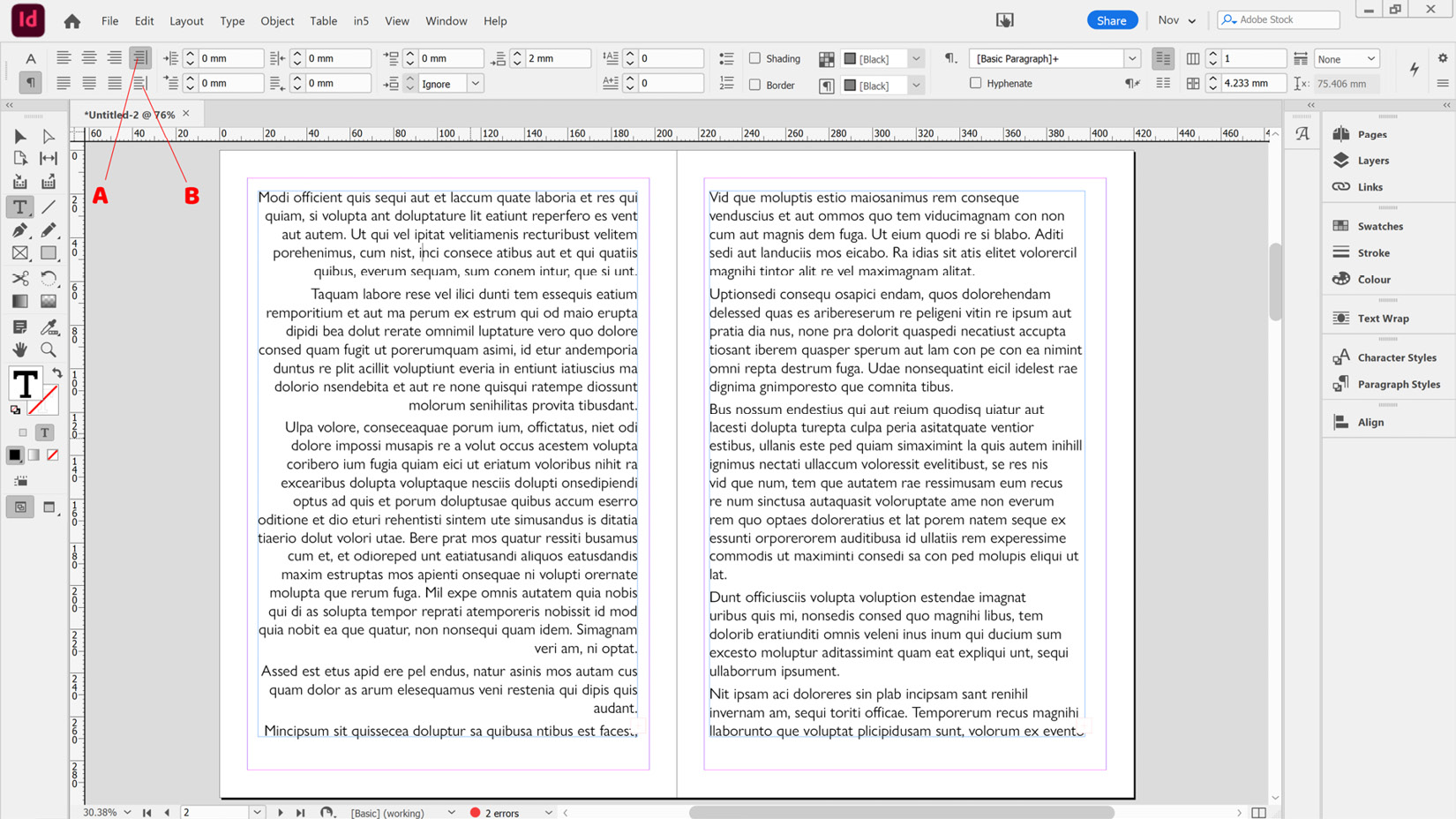
Figure 2.22: An example of two frames with text aligned toward the spine
- Having aligned our text to the left, we now want to indent the second paragraph slightly by 10 mm. To do this, select part of that paragraph and type 10 mm in the Left Indent box (marked as A in Figure 2.23).
In addition to the Left Indent option, you will see other indent options available here: First Line Indent (marked as B in Figure 2.23), Right Indent (marked as C in Figure 2.23), and Last Line Right Indent (marked as D in Figure 2.23):
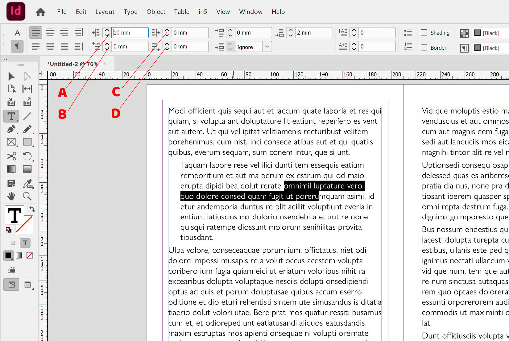
Figure 2.23: Paragraph indent options in InDesign
- When working with multiple paragraphs of text, putting a little space either after or before your paragraphs can make it easier for the reader, not to mention visually more appealing. To do this, select all your text and apply 3 mm to the Space After option (marked as A in Figure 2.24). This will add space after each paragraph—in this case, 3 mm.
If you prefer to add space before each paragraph, simply use the Space Before option, marked as B in Figure 2.24, instead.
In Figure 2.24, you can see a text frame on the left-hand page with 3 mm of space applied after each paragraph. On the right-hand page, the exact same text is shown with no space applied after each paragraph, for comparison:
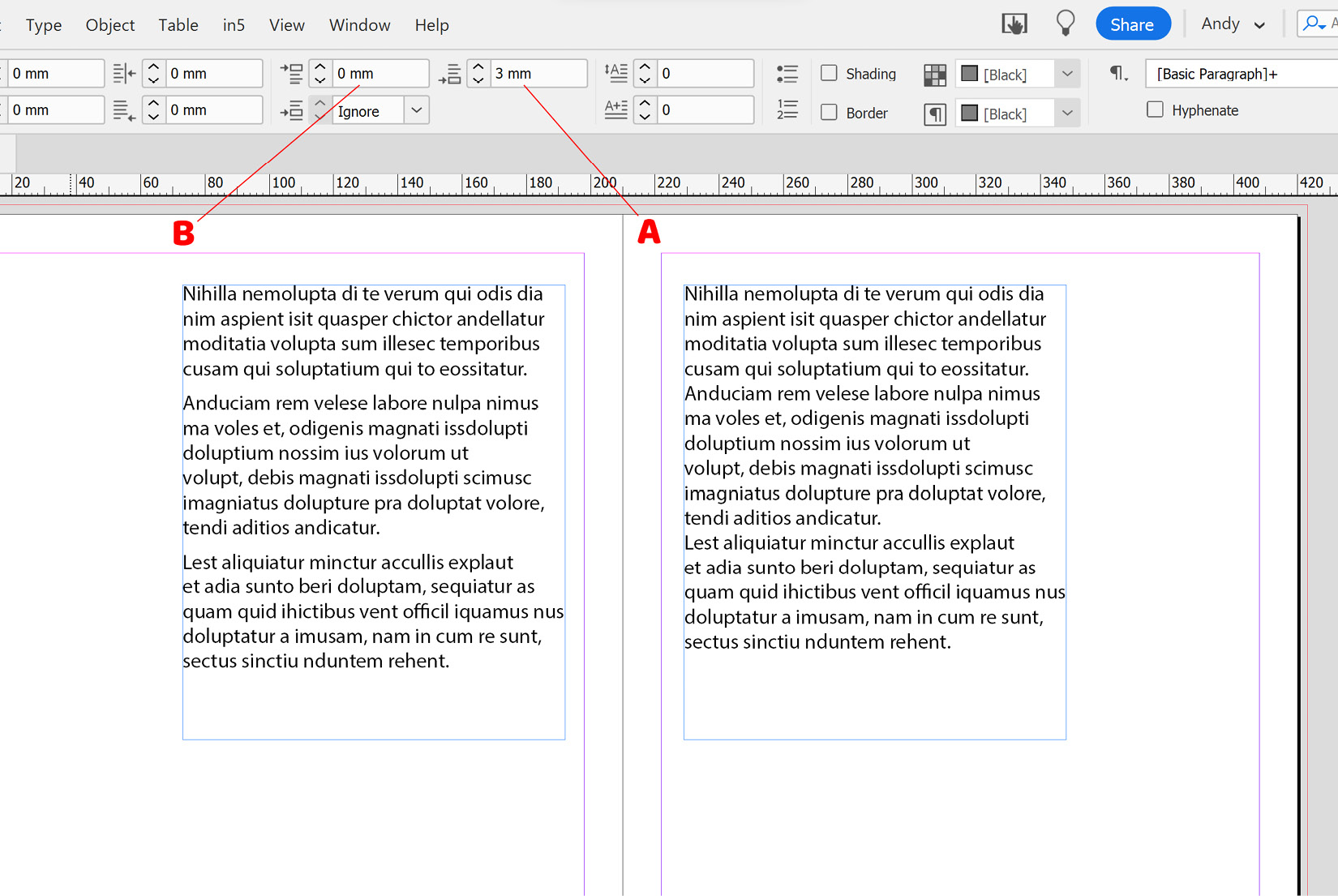
Figure 2.24: Space Before and Space After options in InDesign
- Having now formatted our text with some space after each paragraph, we want to apply a decorative effect called drop caps. Click into the paragraph that you would like to apply drop caps to, and then select the number of letters you would like to use (marked as A in Figure 2.25) and the number of lines you would like them to drop over (marked as B in Figure 2.25). In our case, we will drop two letters over three lines, as shown in Figure 2.25:
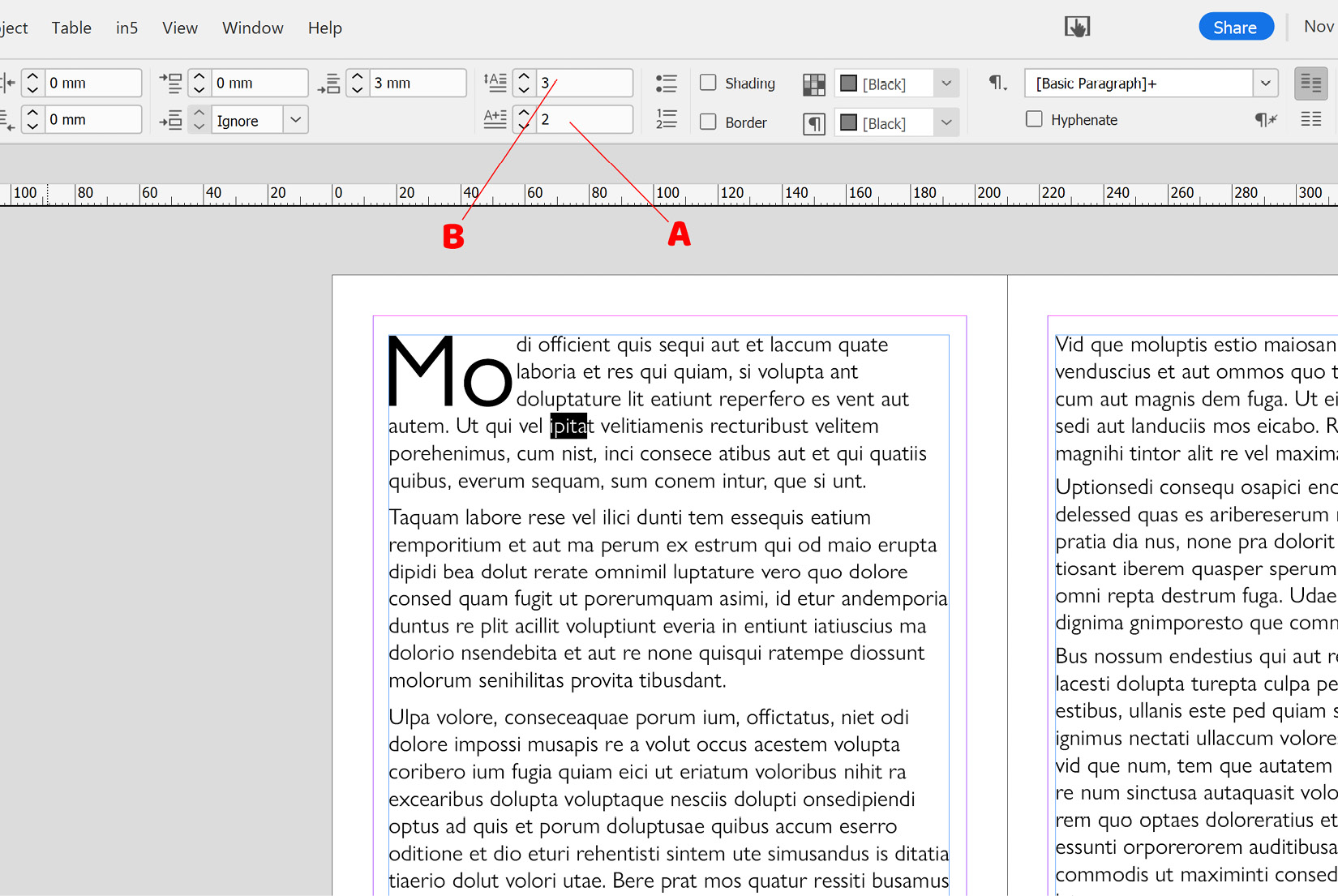
Figure 2.25: Applying drop caps in InDesign
Note
Drop caps have been used for a very long time, with numerous examples dating back as far as the 15th century and even earlier.
- Having applied our alignment, indents, space after, and drop caps, we want to finish off by controlling hyphenation on the text. Hyphenation is when longer words are effectively split in the middle and part of the word pushed onto the next line. In InDesign, you can turn hyphenation off or on by simply selecting your text and then deselecting or selecting the Hyphenate checkbox on the Control panel (marked as A in Figure 2.26):
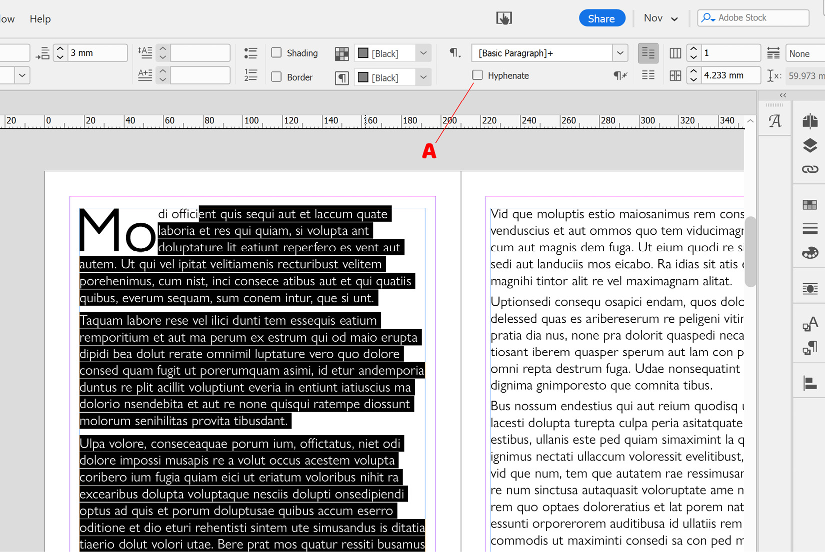
Figure 2.26: Disabling hyphenation in InDesign
Tip
When working on a document in InDesign, switch to the Type tool, and with no text selected, disable the Hyphenation checkbox (marked as A in Figure 2.26). You will now find hyphenation is automatically disabled for all new text frames within that document. If you switch to the Type tool and deselect the Hyphenation checkbox in InDesign when no document is open, it is now disabled by default for every new document you create going forward. This method of setting default properties in InDesign also works for a wide range of other properties, from Font Face and Swatches to Paragraph Styles and Character Styles.


