Sometimes, the pieces of the puzzle go missing, and you find yourself with a blank spot. Imagine that you could fill that empty spot with a piece that you crafted yourself – not the original one that came with the puzzle box. That's a rough analogy for what a Vue slot is.
Vue slots are like open spaces in your component that other components can fill with text, HTML elements, or other Vue components. You can declare where the slot will be and how it will behave in your component.
With this technique, you can create a component and, when needed, customize it without any effort at all.
Getting ready
The prerequisite for this recipe is Node.js 12+.
The Node.js global objects that are required for this recipe are as follows:
- @vue/cli
- @vue/cli-service-global
To complete this recipe, we will use our Vue project and the Vue CLI, as we did in the Creating a visual template component recipe.
How to do it...
Follow these instructions to create slots and named slots in components:
- Open the MaterialCardBox.vue file in the components folder.
- In the <template> part of the component, we will need to add four main sections to the card. These sections are based on the Material Design card's anatomy and are the header, media, main section, and action areas. We will use the default slot for main section; the rest will all be named scopes. For some named slots, we will add a fallback configuration that will be displayed if the user doesn't choose any setting for the slot:
<template>
  <div class="cardBox elevation_2">
    <div class="header">
      <slot
        v-if="$slots.header"
        name="header"
      />
      <div v-else>
        <h1 class="cardHeader cardText">
          Card Header
        </h1>
        <h2 class="cardSubHeader cardText">
          Card Sub Header
        </h2>
      </div>
    </div>
    <div class="media">
      <slot
        v-if="$slots.media"
        name="media"
      />
      <img
        v-else
        src="https://via.placeholder.com/350x250"
      >
    </div>
    <div
      v-if="$slots.default"
      class="section cardText"
      :class="{
        noBottomPadding: $slots.action,
        halfPaddingTop: $slots.media,
      }"
    >
      <slot/>
    </div>
    <div
      v-if="$slots.action"
      class="action"
    >
      <slot name="action"/>
    </div>
  </div>
</template>
- Now, we need to create our text CSS rules for the component. In the style folder, create a new file called cardStyles.css. Here, we will add the rules for the card's text and headers:
h1, h2, h3, h4, h5, h6 {
  margin: 0;
}

.cardText {
  -moz-osx-font-smoothing: grayscale;
  -webkit-font-smoothing: antialiased;
  text-decoration: inherit;
  text-transform: inherit;
  font-size: 0.875rem;
  line-height: 1.375rem;
  letter-spacing: 0.0071428571em;
}

h1.cardHeader {
  font-size: 1.25rem;
  line-height: 2rem;
  font-weight: 500;
  letter-spacing: .0125em;
}

h2.cardSubHeader {
  font-size: .875rem;
  line-height: 1.25rem;
  font-weight: 400;
  letter-spacing: .0178571429em;
  opacity: .6;
}
- In the <style> part of the component, we need to create some CSS that will follow the rules of our design guide:
<style scoped>
  @import url("https://fonts.googleapis.com/css?family=Roboto:400,500,700&display=swap");
  @import "../style/elevation.css";
  @import "../style/cardStyles.css";

  * {
    font-family: "Roboto", sans-serif;
  }

  .cardBox {
    width: 100%;
    max-width: 300px;
    border-radius: 0.25rem;
    background-color: #fff;
    position: relative;
    display: inline-block;
    box-shadow: 0 1px 5px rgba(0, 0, 0, 0.2), 0 2px 2px rgba(0, 0,
      0, 0.14),
    0 3px 1px -2px rgba(0, 0, 0, 0.12);
  }

  .cardBox > .header {
    padding: 1rem;
    position: relative;
    display: block;
  }

  .cardBox > .media {
    overflow: hidden;
    position: relative;
    display: block;
    max-width: 100%;
  }

  .cardBox > .section {
    padding: 1rem;
    position: relative;
    margin-bottom: 1.5rem;
    display: block;
  }

  .cardBox > .action {
    padding: 0.5rem;
    position: relative;
    display: block;
  }

  .cardBox > .action > *:not(:first-child) {
    margin-left: 0.4rem;
  }

  .noBottomPadding {
    padding-bottom: 0 !important;
  }

  .halfPaddingTop {
    padding-top: 0.5rem !important;
  }
</style>
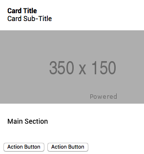
- In the App.vue file, in the src folder, we need to add elements to these slots. These elements will be added to each one of the named slots, as well as the default slot. We will change the component inside the <template> part of the file. To add a named slot, we need to use a directive called v-slot: and then add the name of the slot we want to use:
<template>
  <div id="app">
    <MaterialCardBox>
      <template v-slot:header>
        <strong>Card Title</strong><br>
        <span>Card Sub-Title</span>
      </template>
      <template v-slot:media>
        <img src="https://via.placeholder.com/350x150">
      </template>
      <p>Main Section</p>
      <template v-slot:action>
        <button>Action Button</button>
        <button>Action Button</button>
      </template>
    </MaterialCardBox>
  </div>
</template>
-
To run the server and see your component, you need to open a Terminal (macOS or Linux) or Command Prompt/PowerShell (Windows) and execute the following command:
> npm run serve
Here is the component rendered and running:

How it works...
Slots are places where you can put anything that can be rendered into the DOM. We choose the position of our slot and tell the component where to render when it receives any information.
In this recipe, we used named slots, which are designed to work with a component that requires more than one slot. To place any information inside that component within the Vue single file (.vue) <template> part, you need to add the v-slot: directive so that Vue knows where to place the information that was passed down.
See also
- You can find more information about Vue slots at https://v3.vuejs.org/guide/component-slots.html.
- You can find more information about the Material Design card's anatomy at https://material.io/components/cards/#anatomy.


