Moving blocks to the main course area
The standard Moodle installation gives you the choice of two, one, or no side columns for your blocks. If you want to eliminate the side columns, you have more space for your course content, but no space for blocks. Let's explore a workaround for that. We'll use the Participants block as an example.
Normally, the Participants block would occupy one of the side columns, which is valuable screen space and can be used for the main course content. Now, what if we want to have the functionality of the block, without needing a side column? This is examined in the next section.
The goal
We want to arrive at a solution that looks like this:
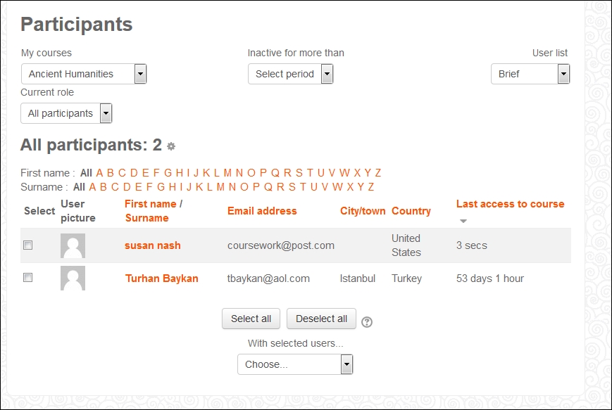
Note that, instead of having a People block in one of the side columns, the course displays a link to the Participants in the main course area.
You can see in the following screenshot the Participants link in the current course area and see that it takes you to Course blogs, Notes, and the User's personal page, where the User...


