Quick start – using 960 Grid System from Photoshop to code
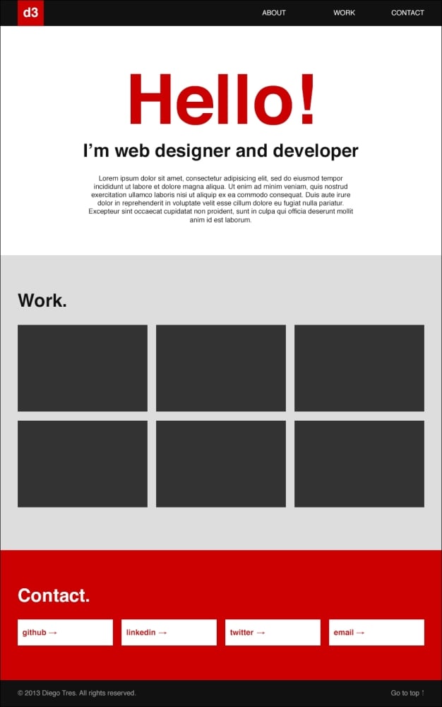
In this section, we will show you how to create your first website, similar to the following screenshot, based on 960.gs:

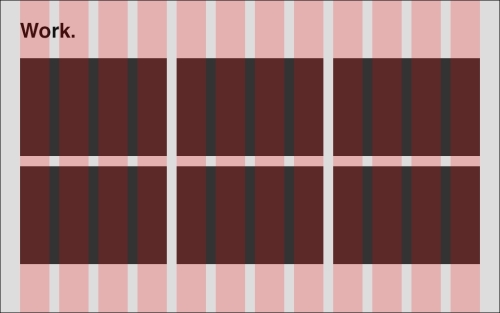
As you can see, my section Work. is divided into three sections (four columns per job), and because of that, I used the 12-column grid. If I have had used a grid with 16 columns, it would have been impossible to make this section, because it is not divisible by three. In this case, we should change our layout to use one or two or four or eight or 16 jobs per line.

All the elements are totally aligned with almost no effort, as I will show you.
Step 1 – laying out in Photoshop with the 960 Grid System
Perform the following steps for laying out Photoshop with the 960 Grid System:
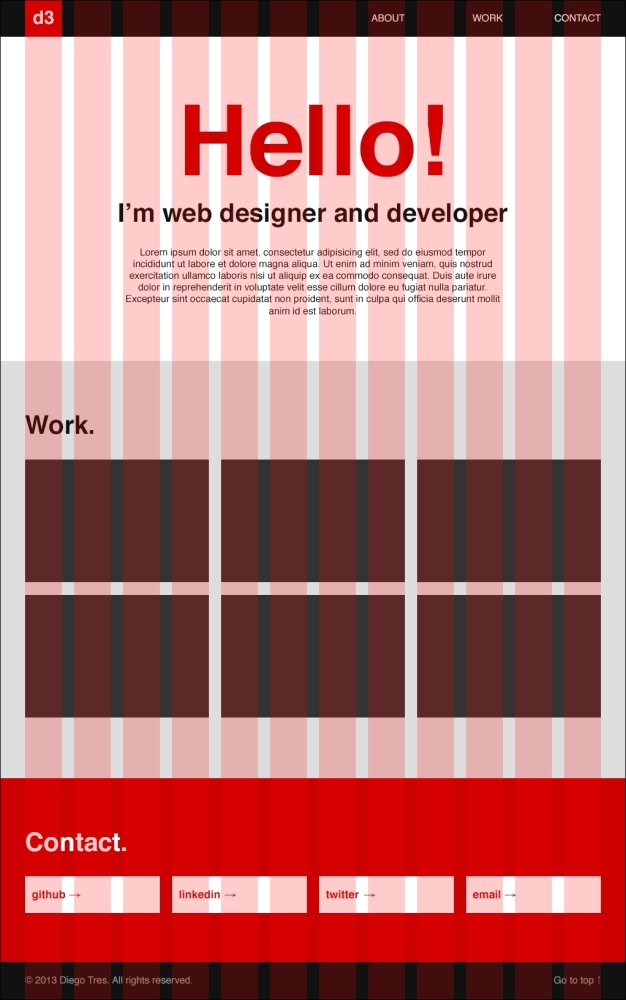
For the header, let's draw the logo with one column and the navigation items with six, leaving five blank columns between them.

For the ABOUT section, let's use 12 columns for the title, 12 for the subtitle, and 8 columns for the text, with two columns for space on both the sides.

For the WORK section, let's use 12 columns for the title and three columns for each thumbnail. I think you will have picked this up quickly and won't need more red and green markers.

The CONTACT section is almost the same as the previous one:

For the footer, let's use 10 columns for the copyright and two for the Go to Top link.

As you learned when you were using grids in Photoshop, it was not too necessary to think about in all the columns and spaces all the time. The most important thing here is learning how to read a grid file—always read in a line from left to right.
Step 2 – from layout to code
Now, we will learn the 960.gs stylesheet and how to convert the layout to code.
All the sections need to be a container class. In this case,
.container_12. If we were using a layout with 16 columns, this class would have been.container_16.After each container, we need add a
divtag with the class.clearin order to clear the floats. If you need more information on this, please read the article at http://sonspring.com/journal/clearing-floatsNow we can work on the header section.
In this image, I've converted all the columns to 960.gs names.

As you can see,
grid_1represents one column,grid_2represents two columns, and so on. Let's see how it is represented in the code:<div class="container_12"> <h1 class="grid_1"> <a class="logo" href="#">d3</a> </h1> <ul class="grid_6"> <li><a href="#about">ABOUT</a></li> <li><a href="#work">WORK</a></li> <li><a href="#contact">CONTACT</a></li> </ul> </div>Add the space
prefix_5to the element UL, which has five columns before it. In 960.gs, the name of this space BEFORE is prefix:<div class="container_12"> <h1 class="grid_1"> <a class="logo" href="#">d3</a> </h1> <ul class="grid_6 prefix_5"> <li><a href="#about">ABOUT</a></li> <li><a href="#work">WORK</a></li> <li><a href="#contact">CONTACT</a></li> </ul> </div>And let's finish adding the tag header for the background, the links of the navigation, and the
.clearclass:<header class="main_header"> <div class="container_12"> <h1 class="grid_1"> <a class="logo" href="#">d3</a> </h1> <ul class="grid_6 prefix_5"> <li><a href="#about">ABOUT</a></li> <li><a href="#work">WORK</a></li> <li><a href="#contact">CONTACT</a></li> </ul> </div> <div class="clear"></div> </header>Now, if you open the
index.htmlfile in your browser, it should look like this:
Tip
Install the 960 Gridder System (http://peol.github.io/960gridder/) in your browser to see the grids in your HTML.
Let's do the same with the ABOUT section:

But now we have a space after
.grid_8. It's not so hard. We need to remember that every container should always sum-up to 12. So, to fill the extra space after the element, use the class.suffix_2.Let's see this in the code:
<section id="about">
  <div class="container_12">
    <header>
      <h2 class="grid_12">Hello!</h2>
      <h3 class="grid_12">I'm web designer and developer</h3>
    </header>
    <p class="grid_8 prefix_2 suffix_2">
      Lorem ipsum dolor sit amet, consectetur adipisicing
      elit, sed do eiusmod tempor incididunt ut labore
      et dolore magna aliqua. Ut enim ad minim veniam,
      quis nostrud exercitation ullamco laboris nisi ut
      aliquip ex ea commodo consequat. Duis aute irure
      dolor in reprehenderit in voluptate velit esse
      cillum dolore eu fugiat nulla pariatur.
      Excepteur sint occaecat cupidatat non proident,
      sunt in culpa qui officia deserunt mollit
      anim id est laborum.
    </p>
  </div>
  <div class="clear"></div>
</section>
Now, if you reload your page, you should see something like this:

Now let's work on the WORK section.
In the code for this section, nothing is new. Just add
grid_12to the title"work"andgrid_4to each holder of each image:<section id="work"> <div class="container_12"> <header class="grid_12"> <h3>Work.</h3> </header> <ul> <li class="grid_4"> <a href="#"> <img src="http://placehold.it/300x200"> </a> </li> <li class="grid_4"> <a href="#"> <img src="http://placehold.it/300x200"> </a> </li> <li class="grid_4"> <a href="#"> <img src="http://placehold.it/300x200"> </a> </li> <li class="grid_4"> <a href="#"> <img src="http://placehold.it/300x200"> </a> </li> <li class="grid_4"> <a href="#"> <img src="http://placehold.it/300x200"> </a> </li> <li class="grid_4"> <a href="#"> <img src="http://placehold.it/300x200"> </a> </li> </ul> </div> <div class="clear"></div> </section>Tip
I'm using a service called
placehold.it(http://placehold.it/) to avoid saving the thumbnails at this time. It's very useful when you want to prototype fast.Reload your browser to see the new code applied:

We are almost there; let's code the CONTACT section now.
Again, there is nothing new in this section, we're just writing the code again for practice. Add
grid_12to the title"Contact"andgrid_3to each button:<section id="contact"> <div class="container_12"> <header class="grid_12"> <h3>Contact.</h3> </header> <ul> <li class="grid_3"><a href="#">github →</a></li> <li class="grid_3"><a href="#">linkedin →</a></li> <li class="grid_3"><a href="#">twitter →</a></li> <li class="grid_3"><a href="#">email →</a></li> </ul> </div> <div class="clear"></div> </section>If you don't remember the layout of this section, take a quick look:

It's a piece of cake, isn't it? Let's update our browser again.

Lastly, let's code the footer section:
Add
grid_10to the text on the left andgrid_2to the text on the right. Remember always that the columns inside thecontainer_12class need to sum up to 12.<footer class="main_footer"> <div class="container_12"> <p class="grid_10"> © 2013 Diego Tres. <span>All rights reserved.</span> </p> <p class="grid_2 go_top"> <a href="#">Go to top ↑</a> </p> </div> <div class="clear"></div> </footer>And tadaaaaaa! It's over. Let's update the browser.

While it certainly isn't the most beautiful website out there, nobody can say it is misaligned.
Step 3 – adding some colors, padding, and text alignment
As the basics of CSS aren't the focus of this book, let's start styling our elements together. First, we need to create another CSS stylesheet to store our styles.
Inside the
cssfolder, create a file calledmain.css.Before you write any line of code, link it to your
index.htmlfile beneath the place where you linked960.cssbefore. Always insert the stylesheet files of the frameworks before yours, because it is better to overwrite the properties than to change the original file. This is how CSS works—in cascade.<!doctype html> <html> <head> <meta charset="utf-8"> <meta name="viewport" content="width=device-width"> <title>Portfolio</title> <link href="css/reset.css" rel="stylesheet" type="text/css"> <link href="css/960.css" rel="stylesheet" type="text/css"> <link href="css/main.css" rel="stylesheet" type="text/css"> </head>Now let's identify the common elements.
Identifying the common elements isn't the easiest task but I was able to do some. Inside your main file,
main.css, write the common styles as shown in the following code:/* common styles ================================ */ body { font-family: helvetica, arial, sans-serif; color: #111; } a { text-decoration: none; } section { padding-top: 80px; padding-bottom: 80px; } h2 { font-size: 160px; } h3 { font-size: 42px; padding-bottom: 30px; }Now if you update the browser, your website will look a little better:

Now, let's work on the header.
In the same file, let's add the header styles:
/* main header
================================ */
.main_header {
  height: 60px;
  background: #111;
}

.main_header .logo {
  float: left;
  width: 60px;
  font-size: 30px;
  line-height: 60px;
  text-align: center;
  background: #C00;
  color: #FFF;
}

.main_header ul {
  text-align: right;
}

.main_header ul li {
  display: inline;
  margin-left: 40px;
}

.main_header ul li a {
  line-height: 60px;
  color: #fff;
}
Update the website again:

Now, let's see the ABOUT section.
In this section, let's just centralize the text and change the color of the title to red:
/* about
================================ */
#about {
  text-align: center;
}

#about h2 {
  color: #C00;
}
Reload your browser again:

And now, let's finish the WORK, CONTACT, and footer sections:
/* work
================================ */
#work {
  background: #ddd;
}

#work li {
  margin-bottom: 20px;
}

#work a {
  display: block;
}

#work img {
  width: 100%;
  height: auto;
}

/* contact
================================ */
#contact {
  background: #c00;
}

#contact h3 {
  color: #fff;
}

#contact a {
  display: block;
  font-size: 18px;
  font-weight: bold;
  padding: 20px 10px;
  background: #fff;
  color: #c00;
}

/* footer
================================ */
.main_footer {
  padding: 20px 0;
  background: #111;
  color: #999;
}

.main_footer .go_top {
  text-align: right;
}

.main_footer .go_top a {
  color: #999;
}
Now, we have a website that is aligned and beautiful.

In the next section we'll learn how to make our portfolio responsive and capable of running outside the desktop.


