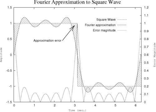
Adding a label with an arrow
Complex graphs can often benefit from information in addition to what can be provided in a title, in the axis labels, and a legend. Sometimes we need to explain the meaning of a particular feature on the graph. This can be done with labels and arrows.

How to do it…
Following is the complete script that you can feed to gnuplot to create the graph:
set term postscript landscape
set out 'fourier.ps'
set yrange [-1.5:1.5]
set xrange [0:6.3]
set ytics nomirror
set y2tics 0,.1
set y2range [0:1.2]
set style fill pattern 5
set key at graph .9, .9 spacing 3 font "Helvetica, 14"
set xlabel "Time (sec.)" font "Courier, 12"
set ylabel "Amplitude" font "Courier, 12"
set y2label "Error Magnitude" font "Courier, 12"
set title "Fourier Approximation to Square Wave" font "Times-Roman, 24"
set label "Approximation error" right at 2.4, 0.45 offset -.5, 0
set arrow 1 from first 2.4, 0.45 to 3, 0.93 lt 1 lw 2 front size .3, 15
plot 'ch2.dat' using 1:2:(sgn($2)) with filledcurves notitle...


