The QlikView calculation engine
QlikView is very clever in how it does its calculations. As well as the data storage, as discussed earlier in this chapter, it also stores the binary state of every field and of every data table dependent on user selection—essentially, depending on the green/white/grey state of each field, it is either included or excluded. This area of storage is called the state space and is updated by the QlikView logical inference engine every time a selection is made. There is one bit in the state space for every value in the symbol table or row in the data table—as such, the state space is much smaller than the data itself and hence much faster to query.
There are three steps to a chart being calculated:
The user makes a selection, causing the logical inference engine to reset and recalculate the state space. This should be a multithreaded operation.
On one thread per object, the state space is queried to gather together all of the combinations of dimensions and values necessary to perform the calculation. The state space is being queried, so this is a relatively fast operation, but could be a potential bottleneck if there are many visible objects on the screen.
On multiple threads per object, the expression is calculated. This is where we see the cores in the task manager all go to 100 percent at the same time. Having 100 percent CPU is expected and desired because QlikView will "burst" calculations across all available processor cores, which makes this a very fast process, relative to the size and complexity of the calculation. We call it a burst because, except for the most complex of calculations, the 100 percent CPU should only be for a short time.
Of course, the very intelligent cache comes into play as well and everything that is calculated is stored for potential subsequent use. If the same set of selections are met (such as hitting the Back button), then the calculation is retrieved from the cache and will be almost instantaneous.
Now that we know more about how QlikView performs its calculations, we can look at a few ways that we can optimize things.
Creating flags for well-known conditions
We cannot anticipate every possible selection or query that a user might make, but there are often some quite well-known conditions that will generally be true most of the time and may be commonly used in calculations. In this example, we will look at Year-to-Date and Last Year-to-Date—commonly used on dashboards.
The following is an example of a calculation that might be used in a gauge:
Sum(If(YearToDate(Date), LineValue, 0))
/Sum(If(YearToDate(Date,-1), LineValue, 0))
-1
This uses the YearToDate() function to check whether the date is in the current year to date or in the year to date period for last year (using the -1 for the offset parameter). This expression is a sum of an if statement, which is generally not recommended. Also, these are quite binary—a date is either in the year to date or not—so are ideal candidates for the creation of flags. We can do this in the Calendar table in the following script:
Calendar:
Load Distinct
     DateID,
     -YearToDate(DateID) As YTD_Flag,
     -YearToDate(DateID,-1) As LYTD_Flag,
     Date(DateID) As Date,
     Year(DateID) As Year,
     Month(DateID) As Month,
     Day(DateID) As Day,
     Date(MonthStart(DateID), 'YYYY-MM') As YearMonth
Resident
   Order;
Note
Note the - sign before the function. This is because YearToDate is a Boolean function that returns either true or false, which in QlikView is represented by -1 and 0. If the value is in the year to date, then the function will return -1, so I add the - to change that to 1. A - sign before 0 will make no difference.
In a particular test dataset, we might see an increase from 8,684 bytes to 13,026—not an unexpected increase and not significant because the Calendar table is relatively small. We are creating these flags to improve performance in the frontend and need to accept a small change in the data size.
The significant change comes when we change the expression in the chart to the following:
Sum(LineValue*YTD_Flag)/Sum(LineValue*LYTD_Flag)-1
In a sample dataset, we might see that the calculation reduces from, say, 46 to, say, 16—a 65 percent reduction. This calculation could also be written using Set Analysis as follows:
Sum({<YTD_Flag={1}>} LineValue)/Sum({<LYTD_Flag={1}>} LineValue)-1However, this might only get a calc time of 31—only a 32.6 percent reduction. Very interesting!
If we think about it, the simple calculation of LineValue*YTD_Flag is going to do a multithreaded calculation using values that are derived from the small and fast in-memory state space. Both If and Set Analysis are going to add additional load to the calculation of the set of values that are going to be used in the calculation.
In this case, the flag field is in a dimension table, Calendar, and the value field is in the fact table. It is, of course, possible to generate the flag field in the fact table instead. In this case, the calculation is likely to run even faster, especially on very large datasets. This is because there is no join of data tables required. However, the thing to bear in mind is that the additional pointer indexes in the Calendar table will require relatively little space whereas the additional width of the fact table, because of the large numbers of rows, will be something to consider. However, saying that, the pointers to the flag values are very small, so you do need a really long fact table for it to make a big difference. In some cases, the additional bit necessary to store the pointer in the bit-stuffed table will not make any difference at all, and in other cases, it may add just one byte.
Set Analysis can be very powerful, but it is worth considering that it often has to go, depending on the formula, outside the current state space, and that will cause additional calculation to take place that may be achieved in a simpler manner by creating a flag field in the script and using it in this way. Even if you have to use Set Analysis, the best performing comparisons are going to be using numeric comparisons, so creating a numeric flag instead of a text value will improve the set calculation performance. For example, consider the following expression:
Sum({<YTD_Flag={1}>} LineValue)This will execute much faster than the following expression:
Sum({<YTD_Flag={'Yes'}>} LineValue)So, when should we use Set Analysis instead of multiplying by flags? Barry Harmsen has done some testing that indicates that if the dimension table is much larger relative to the fact table, then using Set Analysis is faster than the flag fields. The reasoning is that the multiply method will process all records (even those containing 0), so in larger tables, it has more to process. The Set Analysis method will first reduce the scope, and apply the calculation to that subset.
Of course, if we have to introduce more advanced logic, that might include AND/OR/NOT operations, then Set Analysis is the way to go—but try to use numeric flags.
Sorting for well-known conditions
Any time that you need to sort a chart or listbox, that sort needs to be calculated. Of course, a numeric sort will always be the fastest. An alphabetic sort is a lot slower, just by its nature. One of the very slowest sorts is where we want to sort by expression.
For example, let's imagine that we wish to sort our Country list by a fixed order, defined by the business. We could use a sort expression like this:
Match(Country,'USA','Canada','Germany','United Kingdom','China','India','Russia','France','Ireland')
The problem is that this is a text comparison that will be continually evaluated. What we can do instead is to load a temporary sort table in the script. We load this towards the beginning of the script because it needs to be the initial load of the symbol table; something like the following:
Country_Sort:
Load * Inline [
Country
USA
Canada
Germany
United Kingdom
China
India
Russia
France
Ireland
];
Then, as we won't need this table in our data, we should remember to drop it at the end of the script—after the main data has been loaded:
Drop Table Country_Sort;
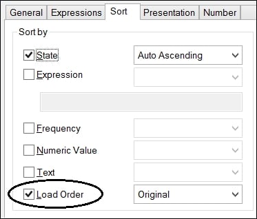
Now, when we use this field anywhere, we can turn off all of the sort options and use the last one—Load Order. This doesn't need to be evaluated so will always calculate quickly:


