Decluttering your slide contents
Unfortunately, most people have seen their share of content-heavy and cluttered slides in their life. Even though we all hate this situation, we keep seeing it very often. I sometimes have the feeling that presenters are afraid the PowerPoint application will explode if they use too many slides. However, I have had some clients tell me they were restricted to a certain number of slides! This is just a shame because we then end up having to read slides full of content and text.
Let me share a secret with you: the more content on your slides, the less readable they get, making the content very difficult to remember. Usually, slides full of content also lead to the use of very small font sizes. You’ve probably heard, at least once in your life: “I don’t know if you can read the figures in this table, but....”. If you have a hard time reading the content yourself, why even bother showing it to your audience?
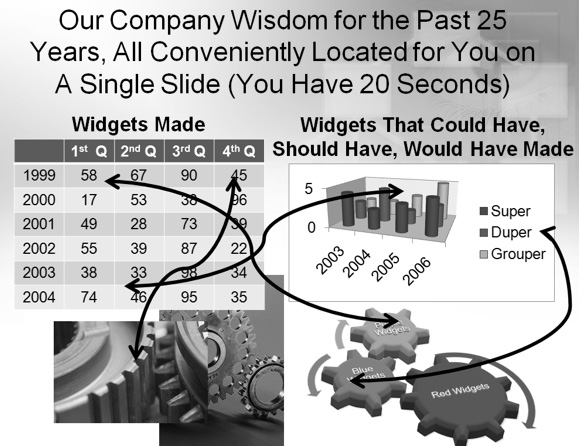
So, what do I mean by cluttered slides? The easiest way to show you is by simply doing a quick Google search with the keywords awful PowerPoint presentations. The results will be very similar to what you can see in Figure 2.7. This is an example I use in my training sessions of a slide that contains too much content and some hard-to-read text. It goes against almost all of the best practices discussed so far.

Figure 2.7 – An example of an awful PowerPoint slide
Any time your slides cannot pass the glance test, meaning that if people can’t grasp the main idea you are discussing within 3 seconds, your visuals will have failed. Your main goal should be to limit your slide content to one idea at a time. Dividing what you need to discuss over multiple slides will be much more efficient for your audience.
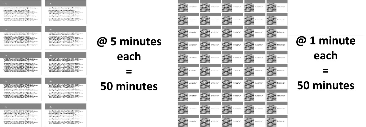
When clients call me for help with their presentation design, most of the time their initial 25-slide file can end up with 60 or 70 slides. Yes, many of them almost fainted when I told them how many slides their presentation might have! Let’s do a bit of math to show you why it does not impact the length of your presentation in a negative way (see Figure 2.8):

Figure 2.8 – Comparison using 10 slides versus 50 slides in a presentation
If your presentation has 10 slides and you are spending 5 minutes per slide, you have content for a 50-minute talk. The problem is that when you spend more than 1 or 2 minutes per slide, the audience can quickly lose interest. When you divide each point of your content so it is shown on its own slide and add a relevant visual element to it, you will spend much less time per slide, creating a more interesting pace. Back to my example in Figure 2.8, if we were to divide the content into 50 slides that we spend about 1 minute on, we would still have 50 minutes of content but the rhythm at which we create a visual change would be much more interesting. Start thinking about your slides as if you were creating a movie. Less time spent on each slide creates a more visually appealing and more memorable presentation.
Here is a list of quick steps you can use to help you remove content from your slides:
- Start by dividing your content into more slides and make sure you keep one main point or idea per slide.
- Remove any information present in more than one place on a slide. For example, if the title of your slide is the same as the title of your chart, remove the one for the chart. When you have repetitive words, try to change how you present the content, so you have only one instance of the same word.
- If possible, remove slide numbers, the date, and the name of the presenter from your content slide. Put that information on the title slide and bring it back on the last slide. This will free up some space to let your content stand out.
- With regard to the company logo and legal information being on each slide, I know that is a big request in many corporations, but you should also try to avoid them. If the reason is that the slides will be printed, then you will have a solution to offer after reading Chapter 3, Leveraging PowerPoint’s Slide Master for Design, and Chapter 4, Using PowerPoint’s Document Masters for Accessible Handouts and Notes, where I will show you how to be aligned with your marketing and legal departments and still be able to reduce the amount of clutter on slides.
If I had to summarize this section on decluttering in one simple sentence it would be: less is more. If you take the time to have less content on your slides but make sure it has a lot of value, you will get better results. You will have less chance of losing your audience to boredom and their favorite app on their smartphone, and you will increase your chances of success.
Removing unnecessary elements from your slides should now be easier to do. It’s now time to discuss how the look and feel of your presentation can be made more consistent and look more professional.


