Responsiveness
The Bartik theme that we talked about in Chapter 3, Basic Concepts, like all modern Drupal 8 themes, is designed to be responsive and so reacts to the size of the browser viewing the page using
breakpoints. The breakpoints are designed for the desktop (wide), tablet (standard), and mobile (narrow) browser widths.
Let's test that out now.
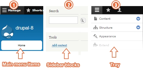
With the tray still visible, gradually resize your browser and you will see two things happen. At the first breakpoint, you will see the Main menu change shape. Try it now.
At the second breakpoint, you'll see two more significant changes.
The Search and Tools blocks both clear so that they fit nicely within a portrait smartphone screen and the items within the Tray itself also clear and reposition themselves on the left-hand side of the screen.

Administration theme
As we mentioned earlier in Chapter 3, Basic Concepts , when you visit any administration type page on your site (any path beginning with /admin/), Drupal switches to the standard profile...


