Search icon CANCEL
Subscription
0
Cart icon
Your Cart (0 item)
Close icon
You have no products in your basket yet
Save more on your purchases! discount-offer-chevron-icon
Savings automatically calculated. No voucher code required.
Arrow left icon
Explore Products
Best Sellers
New Releases
Books
Videos
Audiobooks
Learning Hub
Newsletter Hub
Free Learning
Arrow right icon
timer SALE ENDS IN
0 Days
:
00 Hours
:
00 Minutes
:
00 Seconds
Arrow up icon
GO TO TOP
Angular UI Development with PrimeNG

You're reading from   Angular UI Development with PrimeNG Build rich UI for Angular applications using PrimeNG

Arrow left icon
Product type Paperback
Published in Jul 2017
Publisher Packt
ISBN-13 9781788299572
Length 384 pages
Edition 1st Edition
Languages
Tools
Arrow right icon
Authors (2):
Arrow left icon
Sudheer Jonna Sudheer Jonna
Author Profile Icon Sudheer Jonna
Sudheer Jonna
Oleg Varaksin Oleg Varaksin
Author Profile Icon Oleg Varaksin
Oleg Varaksin
Arrow right icon
View More author details
Toc

Table of Contents (11) Chapters Close

Preface 1. Getting Started with Angular and PrimeNG FREE CHAPTER 2. Theming Concepts and Layouts 3. Enhanced Inputs and Selects 4. Button and Panel Components 5. Data Iteration Components 6. Amazing Overlays and Messages 7. Endless Menu Variations 8. Creating Charts and Maps 9. Miscellaneous Use Cases and Best Practices 10. Creating Robust Applications

Augury in action

The first visible view in Augury is the Component Tree, which shows loaded components. Selecting a component within the tree highlights the component's template within the browser. At the same time, additional information about the selected component is presented on the right side in the Properties tab. Let's select DataTableCrudComponent:
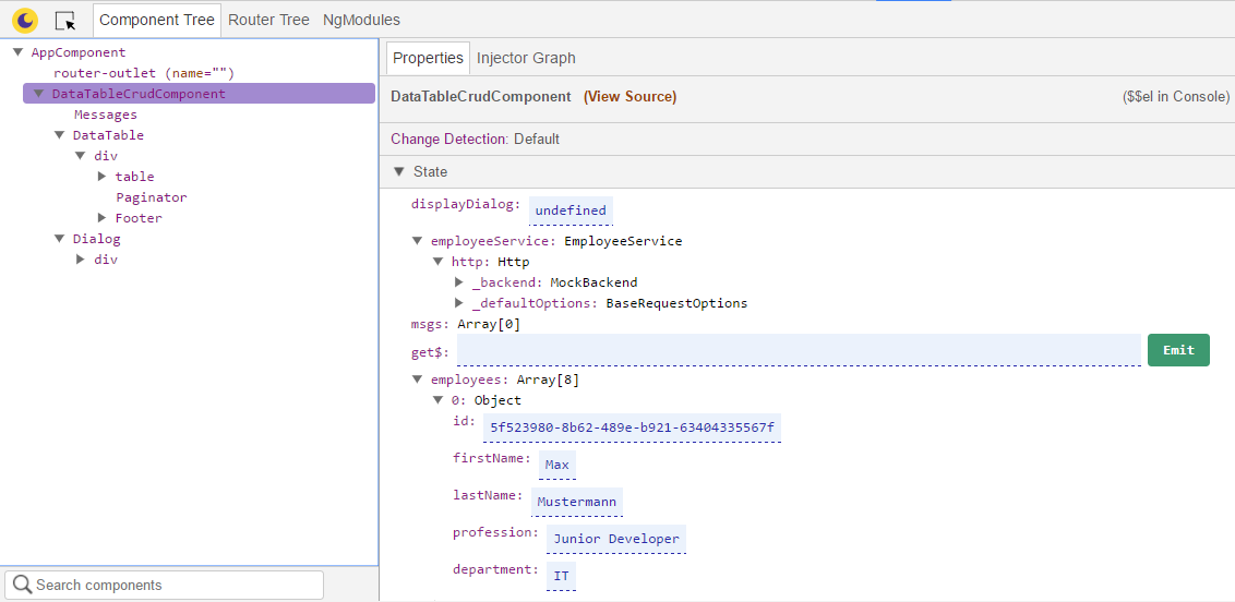
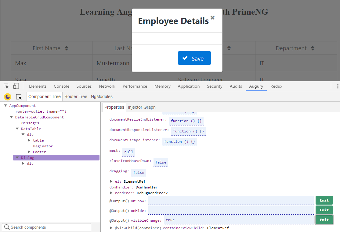
You see all the internal properties, inputs, and outputs. All the properties are editable. The next screenshot shows the properties of the Dialog component. The output property visibleChange is an event emitter. We can trigger the event emitter by setting the value to true and clicking on the button Emit. In response, the dialog becomes visible:
Next to the Properties tab is the Injector Graph, which displays the dependencies of components and services. If we select the DataTable component, the dependency of the DataTable and its ancestry chain to the root injector will be shown:
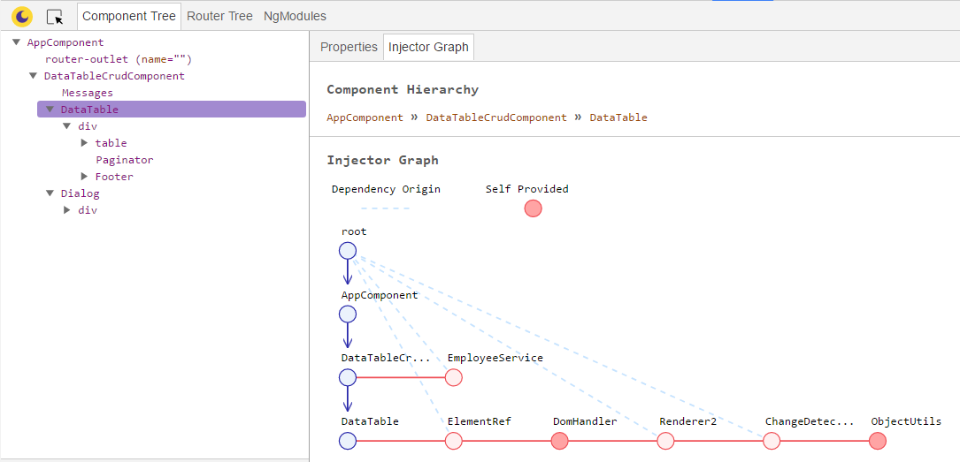
The circle symbols for services need to...

lock icon The rest of the chapter is locked
Register for a free Packt account to unlock a world of extra content!
A free Packt account unlocks extra newsletters, articles, discounted offers, and much more. Start advancing your knowledge today.
Unlock this book and the full library FREE for 7 days
Get unlimited access to 7000+ expert-authored eBooks and videos courses covering every tech area you can think of
Renews at $19.99/month. Cancel anytime
Banner background image