Search icon CANCEL
Arrow left icon
Explore Products
Best Sellers
New Releases
Books
Videos
Audiobooks
Learning Hub
Conferences
Free Learning
Arrow right icon
SwiftUI Cookbook
SwiftUI Cookbook

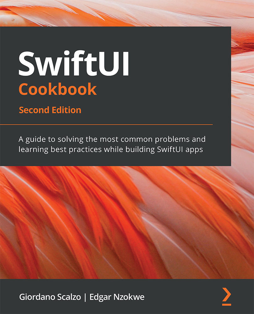
SwiftUI Cookbook: A guide to solving the most common problems and learning best practices while building SwiftUI apps , Second Edition

eBook
€25.99
Paperback
€31.99
Subscription
Free Trial
Renews at €18.99p/m

What do you get with eBook?

Product feature icon Instant access to your Digital eBook purchase
Product feature icon Download this book in EPUB and PDF formats
Product feature icon Access this title in our online reader with advanced features
Product feature icon DRM FREE - Read whenever, wherever and however you want
Product feature icon AI Assistant (beta) to help accelerate your learning
Table of content icon View table of contents Preview book icon Preview Book

SwiftUI Cookbook

Chapter 2: Going Beyond the Single Component with Lists and Scroll Views

In this chapter, we'll learn how to display lists in SwiftUI. List views are like UITableViews in UIKit but are significantly simpler to use. For example, no storyboards or prototype cells are required, and we do not need to remember how many rows or columns we created. Furthermore, SwiftUI's lists are modular so that you can build more significant apps from smaller components.

This chapter will also discuss new and exciting features introduced in WWDC 2021, such as lists with editable text and searchable lists. By the end of this chapter, you will understand how to display lists of static or dynamic items, add or remove items from lists, edit lists, add sections to List views, and much more.

In this chapter, we'll be covering the following recipes:

  • Using scroll views
  • Creating a list of static items
  • Using custom rows in a list
  • Adding rows to a list
  • Deleting rows from a list
  • Creating an editable List view
  • Moving the rows in a List view
  • Adding sections to a list
  • Creating editable Collections
  • Creating Searchable lists

Technical requirements

The code in this chapter is based on Xcode 13 and iOS 15.

You can find the code for this book in this book's GitHub repository: https://github.com/PacktPublishing/SwiftUI-Cookbook-2nd-Edition/tree/main/Chapter02-Lists-and-ScrollViews.

Using scroll views

You can use SwiftUI scroll views when the content to be displayed cannot fit in its container. Scroll views create scrolling content where users can use gestures to bring new content into the section of the screen where it can be viewed. Scroll views are vertical by default but can be made to scroll horizontally or vertically.

In this recipe, we will learn how to use horizontal and vertical scroll views.

Getting ready

Let's start by creating a SwiftUI project called WeScroll.

Optional: If you don't have it yet, download the San Francisco Symbols (SF Symbols) app here: https://developer.apple.com/sf-symbols/.

As we mentioned in Chapter 1, Using the Basic SwiftUI Views and Controls, SF Symbols is a set of over 3,200 symbols provided by Apple.

How to do it…

Let's learn how scroll views work by implementing horizontal and vertical scroll views that display SF symbols for alphabet characters A - P. Here are the steps:

  1. Add an array variable to our ContentView struct that contains the letters a to p:
        let letters =
        ["a","b","c","d","e","f","g","h",
         "i","j","k","l","m","n","o","p"]
  2. Replace the original text view with a VStack, a ScrollView, and a ForEach struct:
        var body: some View {
            VStack{
                ScrollView {
                    ForEach(self.letters, id: \.self){
                            letter in
                            Image(systemName: letter)
                            .font(.largeTitle)
                            .foregroundColor(Color.yellow)
                            .frame(width: 50, height: 50)
                            .background(Color.blue)
                            .symbolVariant(.circle.fill)
                        }
                }
                .frame(width:50, height:200)
                
                ScrollView(.horizontal, showsIndicators:
                   false) {
                    HStack{
                        ForEach(self.letters, id: \.self){
                           name in
                           Image(systemName: name)
                            .font(.largeTitle)
                            .foregroundColor(Color.yellow)
                            .frame(width: 50, height: 50)
                            .background(Color.blue)
                            .symbolVariant(.circle.fill)
                        }
                    }
                }
            }
        }
  3. Run/resume the Xcode preview from the canvas window. It should look as follows:
Figure 2.1 – The WeScroll app with horizontal and vertical scroll views

Figure 2.1 – The WeScroll app with horizontal and vertical scroll views

How it works…

By default, scroll views display items vertically. Therefore, our first scroll view displays its content along the vertical axis without requiring us to specify the axis.

In this recipe, we also introduce the ForEach structure, which computes views on-demand based on an underlying collection of identified data. In this case, the ForEach structure iterates over a static array of alphabet characters and displays the SF Symbols of the said characters.

We provided two arguments to the ForEach structure: the collection we want to iterate over and an id. This id helps us distinguish between the items in the collection and should be unique. Using \.self as id, we indicated that the alphabet characters we are using are unique and will not be repeated in this List. We used unique items because SwiftUI expects each row to be uniquely identifiable and will not run as expected otherwise.

You can use the ForEach structure without specifying the id argument if your collection conforms to the Identifiable protocol.

Moving on to the second scroll view, it uses two arguments: axis and showIndicators. The .horizontal axis's enum indicates we want the content to scroll horizontally, while the .showIdicators: false argument prevents the scrollbar indicator from appearing in the view.

See also

Apple's documentation on scroll views: https://developer.apple.com/documentation/swiftui/scrollview

Creating a list of static items

List views are like scroll views in that they are used to display a collection of items. However, List views are better for dealing with larger datasets because they do not load the entirety of the datasets in memory.

In this recipe, we will create an app the uses static lists to display sample weather data for various cities.

Getting ready

Let's start by creating a new SwiftUI app called StaticList.

How to do it…

We'll create a struct to hold weather information and an array of several cities' weather data. We'll then use a List view to display all the content. The steps are as follows:

  1. Open the ContentView.swift file and add the WeatherInfo struct right above the ContentView struct:
    struct WeatherInfo: Identifiable {
        var id = UUID()
        var image: String
        var temp: Int
        var city: String
    }
  2. Add the weatherData property to the ContentView struct. weatherData contains an array of WeatherInfo items:
        let weatherData: [WeatherInfo] = [
        WeatherInfo(image: "snow", temp: 5, city:"New
          York"),
        WeatherInfo(image: "cloud", temp:5, city:"Kansas
          City"),
        WeatherInfo(image: "sun.max", temp: 80, city:"San
          Francisco"),
        WeatherInfo(image: "snow", temp: 5,
          city:"Chicago"),
        WeatherInfo(image: "cloud.rain", temp: 49,
          city:"Washington DC"),
        WeatherInfo(image: "cloud.heavyrain", temp: 60,
          city:"Seattle"),
        WeatherInfo(image: "sun.min", temp: 75,
          city:"Baltimore"),
        WeatherInfo(image: "sun.dust", temp: 65,
         city:"Austin"),
        WeatherInfo(image: "sunset", temp: 78,
         city:"Houston"),
        WeatherInfo(image: "moon", temp: 80,
         city:"Boston"),
        WeatherInfo(image: "moon.circle", temp: 45,
         city:"denver"),
        WeatherInfo(image: "cloud.snow", temp: 8,
         city:"Philadelphia"),
        WeatherInfo(image: "cloud.hail", temp: 5,
         city:"Memphis"),
        WeatherInfo(image: "cloud.sleet", temp:5,
         city:"Nashville"),
        WeatherInfo(image: "sun.max", temp: 80, city:"San
         Francisco"),
        WeatherInfo(image: "cloud.sun", temp: 5,
         city:"Atlanta"),
        WeatherInfo(image: "wind", temp: 88, city:"Las
         Vegas"),
        WeatherInfo(image: "cloud.rain", temp: 60,
         city:"Phoenix"),
        ]
  3. Add the List view to the ContentView body and use the ForEach structure to iterate over our weatherData collection. Add some font and padding modifiers to improve the styling too:
            List {
                ForEach(self.weatherData){ weather in
                    HStack {
                        Image(systemName: weather.image)
                         .frame(width: 50, alignment:
                           .leading)
                        Text("\(weather.temp)°F")
                         .frame(width: 80, alignment:
                           .leading)
                        Text(weather.city)
                    }
                    .font(.system(size: 25))
                    .padding()
                }
            }

    The resulting preview should look as follows:

Figure 2.2 – Implementing static lists

Figure 2.2 – Implementing static lists

How it works…

First, we created the WeatherInfo struct, which contains properties we'd like to use, such as images, temperature (temperate), and city. Notice that the WeatherInfo struct implements the Identifiable protocol. Making the struct conform to the Identifiable protocol allows us to use the data in a ForEach structure without specifying an id parameter. To conform to the Identifiable protocol, we added a unique property to our struct called id, a property whose value is generated by the UUID() function.

The basic form of a static list is composed of a List view and some other views, as shown here:

List {
 Text("Element one")
 Text("Element two")
}

In this recipe, we went a step further and used the ForEach struct to iterate through an array of identifiable elements stored in the weatherData variable. We wanted to display the data in each list item horizontally, so we displayed the contents in an HStack. Our image, temperature, and city are displayed using image and text views.

The weather image names are SF Symbol variants, so using them with an Image view systemName parameter displays the corresponding SF Symbol. You can read more about SF Symbols in Chapter 1, Using the Basic SwiftUI Views and Controls.

Using custom rows in a list

The number of lines of code required to display items in a List view row could vary from one to several lines of code. Repeating the code several times or in several places increases the chance of an error occurring and potentially becomes very cumbersome to maintain. One change would require updating the code in several different locations or files.

A custom list row can be used to solve this problem. This custom row can be written once and used in several places, thereby improving maintainability and encouraging reuse.

Let's find out how to create custom list rows.

Getting ready

Let's start by creating a new SwiftUI app named CustomRows.

How to do it…

We will reorganize the code in our static lists to make it more modular. We'll create a separate file to hold the WeatherInfo struct, a separate SwiftUI file for the custom view, WeatherRow, and finally, we'll implement the components in the ContentView.swift file. The steps are as follows:

  1. Create a new Swift file called WeatherInfo by going to File | New | File | Swift File (or by using the Command () + N keys).
  2. Create a WeatherInfo struct within the newly created file:
    struct WeatherInfo: Identifiable {
        var id = UUID()
        var image: String
        var temp: Int
        var city: String
    }
  3. Also, add a weatherData variable that holds an array of WeatherInfo:
    let weatherData: [WeatherInfo] = [
         WeatherInfo(image: "snow", temp: 5, city:"New
           York"),
         WeatherInfo(image: "cloud", temp:5, city:"Kansas
           City"),
         WeatherInfo(image: "sun.max", temp: 80, city:"San
           Francisco"),
         WeatherInfo(image: "snow", temp: 5,
           city:"Chicago"),
         WeatherInfo(image: "cloud.rain", temp: 49,
           city:"Washington DC"),
         WeatherInfo(image: "cloud.heavyrain", temp: 60,
           city:"Seattle"),
         WeatherInfo(image: "sun.min", temp: 75,
           city:"Baltimore"),
         WeatherInfo(image: "sun.dust", temp: 65,
           city:"Austin"),
         WeatherInfo(image: "sunset", temp: 78,
           city:"Houston"),
         WeatherInfo(image: "moon", temp: 80,
           city:"Boston"),
         WeatherInfo(image: "moon.circle", temp: 45,
           city:"denver"),
         WeatherInfo(image: "cloud.snow", temp: 8,
           city:"Philadelphia"),
         WeatherInfo(image: "cloud.hail", temp: 5,
           city:"Memphis"),
         WeatherInfo(image: "cloud.sleet", temp:5,
           city:"Nashville"),
         WeatherInfo(image: "sun.max", temp: 80, city:"San
           Francisco"),
         WeatherInfo(image: "cloud.sun", temp: 5,
           city:"Atlanta"),
         WeatherInfo(image: "wind", temp: 88, city:"Las
            Vegas"),
         WeatherInfo(image: "cloud.rain", temp: 60,
            city:"Phoenix"),
         ]
  4. Create a new SwiftUI file by selecting File | New | File | SwiftUI View from the Xcode menu or by using the Command () + N key combination. Name the file WeatherRow.
  5. Add the following weather row design to our new SwiftUI view:
    struct WeatherRow: View {
        var weather: WeatherInfo
        var body: some View {
            HStack {
                Image(systemName: weather.image)
                    .frame(width: 50, alignment: .leading)
                Text("\(weather.temp)°F")
                    .frame(width: 80, alignment: .leading)
                Text(weather.city)
            }
            .font(.system(size: 25))
            .padding()
        }
    }
  6. To preview or update the row design, add a sample WeatherInfo instance to the WeatherRow_Previews function:
    struct WeatherRow_Previews: PreviewProvider {
        static var previews: some View {
            WeatherRow(weather: WeatherInfo(image: "snow",
            temp: 5, city:"New York"))
        }
    }

    The resulting WeatherRow.swift canvas preview should look as follows:

    Figure 2.3 – WeatherRow row preview

    Figure 2.3 – WeatherRow row preview

  7. Open the ContentView.swift file and create a list to display data using the WeatherRow component:
    struct ContentView: View {
        var body: some View {
            List{
                ForEach(weatherData){weather in
                    WeatherRow(weather: weather)
                }
            }
        }
    }

    The resulting canvas preview should look as follows:

Figure 2.4 – CustomRow App preview

Figure 2.4 – CustomRow App preview

Run the app on a device or run a live preview to scroll through and test the app's functionality.

How it works…

WeatherInfo.swift is the model file containing a blueprint of what we want each instance of our weatherInfo struct to contain. We also instantiated an array of the WeatherInfo struct, weatherData, that can be used in other parts of the project previewing and testing areas as we build.

The WeatherRow SwiftUI file is our focus for this recipe. By using this file, we can extract the design of a list row into a separate file and reuse the design in other sections of our project. We added a weather property to our WeatherRow that will hold the WeatherInfo arguments that are passed to our WeatherRow view.

As in the previous recipe, we want the content of each row to be displayed horizontally next to each other, so we enclosed the components related to our weather variable in an HStack.

Important Note

The weatherData array is only necessary during development and should be removed before deployment if such data is obtained at runtime through API calls.

Adding rows to a list

The most common actions users might want to be able to perform on a list include adding, editing, or deleting items.

In this recipe, we'll go over the process of implementing those actions on a SwiftUI list.

Getting ready

Create a new SwiftUI project and call it ListRowAdd.

How to do it…

Let's create a list with a button at the top that can be used to add new rows to the list. The steps are as follows:

  1. Create a state variable in the ContentView struct that holds an array of numbers:
     @State var numbers = [1,2,3,4]
  2. Add a NavigationView struct and a List view to the ContentView struct's body:
            NavigationView{
                List{
                    ForEach(self.numbers, id:\.self){
                        number in
                        Text("\(number)")
                    }
                }
            }
  3. Add a .navigationBarTitle modifier to the list with a title:
    .navigationBarTitle("Number List", displayMode:
      .inline)
  4. Add a navigationBarItems modifier to the list with a function to trigger an element being added to the row:
       .navigationBarItems(trailing: Button("Add", action:
         addItemToRow))
  5. Implement the addItemToRow function and place it immediately after the body view's closing brace:
        private func addItemToRow() {
            self.numbers.append(Int.random(in: 5 ..< 100))
        }

    The preview should look as follows:

Figure 2.5 – ListRowAdd preview

Figure 2.5 – ListRowAdd preview

You can now run the preview and click the Add button to add new items to the list.

How it works…

Our state variable, numbers, holds an array of numbers. We made it a state variable so that the view that's created by our ForEach struct gets updated each time a new number is added to the array.

The .navigationBarTitle ("Number List," displayMode: .inline) modifier adds a title to the top of the list and within the standard bounds of the navigation bar. The display mode is optional, so you could remove it to display the title more prominently. Other display modes include automatic, to inherit from the previous navigation item, and large, to display the title within an expanded navigation bar.

The .navigationbartItems(…) modifier adds a button to the trailing end of the navigation section. The button calls the addItemToRow function when clicked.

Finally, the addItemToRow function generates a random number between 0-99 and appends it to the numbers array. The view gets automatically updated since the numbers variable is a state variable and a change in its state triggers a view refresh.

Important Note

In our list's ForEach struct, we used \.self as our id parameter. However, we may end up with duplicate numbers in our list as we generate more items. Identifiers should be unique, so using values that could be duplicated may lead to unexpected behaviors. Remember to ONLY use unique identifiers for apps meant to be deployed to users.

Deleting rows from a list

So far, we've learned how to add new rows to a list. Now, let's find out how to use a swipe motion to delete items one at a time.

Getting ready

Create a new SwiftUI app called ListRowDelete.

How to do it…

We will create a list of items and use the list view's onDelete modifier to delete rows. The steps are as follows:

  1. Add a state variable to the ContentView struct called countries and initialize it with an array of country names:
        @State var countries = ["USA", "Canada",
         "England", "Cameroon", "South Africa", "Mexico" ,
         "Japan", "South Korea"]
  2. Within the body variable, add a navigationView and a List view that displays our array of countries. Also, include the onDelete modifier at the end of the ForEach structure:
            NavigationView{
                List {
                    ForEach(countries, id: \.self) {
                        country in
                        Text(country)
                    }
                    .onDelete(perform: self.deleteItem)
                }
                .navigationBarTitle("Countries",
                  displayMode: .inline)
            }
  3. Below the body variable's closing brace, add the deleteItem function:
        private func deleteItem(at indexSet: IndexSet){
            self.countries.remove(atOffsets: indexSet)
        }

    The resulting preview should look as follows:

Figure 2.6 – ListRowDelete in action

Figure 2.6 – ListRowDelete in action

Run the canvas preview and swipe right to left on a list row. The Delete button will appear and can be clicked to delete an item from the list.

How it works…

In this recipe, we introduced the .onDelete modifier, whose perform parameter takes a function that will be executed when clicked. In this case, deleting an item triggers the execution of our deleteItem function.

The deleteItem function takes a single parameter, IndexSet, which is the index of the row to be deleted. The onDelete modifier automatically passes the index of the item to be deleted.

There's more…

Deleting an item from a List view can also be performed by embedding the list navigation view and adding an EditButton component.

Creating an editable List view

Adding an edit button to a List view is very similar to adding a delete button, as seen in the previous recipe. An edit button offers the user the option to quickly delete items by clicking a minus sign to the left of each list row.

Getting ready

Create a new SwiftUI project named ListRowEdit.

How to do it…

The steps for adding an edit button to a List view are similar to the steps we used when adding a delete button. The process is as follows:

  1. Replace the ContentView struct with the following content from the DeleteRowFromList app:
    struct ContentView: View {
        @State var countries = ["USA", "Canada",
         "England", "Cameroon", "South Africa", "Mexico" ,
         "Japan", "South Korea"]
        var body: some View {
            NavigationView{
                List {
                    ForEach(countries, id: \.self) {
                        country in
                        Text(country)
                    }
                    .onDelete(perform: self.deleteItem)
                }
                .navigationBarTitle("Countries",
                  displayMode: .inline)
            }
        }
        private func deleteItem(at indexSet: IndexSet){
            self.countries.remove(atOffsets: indexSet)
        }
    }
  2. Add a .navigationBarItems(training: EditButton()) modifier to the List view, just below the .navigationBarTitle modifier.
  3. Run the preview and click on the Edit button at the top-right corner of the emulated device's screen. A minus (-) sign in a red circle will appear to the left of each list item, as shown in the following preview:
Figure 2.7 – ListRowEdit app preview during execution

Figure 2.7 – ListRowEdit app preview during execution

Click on the circle to the left of any list item to delete it.

How it works…

The .navigationBarItems(trailing: EditButton()) modifier adds an Edit button to the top-right corner of the display. Once clicked, it triggers the appearance of a minus sign to the left of each item in the modified List. Clicking on the minus sign executes the function in our .onDelete modifier and deletes the related item from the row.

There's more…

To display the Edit button on the left-hand side of the navigation bar, change the modifier to .navigationBarItems(leading: EditButton()).

Moving the rows in a List view

In this recipe, we'll create an app that implements a List view that allows users to move and reorganize rows.

Getting ready

Create a new SwiftUI project named MovingListRows.

How to do it…

To make the List view rows movable, we'll add a modifier to the List view's ForEach struct, and then we'll embed the List view in a navigation view that displays a title and an edit button. The steps are as follows:

  1. Add a @State variable to the ContentView struct that holds an array of countries:
        @State var countries = ["USA", "Canada",
         "England", "Cameroon", "South Africa", "Mexico" ,
         "Japan", "South Korea"]
  2. Replace the body variable's text view with a NavigationView, a List, and modifiers for navigating. Also, notice that the .on Move modifier is applied to the ForEach struct:
            NavigationView{
                List {
                    ForEach(countries, id: \.self) {
                       country in
                        Text(country)
                    }
                    .on Move(perform: moveRow)
                }
                .navigationBarTitle("Countries",
                  displayMode: .inline)
                .navigationBarItems(trailing:
                  EditButton())
            }
  3. Now, let's add the function that gets called when we try to move a row. The moveRow function should be located directly below the closing brace of the body view:
        private func moveRow(source: IndexSet,
             destination: Int){
            countries.move(fromOffsets: source, toOffset:
             destination)
        }

    Let's run our application in the canvas or a simulator and click on the edit button. If everything was done right, the preview should look as follows. Now, click and drag on the hamburger menu symbol at the right of each country to move it to a new location:

Figure 2.8 – MovingListRows

Figure 2.8 – MovingListRows

How it works…

To move list rows, you need to wrap the list in a NavigationView, add the .on Move(perform:) modifier to the ForEach struct, and add a .navigationBarItems(..) modifier to the list. The on Move modifier calls the moveRow function when clicked, while .navigationBarItem displays the button that starts the "move mode," where list row items become movable.

The moveRow(source: IndexSet, destination: Int) function takes two parameters, source and IndexSet, which represent the current index of the item to be moved and its destination index, respectively.

Adding sections to a list

In this recipe, we will create an app that implements a static list with sections. The app will display a list of countries grouped by continent.

Getting ready

Let's start by creating a new SwiftUI app in Xcode named ListWithSections.

How to do it…

We will add a Section view to our List to separate groups of items by section titles. Proceed as follows:

  1. (Optional) Open the ContentView.swift file and replace the Text view with a NavigationView. Wrapping the List in a NavigationView allows us to add a title and navigation items to the view:
    NavigationView{
    }
  2. Add a list and section to NavigationView (or body view if you skipped optional Step 1). Also, add a listStyle and navigationBarTitle modifier:
    List {
        Section(header: Text("North America")){
            Text("USA")
            Text("Canada")
            Text("Mexico")
            Text("Panama")
            Text("Anguilla")
        }
    }
    .listStyle(.grouped)
    .navigationBarTitle("Continents and Countries",
      displayMode: .inline)
  3. Below the initial Section, add more sections representing countries in various continents:
                List {
                    …
                    Section(header: Text("Africa")){
                        Text("Nigeria")
                        Text("Ghana")
                        Text("Kenya")
                        Text("Senegal")
                    }
                    Section(header: Text("Europe")){
                        Text("Spain")
                        Text("France")
                        Text("Sweden")
                        Text("Finland")
                        Text("UK")
                    }
                }

    Your canvas preview should resemble the following:

Figure 2.9 – ListWithSections preview

Figure 2.9 – ListWithSections preview

Looking at the preview, you can see the continents where each country is located by reading the section titles.

How it works…

SwiftUI's Section views are used to separate items into groups. In this recipe, we used Section views to visually group countries by their continents. A Section view can be used with a header, as shown in this recipe, or without a header, as follows:

                Section {
                    Text("Spain")
                    Text("France")
                    Text("Sweden")
                    Text("Finland")
                    Text("UK")
                }

You can change section styles by using the listStyle() modifier with the .grouped style.

Creating editable Collections

Editing lists has always been possible in SwiftUI but before WWDC 2021 and SwiftUI 3, doing so was very inefficient because SwiftUI did not support binding to Collections. Let's use bindings on a collection and discuss how and why it works better now.

Getting ready

Create a new SwiftUI project and name it EditableListsFields.

How to do it…

Let's create a simple to-do list app with a few editable items. The steps are as follows:

  1. Add a TodoItem struct below the import SwiftUI line:
    struct TodoItem: Identifiable {
        let id = UUID()
        var title: String
        init(_ someTitle:String){
            title = someTitle
        }
    }
  2. In our ContentView struct, let's add a collection of TodoItem instances:
        @State var todos = [
            TodoItem("Eat"),
            TodoItem("Sleep"),
            TodoItem("Code")
        ]
  3. Replace the Text view in the body with a List and a TextField view that displays the collection of todo items:
        var body: some View {
            List($todos) { $todo in
                TextField("Number", text: $todo.title)
          }
        }

    Run the preview in canvas. You should be able to edit the text in each row, as shown in the following screenshot:

Figure 2.10 – Editable Collections preview

Figure 2.10 – Editable Collections preview

Click on any of the other rows and edit it to your heart's content.

How it works…

Let's start by looking at how editable lists were handled before SwiftUI 3. Before SwiftUI 3, the code for an editable list of items would use list indices to create bindings to a collection, as follows:

List(0..<todos.count) { index in
  TextField("Todo", text: $todos[index].title)
}

Not only was such code slow, but editing a single item caused SwiftUI to re-render the entire List of elements, leading to flickering and slow UI updates.

With SwiftUI 3, we can pass a binding to a collection of elements, and SwiftUI will internally handle binding to the current element specified in the closure. Since the whole of our collection conforms to the Identifiable protocol, each of our list items can be uniquely identified by its id parameter; therefore, adding or removing items from the list does not change list item indices and does not cause the entire list to be re-rendered.

Left arrow icon Right arrow icon
Download code icon Download Code

Key benefits

  • Apply the declarative programming paradigm to build cross-platform UIs for Apple devices
  • Learn to integrate UIkit, Core Data, Firebase, and Sign in with Apple with SwiftUI
  • Adopt the new SwiftUI 3.0 features to build visually appealing UIs speedily

Description

SwiftUI provides an innovative and simple way to build beautiful user interfaces (UIs) for all Apple platforms, from iOS and macOS through to watchOS and tvOS, using the Swift programming language. In this recipe-based cookbook, you’ll cover the foundations of SwiftUI as well as the new SwiftUI 3 features introduced in iOS 15 and explore a range of essential techniques and concepts that will help you through the development process. The cookbook begins by explaining how to use basic SwiftUI components. Once you’ve learned the core concepts of UI development, such as Views, Controls, Lists, and ScrollViews, using practical implementations in Swift, you'll advance to adding useful features to SwiftUI using drawings, built-in shapes, animations, and transitions. You’ll understand how to integrate SwiftUI with exciting new components in the Apple development ecosystem, such as Combine for managing events and Core Data for managing app data. Finally, you’ll write iOS, macOS, and watchOS apps by sharing the same SwiftUI codebase. By the end of this SwiftUI book, you'll have discovered a range of simple, direct solutions to common problems encountered when building SwiftUI apps.

Who is this book for?

This book is for mobile developers who want to learn SwiftUI as well as experienced iOS developers transitioning from UIkit to SwiftUI. The book assumes knowledge of the Swift programming language. Knowledge of object-oriented design and data structures will be useful but not necessary. You'll also find this book to be a helpful resource if you're looking for reference material regarding the implementation of various features in SwiftUI.

What you will learn

  • Explore various layout presentations in SwiftUI such as HStack, VStack, LazyHStack, and LazyVGrid
  • Create widgets to quickly display relevant content at glance
  • Get up to speed with drawings in SwiftUI using built-in shapes, custom paths, and polygons
  • Discover modern animation and transition techniques in SwiftUI
  • Add user authentication using Firebase and Sign in with Apple
  • Manage concurrency with Combine and async/await in SwiftUI
  • Solve the most common SwiftUI problems, such as integrating a MapKit map, unit testing, snapshot testing, and previewing layouts

Product Details

Country selected
Publication date, Length, Edition, Language, ISBN-13
Publication date : Nov 01, 2021
Length: 616 pages
Edition : 2nd
Language : English
ISBN-13 : 9781803240435
Vendor :
Apple
Category :
Languages :
Tools :

What do you get with eBook?

Product feature icon Instant access to your Digital eBook purchase
Product feature icon Download this book in EPUB and PDF formats
Product feature icon Access this title in our online reader with advanced features
Product feature icon DRM FREE - Read whenever, wherever and however you want
Product feature icon AI Assistant (beta) to help accelerate your learning

Product Details

Publication date : Nov 01, 2021
Length: 616 pages
Edition : 2nd
Language : English
ISBN-13 : 9781803240435
Vendor :
Apple
Category :
Languages :
Tools :

Packt Subscriptions

See our plans and pricing
Modal Close icon
€18.99 billed monthly
Feature tick icon Unlimited access to Packt's library of 7,000+ practical books and videos
Feature tick icon Constantly refreshed with 50+ new titles a month
Feature tick icon Exclusive Early access to books as they're written
Feature tick icon Solve problems while you work with advanced search and reference features
Feature tick icon Offline reading on the mobile app
Feature tick icon Simple pricing, no contract
€189.99 billed annually
Feature tick icon Unlimited access to Packt's library of 7,000+ practical books and videos
Feature tick icon Constantly refreshed with 50+ new titles a month
Feature tick icon Exclusive Early access to books as they're written
Feature tick icon Solve problems while you work with advanced search and reference features
Feature tick icon Offline reading on the mobile app
Feature tick icon Choose a DRM-free eBook or Video every month to keep
Feature tick icon PLUS own as many other DRM-free eBooks or Videos as you like for just €5 each
Feature tick icon Exclusive print discounts
€264.99 billed in 18 months
Feature tick icon Unlimited access to Packt's library of 7,000+ practical books and videos
Feature tick icon Constantly refreshed with 50+ new titles a month
Feature tick icon Exclusive Early access to books as they're written
Feature tick icon Solve problems while you work with advanced search and reference features
Feature tick icon Offline reading on the mobile app
Feature tick icon Choose a DRM-free eBook or Video every month to keep
Feature tick icon PLUS own as many other DRM-free eBooks or Videos as you like for just €5 each
Feature tick icon Exclusive print discounts

Frequently bought together


Stars icon
Total 118.97
iOS 15 Programming for Beginners
€44.99
Swift Cookbook
€41.99
SwiftUI Cookbook
€31.99
Total 118.97 Stars icon

Table of Contents

16 Chapters
Chapter 1: Using the Basic SwiftUI Views and Controls Chevron down icon Chevron up icon
Chapter 2: Going Beyond the Single Component with Lists and Scroll Views Chevron down icon Chevron up icon
Chapter 3: Exploring Advanced Components Chevron down icon Chevron up icon
Chapter 4: Viewing while Building with SwiftUI Preview Chevron down icon Chevron up icon
Chapter 5: Creating New Components and Grouping Views with Container Views Chevron down icon Chevron up icon
Chapter 6: Presenting Extra Information to the User Chevron down icon Chevron up icon
Chapter 7: Drawing with SwiftUI Chevron down icon Chevron up icon
Chapter 8: Animating with SwiftUI Chevron down icon Chevron up icon
Chapter 9: Driving SwiftUI with Data Chevron down icon Chevron up icon
Chapter 10: Driving SwiftUI with Combine Chevron down icon Chevron up icon
Chapter 11: SwiftUI Concurrency with async await Chevron down icon Chevron up icon
Chapter 12: Handling Authentication and Firebase with SwiftUI Chevron down icon Chevron up icon
Chapter 13: Handling Core Data in SwiftUI Chevron down icon Chevron up icon
Chapter 14: Creating Cross-Platform Apps with SwiftUI Chevron down icon Chevron up icon
Chapter 15: SwiftUI Tips and Tricks Chevron down icon Chevron up icon
Other Books You May Enjoy Chevron down icon Chevron up icon

Customer reviews

Top Reviews
Rating distribution
Full star icon Full star icon Full star icon Full star icon Half star icon 4.3
(20 Ratings)
5 star 60%
4 star 20%
3 star 10%
2 star 5%
1 star 5%
Filter icon Filter
Top Reviews

Filter reviews by


Andrés Cortes Dec 01, 2021
Full star icon Full star icon Full star icon Full star icon Full star icon 5
This book is a very nice option for swift developers to start using UI components to create powerful applications and apply UX concepts. The code samples available in GitHub are helpful to use for practice and template for new projects.Every chapter in this book is logically structured to guide the reader in the app design from scratch to the complexity of cross platform Apps.If you want to deep dive into swift yo world this is the book you need.
Amazon Verified review Amazon
Michael Jan 25, 2022
Full star icon Full star icon Full star icon Full star icon Full star icon 5
I originally learned SwiftUI by studying various tutorials online and writing code. That was a good intro but having a complete reference in a well organized book really helped fill in the gaps. I especially liked the more advanced features like binding and using Combine with SwiftUI...and by "combining" the book with the examples on Github, it allowed me to work along with each chapter.
Amazon Verified review Amazon
Nikolay R. Feb 22, 2022
Full star icon Full star icon Full star icon Full star icon Full star icon 5
It is not the next boring book that will stay on the bookshelf!I have fount this “Cookbook” approach working way better for me than any other books and even video tutorials.The examples are easy to follow. (I am sayng that from the point of person who passed a few online courses and books about SwiftUI)Only my criticism is about the format of examples - they could be colored and the first few are not arranged IDE style. But that's not big deal - I am coloring them myself and find that it my even help me to understand better what's going on.I have to admit the advantage of particularly this book the simplicity of using it like documentation / reference guide.If you are into dev field, the most valuable aspect of any learning source would be the time saving. Otherwize all of us would go to first to the official documentation :).So I just try to say that the book could be used for gate to the official ducumentation where we go when we need to check something deeply.The book provides the official documentation links, so really I would use it as my fist point of reference.I appreciate this book for either time saving and money saving. For this price and 616 pages which covers a lot, for me it is a bargain.Thanks to the authors for putting that effor and making this book!
Amazon Verified review Amazon
Pravin Jan 11, 2022
Full star icon Full star icon Full star icon Full star icon Full star icon 5
I am an passionate iOS developer. It's been since quite some time I wanted to get hands on with SwiftUI. This book helped me get started and is one of the best book for SwiftUI with very good examples hosted on GitHub. I would like to thank Authors of this book @Giordano Scalzo & @Edgar Nzokwe for this book. Good to have in your library for iOS technology professionals.
Amazon Verified review Amazon
anthony mata Dec 02, 2021
Full star icon Full star icon Full star icon Full star icon Full star icon 5
The is a compressive book on SwifUI and provides clear examples that are well done. This book is to further your skills, but it assumes you understand and have basic programing knowledge and Swift knowledge. I found all the nice detail and deeper explanation a very good change of pace compared to most books. For those of you new to “cookbook” it’s a template of written code like a recipe hence the name cookbook. If you follow the steps in the book, you will get a really good idea on how to modify the code into something you will need in the future. As a matter of fact this book has answered questions for me on how to accomplish tasks.The only gripe I have is I had to run a clean build folder at one point but that means nothing in the long run because all code sometime requires this once in a while. But this is not worthy of a rating demotion.
Amazon Verified review Amazon
Get free access to Packt library with over 7500+ books and video courses for 7 days!
Start Free Trial

FAQs

How do I buy and download an eBook? Chevron down icon Chevron up icon

Where there is an eBook version of a title available, you can buy it from the book details for that title. Add either the standalone eBook or the eBook and print book bundle to your shopping cart. Your eBook will show in your cart as a product on its own. After completing checkout and payment in the normal way, you will receive your receipt on the screen containing a link to a personalised PDF download file. This link will remain active for 30 days. You can download backup copies of the file by logging in to your account at any time.

If you already have Adobe reader installed, then clicking on the link will download and open the PDF file directly. If you don't, then save the PDF file on your machine and download the Reader to view it.

Please Note: Packt eBooks are non-returnable and non-refundable.

Packt eBook and Licensing When you buy an eBook from Packt Publishing, completing your purchase means you accept the terms of our licence agreement. Please read the full text of the agreement. In it we have tried to balance the need for the ebook to be usable for you the reader with our needs to protect the rights of us as Publishers and of our authors. In summary, the agreement says:

  • You may make copies of your eBook for your own use onto any machine
  • You may not pass copies of the eBook on to anyone else
How can I make a purchase on your website? Chevron down icon Chevron up icon

If you want to purchase a video course, eBook or Bundle (Print+eBook) please follow below steps:

  1. Register on our website using your email address and the password.
  2. Search for the title by name or ISBN using the search option.
  3. Select the title you want to purchase.
  4. Choose the format you wish to purchase the title in; if you order the Print Book, you get a free eBook copy of the same title. 
  5. Proceed with the checkout process (payment to be made using Credit Card, Debit Cart, or PayPal)
Where can I access support around an eBook? Chevron down icon Chevron up icon
  • If you experience a problem with using or installing Adobe Reader, the contact Adobe directly.
  • To view the errata for the book, see www.packtpub.com/support and view the pages for the title you have.
  • To view your account details or to download a new copy of the book go to www.packtpub.com/account
  • To contact us directly if a problem is not resolved, use www.packtpub.com/contact-us
What eBook formats do Packt support? Chevron down icon Chevron up icon

Our eBooks are currently available in a variety of formats such as PDF and ePubs. In the future, this may well change with trends and development in technology, but please note that our PDFs are not Adobe eBook Reader format, which has greater restrictions on security.

You will need to use Adobe Reader v9 or later in order to read Packt's PDF eBooks.

What are the benefits of eBooks? Chevron down icon Chevron up icon
  • You can get the information you need immediately
  • You can easily take them with you on a laptop
  • You can download them an unlimited number of times
  • You can print them out
  • They are copy-paste enabled
  • They are searchable
  • There is no password protection
  • They are lower price than print
  • They save resources and space
What is an eBook? Chevron down icon Chevron up icon

Packt eBooks are a complete electronic version of the print edition, available in PDF and ePub formats. Every piece of content down to the page numbering is the same. Because we save the costs of printing and shipping the book to you, we are able to offer eBooks at a lower cost than print editions.

When you have purchased an eBook, simply login to your account and click on the link in Your Download Area. We recommend you saving the file to your hard drive before opening it.

For optimal viewing of our eBooks, we recommend you download and install the free Adobe Reader version 9.