Distributions
Probability distributions are a way of describing all possible outcomes a random variable can take within a sample space. There are lots of probability distributions, With the solar cell manufacturing example, we might expect to see something similar to a normal distribution.
The normal distribution and using scipy to generate distributions
The normal distribution is also called the Gaussian distribution or the bell curve and shows up often. This is something we could see when taking measurements from a biological population (like dimensions of plants) or measurements of a manufacturing process, like the efficiency of solar cells coming off a manufacturing line. We can generate most common distributions in Python with scipy. We want to first make sure we have scipy installed: conda install -c conda-forge scipy -y. Then we can create and plot a normal distribution:
import numpy as np
from scipy.stats import norm
x = np.linspace(-4, 4, 100)
plt.plot(x, norm.pdf(x))
plt.plot(x, norm.cdf(x)
First, we import the norm class from scipy.stats. Then, we create a numpy array with 100 values ranging from -4 to 4, equally spaced with np.linspace(). Next, we plot these x-values versus the probability density function (PDF) of a normal distribution with norm.pdf(x), and our cumulative density function (CDF).
Our plot looks like this:
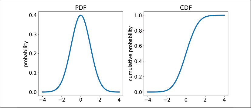
Figure 8.4: A plot of a normal distribution probability distribution function (PDF) and cumulative distribution function (CDF)
The probability density function gives us the relative likelihood of an event at that value x. For example, in the plot on the left above, the probability of observing a 0 for the value of x is the maximum value on the PDF, so we have the highest chance of observing a value around 0 with this distribution. The CDF is simply the cumulative sum of the PDF. This tells us the probability that our value will be less than or equal to any point on the plot. We can see there is a 50% chance that our value of x will be less than or equal to 0 from the CDF.
Note that the CDF ends at a value approaching 1 and is the cumulative area under the PDF (which sums to 1). Since the sample space for a continuous variable is infinite, the exact probability of any one value occurring is 0 (1 divided by infinity). These PDFs are calculated from mathematical formulas. As the PDF moves toward negative and positive infinity, the relative probabilities approach 0, but never exactly reach 0.
The scipy distribution classes, like norm, have a set of common functions such as pdf() and cdf(). Another common function is rvs(), which is "random variable sampling." We can use this to generate samples of data from a distribution.
For example, we can generate 10,000 datapoints for our normal distribution and plot the data in a histogram like so:
data = norm.rvs(size=10000, random_state=42)
plt.hist(data, bins=30)
We use the rvs() method of the norm class, and provide a size argument for the number of points, as well as a random_state argument. This random_state argument sets the "seed" for our randomly generated points, which means our generated points will be the same every time we run this function. Otherwise, we would get slightly different results every time we run it. Our histogram looks like this:
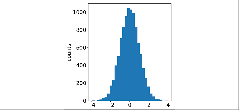
Figure 8.5: A histogram of our data sampled from a normal distribution
We can see this histogram looks almost the same as our PDF, which it is. When we plot distributions of data, it's often as a histogram and represents the empirical PDF (the measured probabilities for each value of x) for that data. This is a good start to generating data from distributions, and the next step is to customize our distributions with parameters.
Descriptive statistics of distributions
Distributions are mathematical equations characterized by parameters. For example, the normal distribution's PDF is represented with an equation:

This is in fact how scipy is calculating the PDF in our Python code above. Here, the function uses the same math notation as we did with conditional probabilities – the PDF function is for a value of x given values for the Greek characters sigma ( ) and mu (
 ). These values are the standard deviation and mean, respectively.
The standard deviation is how spread out the data is (there is an equation for calculating it from data, not shown here), while the mean is the average of the data (also with a formal equation, not shown here). We also see the constant pi ( , 3.14) in there as well as Euler's number (e, roughly 2.72). Euler's number exponentiated to the value
  is what gives the normal distribution its bell-curve shape. The other part of the equation,
  , is just a scaling factor.
Wikipedia is one place where you can find the PDF and CDF equations for most probability distributions. You'll see that many of the PDF equations use the gamma function, which is a symbol that looks like an upside-down L.
Once we know the parameters in the PDF of a distribution, we can use them to create distributions with different characteristics. For example, if we know from measurements that the average efficiency from a solar cell manufacturing line is 14% and the standard deviation is 0.5%, we can create and plot a normal distribution with those parameters:
x = np.linspace(12, 16, 100)
plt.plot(x, norm.pdf(x, loc=14, scale=0.5))
We are first creating an array of 100 equally spaced x-values from 12 to 16 with np.linspace(), which centers around our mean of 14. We then set the mean and standard deviation parameters (loc and scale) to the specified values of 14 and 0.5. Our probability distribution function looks like this:
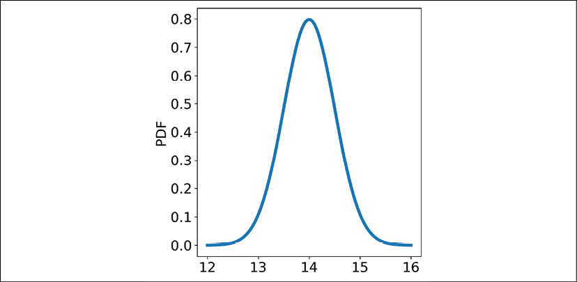
Figure 8.6: A normal distribution PDF with a mean of 14 and a standard deviation of 0.5
The arguments loc and scale are described in the scipy documentation for the scipy.stats.norm class. For the other distributions we will cover in this chapter, scipy has similar documentation explaining what the argument names are for each distribution's parameters. The loc and scale arguments show up as parameters in many distributions in scipy.
Let's take a sample of 10,000 points from this normal distribution we just created with the rvs() function:
solar_data = norm.rvs(size=10000, loc=14, scale=0.5, random_state=42)
If you like, try plotting it to make sure it looks okay with plt.hist(solar_data, bins=30). Once we have this data (which is a numpy array), we can generate some descriptive statistics of the data:
solar_data.mean()
solar_data.std()
These will calculate the mean and standard deviation of our data, which should be very close to 14 and 0.5. These are a few of the key methods we can describe our data with, especially if it resembles a normal distribution. Another couple of ways we can describe a distribution that may be similar to a normal distribution are skewness and kurtosis.
The mean, standard deviation, skewness, and kurtosis are called moments, which are quantifications of the data distribution's shape. The mean is called the first raw moment, while the standard deviation is actually the square of the second central moment, variance. Skewness is the third normalized moment, and kurtosis is the fourth normalized moment. The terminology raw, central, and normalized signify slight differences in calculations. "Raw" is as it sounds, simply an equation without normalization or adjustment. "Central" means a moment around the data's mean, and "normalized" means the moment is normalized (divided) by the standard deviation. This results in us being able to compare skewness and kurtosis across distributions of data, even if they have wildly different standard deviations (spread of the data).
An easy way to calculate skew and kurtosis is to put our data in a pandas DataFrame:
import pandas as pd
df = pd.DataFrame(data={'efficiency': solar_data})
df['efficiency'].skew()
df.kurtosis()
As we can see above, the skew and kurtosis are simply functions we can call with a pandas DataFrame or Series. The skew measures the magnitude and direction of the asymmetry of a distribution. In other words, it's which way the tails on a distribution are biased towards (left or right). For a distribution with positive skew, most of the data will be on the left of the center if we plot it, with a tail extending to the right, and vice-versa for a negative skew. The kurtosis measures how much of the data is in the tails of the distribution; a higher kurtosis means more data is in the tails. In other words, we have likely more outliers with more data in the tails. The following chart shows the difference between a normal distribution, a skewed distribution, and a distribution with high kurtosis:
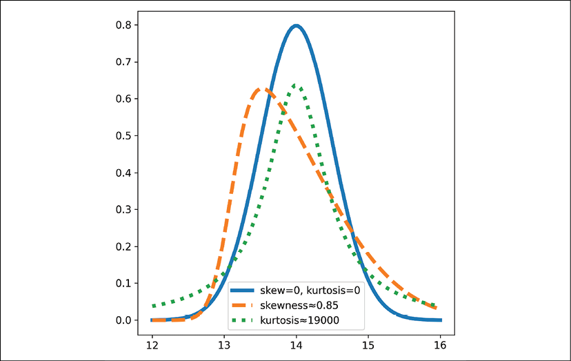
Figure 8.7: PDFs for normal (or close to normal) distributions with mean 14 and standard deviation 0.5 and different skew and kurtosis values. Values for skew and kurtosis are 0 unless otherwise specified.
We can see the high skewness distribution has its center of mass moved to the left and a tail extending to the right, corresponding to a positive skew value. This value scales between -1 and +1, so a value of 0.85 is quite high. The high kurtosis PDF shows fatter tails than the default normal distribution. This measure has no upper bound, but 19,000 is a high value for kurtosis.
These measures of distributions can be used to compare the distributions of data in a quantitative way. The measures can be calculated for any distribution but are most useful when applied to something that may be similar to a normal distribution or one of its variants.
Variants of the normal distribution
Two of the variants of the normal distribution are the skewed normal and lognormal distribution. The skewed normal distributions simply introduces a skew parameter to alter the skewness of the distribution, and we used it in the plot above with the function call scipy.stats.skewnorm.pdf(x, scale=1.15, loc=13.1, a=5) after importing scipy with import scipy. The lognormal distribution is a distribution where the logarithm of our data is normally distributed ( , where the logarithm is the inverse of exponentiation,
  ), and looks like this:
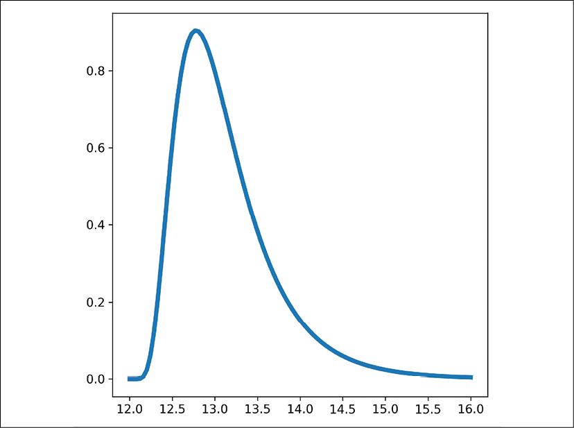
Figure 8.8: A lognormal distribution PDF
The lognormal distribution shows up in many places. For example, it shows up in the length of comments in online forums and the amount of time people spend on web pages for articles. We can access distributions for skewed normal and lognormal distributions through the scipy.stats classes skewnorm and lognorm. Here is the function call for the PDF of the lognormal distribution above: plt.plot(x, scipy.stats.lognorm.pdf(x, loc=12, s=0.5)) (where x is from earlier, x = np.linspace(12, 16, 100)). The s parameter is the "shape" parameter and moves the peak of the PDF left and flattens the PDF as s increases.
Fitting distributions to data to get parameters
If we have data from measurements, say the efficiency of solar cells from a manufacturing line, we can fit a distribution to that data to extract the distribution's PDF parameters and moments like mean, variance (and standard deviation), skewness, and kurtosis. This is more useful for other distributions that have different parameters that are not simply the mean and standard deviation. As an example, let's load some simulated solar cell efficiency data (available in the GitHub materials for this book under Chapter8/data/):
df = pd.read_csv('data/solar_cell_efficiencies.csv')
df.describe()
The result of describe() looks like this:
efficiency
count  187196.000000
mean   14.181805
std    0.488751
min    9.691218
25%    13.932445
50%    14.205567
75%    14.482341
max    17.578530
We can see the mean near 14 and standard deviation near 0.5. We can also examine the skew and kurtosis with df['efficiency'].skew() and df['efficiency'].kurt(), which return -0.385 and 1.117. The negative skew tells us our distribution leans to the right, with a tail to the left. The kurtosis tells us we have a few more datapoints in the tails than a usual Gaussian distribution, but barely.
To fit the distribution and extract the PDF parameters, we simply run:
scipy.stats.norm.fit(df['efficiency'])
This gives us 14.18 for the mean and 0.488 for the standard deviation, the same as we saw in the describe() results. Since we can get these parameters from describe() or mean() and std(), it's not that useful. For other distributions in scipy with more complex parameters, this is more useful.
The Student's t-distribution
The t-distribution shows up in statistical tests, as we will see in the next chapter. This distribution can be used from the class scipy.stats.t. For example, the PDF with high kurtosis in Figure 8.7 above was generated with t.pdf(x, loc=14, scale=0.5, df=1). The t-distribution has the loc, scale, and df (degrees of freedom) arguments. The loc and scale arguments act similar to how they do with the normal distribution, and the df argument causes fatter tails in the distribution as it gets smaller.
The Bernoulli distribution
The Bernoulli distribution is a discrete distribution, meaning it can only take on a few values. The other distributions we discussed (normal and its variations, and t) are continuous distributions. Discrete distributions have a probability mass function (PMF) instead of a probability distribution function (PDF).
The Bernoulli distribution represents binary outcomes: 0 or 1, for example, from a coin flip. Another example of a binary outcome would be a customer conversion – for example, if a customer buys something or not. We can use this distribution through scipy to generate a sample of an event using the rvs() function:
scipy.stats.bernoulli(p=0.7).rvs()
First, we are creating a bernoulli class from scipy.stats with a probability of 0.7 for success (the probability of getting a 1 and not 0). This also demonstrates another way to create distributions with scipy: we can provide the parameters to the class name instead of the function. Then we can use functions like rvs(), pmf(), or pdf() from there.
The binomial distribution
The Bernoulli distribution is for a single binary event, and the Binomial distribution is for a collection of Bernoulli events. The binomial distribution represents a number of successes (1s) out of a number of Bernoulli events (binary with a 1 or 0 outcome) with the probability of success p. For example, if 10 customers visit our website and we have a 70% chance of them buying a product, our binomial distribution would be:
binom_dist = scipy.stats.binom(p=0.7, n=10)
plt.bar(range(11), binom_dist.pmf(k=range(11)))
This creates our distribution object in the first line, then plots the PMF (from 0 to 10) as a bar chart on the second line. Since it's a discrete distribution, we should only point to each discrete value of x. Notice for the pmf() function, we provide a range of integers for the argument k. These should span from 0 to our value of n in the binom() class (our number of trials) to get the full PMF. The plot looks like this:
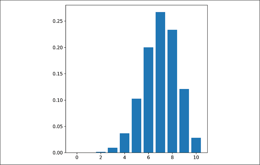
Figure 8.9: A binomial distribution PMF with n=10 and p=0.7
We can see the probabilities of getting 0, 1, 2, or 3 successes are very low, and the probability of getting 7/10 successes is the highest. This is because our probability of success for each trial is 0.7. We can use this distribution to model situations like the customer conversion situation, or anything else where we want to understand how many successes we are likely to get in a trial of binary events.
The uniform distribution
The uniform distribution shows up when we have several events, all with an equal likelihood of occurring. The canonical example is rolling a 6-sided dice. Each value of 1 through 6 has an equal likelihood of occurring. This distribution can also be used for getting random values between a range. It's available in scipy through the scipy.stats.uniform() class. It can also be useful for describing existing datasets, as we saw in Chapter 5, Exploratory Data Analysis and Visualization, with pandas-profiling reports.
The exponential and Poisson distributions
The exponential distribution describes the space or time between events that are independent. Some examples are support center calls and radioactive materials emitting particles. These events are assumed to be independent (for example, we assume each support call doesn't affect the next one) and events have some characteristic time by which they tend to be separated. In the exponential distribution, this parameter is called lambda ( ) and appears in the PDF equation as
  . The e here is again Euler's number and is sometimes written
  . We can specify this value of lambda with the
 scale argument in scipy:
from labellines import labelLines
x = np.linspace(0, 5, 100)
plt.plot(x, scipy.stats.expon.pdf(x, scale=1), label='λ=1')
plt.plot(x, scipy.stats.expon.pdf(x, scale=0.25), label='λ=4')
labelLines(plt.gca().get_lines())
Here, we are plotting the exponential distribution from 0 to 5 with a few different values for lambda/scale, as well as drawing a legend. We are also using the package matplotlib-label-lines to label the lines directly as we did in Chapter 5, Exploratory Data Analysis and Visualization. Alternatively, we could call plt.legend() instead of the labelLines() function. The results look like this:
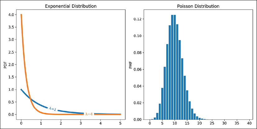
Figure 8.10: Two exponential distribution PDFs with different lambda values, and a Poisson distribution PMF
The scale argument in scipy is actually 1/lambda. As lambda increases, our average time between events decreases.
Related to the exponential distribution is the Poisson distribution. This is a discrete distribution, so has a PMF instead of PDF. We can plot a Poisson distribution PMF like so:
bar(range(40), scipy.stats.poisson.pmf(range(40), mu=10))
The results of this plot are shown in Figure 8.10 above. The Poisson distribution has a lambda parameter like the exponential (the mu argument in the scipy.stats.poisson() functions) and is a generalization of the exponential distribution. The Poisson distribution provides the probability that a number of events will happen within a characteristic time, lambda. This characteristic time is the average time between exponential distribution events occurring. So, if we get a call at a call center on average every 10 minutes, we can set our lambda value to 10 to describe this distribution.
Although scipy cannot fit data and extract distribution parameters for discrete probability distributions like the Poisson distribution, another package, statsmodels, has a module statsmodels.discrete.discrete_model that can do so.
The Poisson and exponential distributions show up in situations such as call centers, packets arriving at routers, or numbers of mutations on a strand of DNA per unit length, where we have events occurring in space or time with a characteristic frequency.
The Weibull distribution
The Weibull distribution is like an extension of the exponential distribution, where the characteristic time or space between events changes over time. This can be useful for time-to-failure analysis, like with hard drives. It also can be used with wind forecasting for wind speed distributions, which can be used for forecasting with the MISO energy data we examined in the previous chapter. There are two implementations of Weibull in scipy: the max and min versions. The max version is for x-values that are negative, and the min version is for positive values. We can plot the PDF like so:
x = np.linspace(0, 10, 100)
plt.plot(x, scipy.stats.weibull_min(c=3).pdf(x))
The main parameter is c, the shape parameter. There are also scale and loc arguments available. The scale argument changes the spread of the data while the loc argument changes where the distribution begins on the x-axis. The shape parameter, c, determines if the time-to-failure is decreasing over time (c<1), staying constant (c=1, the exponential distribution), or increasing over time (c>1).
The Zipfian distribution
The last distribution we'll touch on is the Zipfian distribution, which comes from Zipf's law. This can be used in text data to model the ranked frequency of words, and we'll learn more about it in Chapter 18, Working with Text. The distribution shows up in surprising places, like the ranking of cities by population from greatest to least and the distribution of company sizes. The distribution is available in scipy, and we can plot the PMF (it's a discrete distribution) like so:
x = range(1, 50)
plt.plot(x, scipy.stats.zipf(a=1.1).pmf(x), marker='.')
plt.xscale('log')
plt.yscale('log')
Since the distribution starts with rank 1 of a series of data, we start our range at 1. Then we provide the shape parameter a to the zipf() class and plot the PMF function. We use a log scale on both the x- and y-axis, since this distribution is best viewed that way. When using a log-log plot like this, the distribution makes a straight line.
This concludes our section on distributions, but there are many more. The scipy package has classes for many of the other distributions as well. However, we visited some of the more useful and common distributions we might encounter here. We already saw how we can sample from these distributions, but let's now look at sampling from raw data.


