
Managing data source metadata
Data sources in Tableau store information about the connection(s). In addition to the connection itself (for example, database server name, database, and/or filenames), the data source also contains information about all the fields available (such as field name, data type, default format, comments, and aliases). Often, this data about the data is referred to as metadata.
Right-clicking a field in the data pane reveals a menu of metadata options. Some of these options will be demonstrated in a later exercise; others will be explained throughout the book. These are some of the options available via right-clicking:
- Renaming the field
- Hiding the field
- Changing aliases for values of a non-date dimension
- Creating calculated fields, groups, sets, bins, or parameters
- Splitting the field
- Changing the default use of a date or numeric field to either discrete or continuous
- Redefining the field as a dimension or a measure
- Changing the data type of the field
- Assigning a geographic role to the field
- Changing defaults for how a field is displayed in a visualization, such as the default colors and shapes, number or date format, sort order (for dimensions), or type of aggregation (for measures)
- Adding a default comment for a field (which will be shown as a tooltip when hovering over a field in the data pane, or shown as part of the description when Describe... is selected from the menu)
- Adding or removing the field from a hierarchy
Metadata options that relate to the visual display of the field, such as default sort order or default number format, define the overall default for a field. However, you can override the defaults in any individual view by right-clicking the active field on the shelf and selecting the desired options.
To see how this works, use the filled map view of Profit by State that you created in the Connect to Google Sheets view. If you did not create this view, you may use the Orders and Returns data source, though the resulting view will be slightly different. With the filled map in front of you, follow these steps:
- Right-click the Profit field in the data pane and select Default Properties | Number Format.... The resulting dialog gives you many options for numeric format.
- Set the number format to Currency (Custom) with
0Decimal places and the Display Units inThousands (K). After clicking OK, you should notice that the labels on the map have updated to include currency notation:
Figure 2.19: Editing the default number format of a field
- Right-click the Profit field again and select Default properties | Color.... The resulting dialog gives you an option to select and customize the default color encoding of the Profit field. Experiment with various palettes and settings. Notice that every time you click the Apply button, the visualization updates.
Diverging palettes (palettes that blend from one color to another) work particularly well for fields such as Profit, which can have negative and positive values. The default center of 0 allows you to easily tell what values are positive or negative based on the color shown.
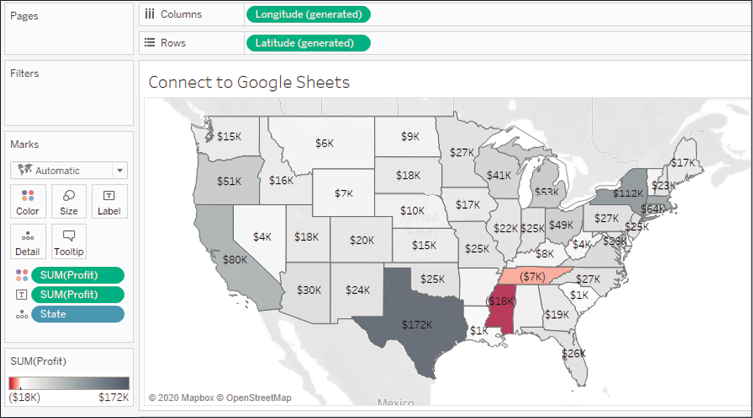
Figure 2.20: Customizing color
Because you have set the default format for the field at the data-source level, any additional views you create using Profit will include the default formatting you specified.
Consider using color blind-safe colors in your visualizations. Orange and blue are usually considered a color blind-safe alternative to red and green. Tableau also includes a discrete color blind-safe palette. Additionally, consider adjusting the intensity of the colors, using labels, or different visualizations to make your visualizations more accessible.