Styling pages and widgets
This section assumes a basic understanding of HTML and CSS styling.
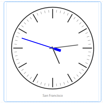
Congratulations, you've just built a functional custom homepage! It looks pretty good, but it feels a little unbalanced since the clocks are so big. Let's make them smaller.
To do this, we're going to change some of the grid size class names, and utilize the Page Specific CSS option for the portal. If you click on a clock widget, you'll see a thin blue line around it. If you look carefully, you'll also see not just one, but two dotted blue lined boxes drawn around it. These are the container borders. There are three containers there:

Select the container surrounding the clock. Once you've selected the correct element, you'll see the word Column at the top-right of the page next to the three icons:

Click on the edit icon in the top-right. Not the top-right of the clock widget, but the top-right of the page. You will see a field called CSS class, and select fields denoting size. Set the CSS class...


