Search icon CANCEL
Arrow left icon
Explore Products
Best Sellers
New Releases
Books
Videos
Audiobooks
Learning Hub
Conferences
Free Learning
Arrow right icon
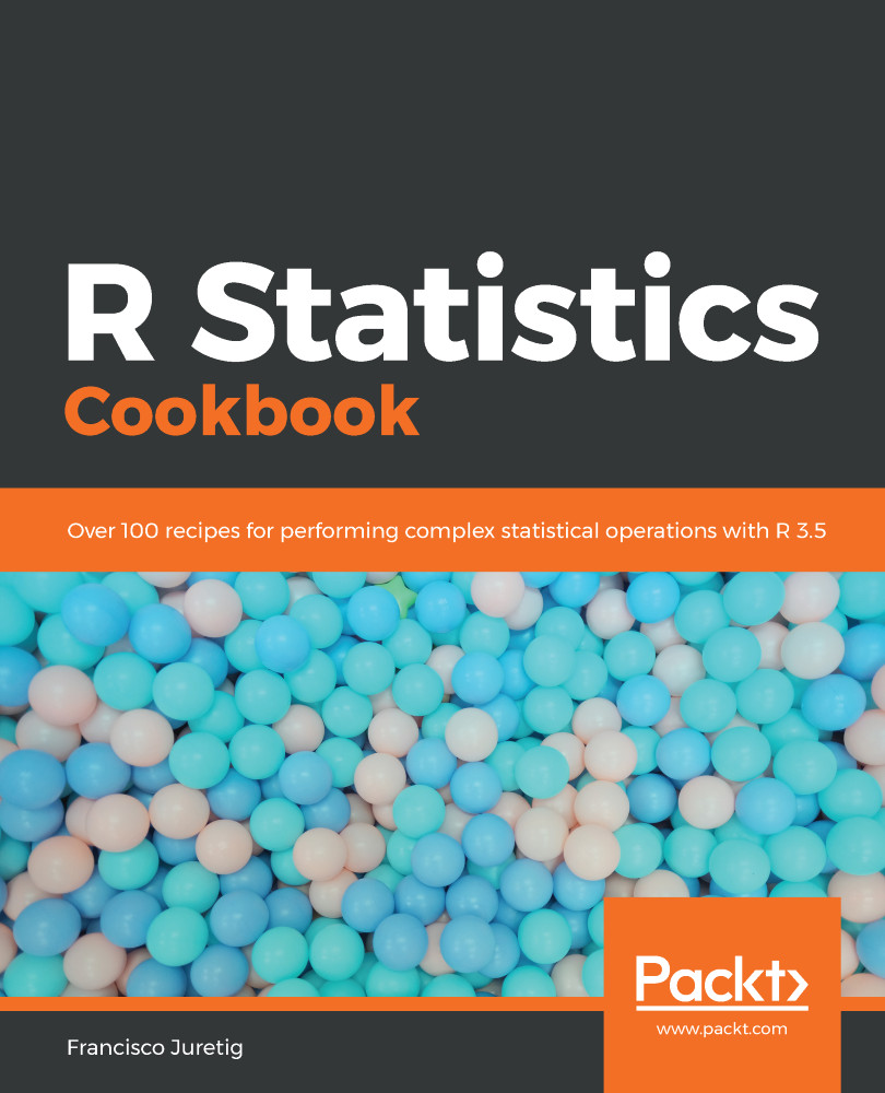
R Statistics Cookbook

R Statistics Cookbook: Over 100 recipes for performing complex statistical operations with R 3.5

eBook
$13.98 $19.99
Paperback
$26.99
Subscription
Free Trial
Renews at $19.99p/m

What do you get with eBook?

Product feature icon Instant access to your Digital eBook purchase
Product feature icon Download this book in EPUB and PDF formats
Product feature icon Access this title in our online reader with advanced features
Product feature icon DRM FREE - Read whenever, wherever and however you want
Product feature icon AI Assistant (beta) to help accelerate your learning
Table of content icon View table of contents Preview book icon Preview Book

R Statistics Cookbook

Getting Started with R and Statistics

In this chapter, we will cover the following recipes:

  • Maximum likelihood estimation
  • Calculation densities, quantiles, and CDFs
  • Creating barplots using ggplot
  • Generating random numbers from multiple distributions
  • Complex data processing with dplyr
  • 3D visualization with the plot3d package
  • Formatting tabular data with the formattable package
  • Simple random sampling
  • Creating plots via the DiagrammeR package
  • C++ in R via the Rcpp package
  • Interactive plots with the ggplot GUI package
  • Animations with the gganimate package
  • Using R6 classes
  • Modelling sequences with the TraMineR package
  • Clustering sequences with the TraMineR package
  • Displaying geographical data with the leaflet package

Introduction

In this chapter, we will introduce a wide array of topics regarding statistics and data analysis in R. We will use quite a diverse set of packages, most of which have been released over recent years.

We'll start by generating random numbers, fitting distributions to data, and using several packages to plot data. We will then move onto sampling, creating diagrams with the DiagrammeR package, and analyzing sequence data with the TraMineR package. We also present several techniques, not strictly related to statistics, but important for dealing with advanced methods in R—we introduce the Rcpp package (used for embedding highly efficient C++ code into your R scripts) and the R6 package (used for operating with R6 classes, allowing you to code using an object-oriented approach in R).

Technical requirements

We will use R and its packages, that can be installed via the install.packages() command, and we will indicate which ones are necessary for each recipe in the corresponding Getting ready section.

Maximum likelihood estimation

Suppose we observe a hundred roulette spins, and we get red 30 times and black 70 times. We can start by assuming that the probability of getting red is 0.5 (and black is obviously 0.5). This is certainly not a very good idea, because if that was the case, we should have seen nearly red 50 times and black 50 times, but we did not. It is thus evident that a more reasonable assumption would have been a probability of 0.3 for red (and thus 0.7 for black).

The principle of maximum likelihood establishes that, given the data, we can formulate a model and tweak its parameters to maximize the probability (likelihood) of having observed what we did observe. Additionally, maximum likelihood allows us to calculate the precision (standard error) of each estimated coefficient easily. They are obtained by finding the curvature of the log-likelihood with respect to each parameter; this is obtained by finding the second-order derivatives of the log-likelihood with respect to each parameter.

The likelihood is essentially a probability composed of the multiplication of several probabilities. Multiplying lots of probabilities is never a good idea, because if the probabilities are small, we would very likely end up with a very small number. If that number is too small, then the computer won't be able to represent it accurately. Therefore, what we end up using is the log-likelihood, which is the sum of the logarithms of those probabilities.

In many situations, we also want to know if the coefficients are statistically different from zero. Imagine we have a sample of growth rates for many companies for a particular year, and we want to use the average as an indicator of whether the economy is growing or not. In other words, we want to test whether the mean is equal to zero or not. We could fit that distribution of growth rates to a Gaussian distribution (which has two parameters, ), and test whether (estimated ) is statistically equal to zero. In a Gaussian distribution, the mean is . When doing hypothesis testing, we need to specify a null hypothesis and an alternative one. For this case, the null hypothesis is that this parameter is equal to zero. Intuition would tell us that if an estimated parameter is large, we can reject the null hypothesis. The problem is that we need to define what large is. This is why we don't use the estimated coefficients, but a statistic called the Z value—this is defined as the value that we observed divided by the standard error. It can be proven that these are distributed according to a Gaussian distribution.

So, once we have the Z value statistic, how can we reject or not reject the null hypothesis? Assuming that the null hypothesis is true (that the coefficient is equal to zero), we can compute the probability that we get a test statistic as large or larger than the one we got (these are known as p-values). Remember that we assume that the coefficients have fixed values, but we will observe random deviations from them in our samples (we actually have one sample). If the probability of finding them to be as large as the ones that we observed is small, assuming that the true ones are zero, then that implies that luck alone can't explain the coefficients that we got. The final conclusion in that case is to reject the null hypothesis and conclude that the coefficient is different from zero.

Getting ready

The bbmle package can be installed using the install.packages("bbmle") function in R.

How to do it...

In this exercise, we will generate a 1000 random gamma deviates with its two parameters set to shape=20 and rate=2. We will then estimate the two parameters by using the mle2 function in the bbmle package. This function will also return the Z values, and the p-values. Note that we need to assume a distribution that we will use to fit the parameters (in general we will receive data, and we will need to assume which distribution is reasonable). In this case, since we are generating the data, we already know that the data comes from a gamma distribution.

We will use the bbmle package, which will allow us to maximize the log-likelihood. This package essentially wraps an appropriate numerical maximization routine; we only need to pass a function that computes the sum of the log-likelihood across the whole dataset.

  1. Generate 1000 random gamma deviations with its parameters set to shape=20 and rate=2 as follows:
library(bbmle)
N <- 1000
xx <- rgamma(N, shape=20, rate=2)
  1. Pass a function that computes the sum of the log-likelihood across the whole dataset as follows:
LL <- function(shape, rate) {
R = suppressWarnings(dgamma(xx, shape=shape, rate=rate))
return(-sum(log(R)))
}
  1. Estimate the two parameters by using the mle2 function in the bbmle package as follows:
P_1000 = mle2(LL, start = list(shape = 1, rate=1))
summary(P_1000)

The estimated coefficients, standard errors, and p-values (N=10) are as follows:

Estimate Std. error Z value p-value
Shape 19.04 0.84 22.54 <2.2e-16***
Rate 1.89 0.08 22.68 <2.2e-16***

The standard errors are very small relative to the estimated coefficients, which is to be expected as we have a large sample (1,000 observations). The p-values are consequently extremely small (the asterisks mark that these values are smaller than 0.001). When the p-values are small we say that they are significative (choosing a threshold is somewhat debatable, but most people use 0.05—in this case, we would say that they are highly significative).

How it works...

The LL function wraps the log-likelihood computation, and is called by the mle2 function sequentially. This function will use a derivative-based algorithm to find the maximum of the log-likelihood.

There's more...

Within a maximum likelihood context, the standard errors depend on the number of observations—the more observations we have, the smaller the standard errors will be (greater precision). As we can see in the following results, we get standard errors that are almost 50% of the estimated coefficients:

N <- 10
x <- rgamma(N, shape=20,rate=2)
LL <- function(shape, rate) {
R = suppressWarnings(dgamma(x, shape=shape, rate=rate))
return(-sum(log(R)))
}

P_10 = mle2(LL, start = list(shape = 1, rate=1))
summary(P_10)

The estimated coefficients and standard errors (N=10) are as follows:

Estimate Std. error Z value p-value
Shape 13.76 6.08 2.24 0.02*
Rate 1.36 0.61 2.22 0.02*

The standard errors are much larger than before, almost 50% of their estimated coefficients. Consequently, the p-values are much larger than before, but still significative at the 0.05 level (which is why we get an asterisk). We still conclude that the coefficients are different from zero.

We can also compute confidence intervals using the confint function (in this case, we will use 95% intervals). These intervals can be inverted to get hypothesis tests. For example, we can test whether the shape is equal to 18 with a 95% confidence for our 1,000-sample example, by assessing if 18 is between the upper and lower boundaries; since 18 is between 17.30 and 20.59, we can't reject that the shape is equal to 18. Note that the confidence intervals are much tighter for the 1,000-sample case than for the 10-sample one. This is to be expected, as the precision depends on the sample size (we have already seen that the standard deviation for each estimated parameter depends on the sample size).

This is done via the following command:

confint(P_1000)
confint(P_10)

The confidence intervals are as follows:

Parameter Sample size 2.5% 97.5%
Shape 10 13.64 81.08
Shape 1,000 17.30 20.59
Rate 10 1.48 8.93
Rate 1,000 1.71 2.04

See also

Calculating densities, quantiles, and CDFs

R provides a vast number of functions for working with statistical distributions. These can be either discrete or continuous. Statistical functions are important, because in statistics we generally need to assume that the data is distributed to some distribution.

Let's assume we have an variable distributed according to a specific distribution. The density function is a function that maps every value in the domain in the distribution of the variable with a probability. The cumulative density function (CDF) returns the cumulative probability mass for each value of . The quantile function expects a probability (between 0 and 1) and returns the value of that has a probability mass of to the left. For most distributions, we can use specific R functions to calculate these. On the other hand, if we want to generate random numbers according to a distribution, we can use R's random number generators random number generators (RNGs).

Getting ready

No specific package is needed for this recipe.

How to do it...

In this recipe we will first generate some Gaussian numbers and then, using the pnorm() and qnorm() functions, we will calculate the area to the left and to the right of x=2, and get the 90th quantile to plot the density.

  1. Generate 10000 Gaussian random numbers:
vals = rnorm(10000,0,1)
  1. Plot the density and draw a red line at x=2:
plot(density(vals))
abline(v=2,col="red")
  1. Calculate the area to the left and to the right of x=2, using the pnorm() function and use the qnorm() quantile function to get the 97.7th quantile:
print(paste("Area to the left of x=2",pnorm(2,0,1)))
print(paste("Area to the right of x=2",1-pnorm(2,0,1)))
print(paste("90th Quantile: x value that has 97.72% to the left",qnorm(0.9772,0,1)))

After running the preceding code, we get the following output:

The following screenshot shows the density with a vertical line at 2:

How it works...

Most distributions in R have densities, cumulative densities, quantiles, and RNGs. They are generally called in R using the same approach (d for densities, q for quantiles, r for random numbers, and p for the cumulative density function) combined with the distribution name.

For example, qnorm returns the quantile function for a normal-Gaussian distribution, and qchisq returns the quantile function for the chi-squared distribution. pnorm returns the cumulative distribution function for a Gaussian distribution; pt returns it for a Student's t-distribution.

As can be seen in the diagram immediately previous, when we get the 97.7% quantile, we get 1.99, which coincides with the accumulated probability we get when we do pnorm() for x=2.

There's more...

We can use the same approach for other distributions. For example, we can get the area to the left of x=3 for a chi-squared distribution with 33 degrees of freedom:

print(paste("Area to the left of x=3",pchisq(3,33)))

After running the preceding code we get the following output:

Creating barplots using ggplot

The ggplot2 package has become the dominant R package for creating serious plots, mainly due to its beautiful aesthetics. The ggplot package allows the user to define the plots in a sequential (or additive) way, and this great syntax has contributed to its enormous success. As you would expect, this package can handle a wide variety of plots.

Getting ready

In order to run this example, you will need the ggplot2 and the reshape packages. Both can be installed using the install.packages() command.

How to do it...

In this example, we will use a dataset in a wide format (multiple columns for each record), and we will do the appropriate data manipulation in order to transform it into a long format. Finally, we will use the ggplot2 package to make a stacked plot with that transformed data. In particular, we have data for certain companies. The adjusted sales are sales where the taxes have been removed and the unadjusted sales are the raw sales. Naturally, the unadjusted sales will always be greater than the adjusted ones, as shown in the following table:

Company Adjusted sales Unadjusted sales
Company1 298 394
Company2 392 454
Company3 453 499
Company4 541 598
Company5 674 762
  1. Import the ggplot2 and reshape libraries as follows:
library(ggplot2)
library(reshape)
  1. Then load the dataset:
datag = read.csv("./ctgs.csv")
  1. Transform the data into a long format:
transformed_data = melt(datag,id.vars = "Company")
  1. Use the ggplot function to create the plot:
ggplot(transformed_data, aes(x = Company, y = value, fill = variable)) + geom_bar(stat = "identity")

This results in the following output:

How it works...

In order to build a stacked plot, we need to supply three arguments to the aes() function. The x variable is the x-axis, y is the bar height, and fill is the color. The geom_var variable specifies the type of bar that will be used. The stat=identity value tells ggplot that we don't want to apply any transformation, and leave the data as it is. We will use the reshape package for transforming the data into the format that we need.

The result has one bar for each company, with two colors. The red color corresponds to the Adjusted Sales and the green color corresponds to the Unadjusted Sales.

There's more...

We can change the position of the bars, and place them one next to the other, instead of stacking them up. This can be achieved by using the position=position_dodge() option as shown in the following code block:

ggplot(transformed_data, aes(x = Company, y = value, fill = variable)) + geom_bar(stat = "identity",position=position_dodge())

This results in the following output:

See also

Generating random numbers from multiple distributions

R includes routines to generate random numbers from many distributions. Different distributions require different algorithms to generate random numbers. In essence, all random number generation routines rely on a uniform random number generator that generates an output between (0,1), and then some procedure that transform this number according to the density that we need.

There are several ways of doing this, depending on which distribution we want to generate. A very simple one, which works for a large amount of cases is the inverse transformation method. The idea is to generate uniform random numbers, and find the corresponding quantile for the distribution that we want to sample from.

Getting ready

We need to install the ggplot2, and tidyr packages which can be installed via install.packages().

How to do it...

We will generate two samples of 10,000 random numbers, the first one via the rnorm function, and the second one using the inverse transformation method.

  1. Generate two samples of 10000 random numbers:
rnorm_result = data.frame(rnorm = rnorm(10000,0,1))
inverse_way = data.frame(inverse = qnorm(runif(10000),0,1))
  1. We concatenate the two datasets. Note that we are transposing it using the gather function. We need to transpose the data for plotting both histograms later via ggplot:
total_table = cbind(rnorm_result,inverse_way)
transp_table = gather(total_table)
colnames(transp_table) = c("method","value")
  1. We will then plot the histogram:
ggplot(transp_table, aes(x=value,fill=method)) + geom_density(alpha=0.25) 

How it works...

We are generating two samples, then joining them together and transposing them (from a wide format into a long format). For this, we use the gather function from the tidyr package. After that, we use the ggplot function to plot the two densities on the same plot. Evidently, both methods yield very similar distributions as seen in the following screenshot:

There's more...

The method can also be used to generate random numbers for discrete distributions as well. For example, we can generate random numbers according to a Poisson distribution with a value λ = 5. As you can see in the histogram, we are generating a very similar amount of counts for each possible value that the random variable can take:

rpois_result = data.frame(rpois = rpois(10000,5))
inverse_way = data.frame(inverse = qpois(runif(10000),5))
total_table = cbind(rpois_result,inverse_way)
transp_table = gather(total_table)
colnames(transp_table) = c("method","value")
ggplot(transp_table, aes(x=value,fill=method)) + geom_histogram(alpha=0.8,binwidth=1)

This yields the following overlaid histogram:

Complex data processing with dplyr

The plyr function has started a small revolution within the R community, due to its fantastic functions for data manipulation/wrangling. Its creators released an improved package, called dplyr, which is essentially a plyr on steroids: some of its machinery has been rebuilt via the Rcpp package (this allows the inclusion of C++ functions in R) achieving a much better performance.

The dplyr function is tightly connected to the maggrittr package, which allows us to use the %>% notation to chain operations one after the other. For instance, we could do something like sort %>% filter %>% summarize, wherein the output of each operation will be sent as an input for the next one. This becomes really powerful when writing a lot of code for data manipulation.

Getting ready

The dplyr package can be installed via install.packages() as usual.

How to do it...

We will use it to do data wrangling with the very famous mtcars dataset. This dataset contains several attributes (both numeric and categorical) for several car models. We will combine several of the dplyr functions to compute the mean horsepower and mean miles per gallon for each gear type. We will finally sort the result by the mean horsepower.

  1. Import the dplyr library:
library(dplyr)
  1. The main step is grouping the data by gear; we calculate the mean horsepower, and the sum of the miles per gallon by gear. We then destroy the group structure and we sort the results by mean horsepower using the following code block:
mtcars %>% group_by(am,gear) %>% summarise(mean_hp = mean(hp),sum_mpg = sum(mpg)) %>% ungroup %>% arrange(mean_hp)

How it works...

The beauty of the dplyr package is that it allows us to chain several operations together one after the other. This greatly reduces the complexity of our code, generating very simple and readable code. The ungroup statement is not strictly needed, but it destroys the grouped structure that we have had up to that point. In certain situations, this is necessary, because we might need to work on the ungrouped data after some grouping or summarizing is done.

There's more...

The dplyr function can be used to do dozens of interesting things, as it allows us to summarize, sort, group, compute ranks, arrange accumulators by group, and so on.

See also

3D visualization with the plot3d package

The plot3d package can be used to generate stunning 3-D plots in R. It can generate an interesting array of plots, but in this recipe we will focus on creating 3-D scatterplots. These arise in situations where we have three variables, and we want to plot the triplets of values on the x-y-z space.

We will generate a dataset containing random Gaussian numbers for three variables, and we will plot them into the same plot using the plot3d package.

Getting ready

This package can be installed in the usual way via install.packages("plot3D").

How to do it...

We will generate a dataset containing random gaussian numbers for three variables, and we will plot them into the same plot using the plot3d package.

  1. Import the plot3D library:
library(plot3D)
  1. Generate a dataset containing random Gaussian numbers for three variables:
x = rnorm(100)
y = rnorm(100)
z = x + y + rnorm(100,0,0.3)
idrow = 1:100
  1. Plot the variable in the same plot:
scatter3D(x, y, z, bty = "g", colkey = TRUE, main ="x-y-z plot",phi = 10,theta=50)
text3D(x, y, z, labels = idrow, add = TRUE, colkey = FALSE, cex = 0.5)

The following screenshot is the resulting 3D plot:

How it works...

The scatter3D function draws the scatterplot, and we have an interesting set of options for it. We can turn the color key on/off using the colkey parameter. phi and theta control the angles that will be used to show the plot. The color key is quite useful as it helps to highlight the observations that have higher Z values. This is useful because in 3-D plots it is sometimes difficult to understand a single image without rotating it. We are also using the text3D function to print the values for Z for each point. This step could certainly be omitted, but it is generally useful for isolating individual observations.

Formatting tabular data with the formattable package

The formattable package provides an excellent way of formatting tables, allowing us to change the color of each column, add icons, and add conditional formatting. This is extremely powerful compared to R's native table output capabilities.

Getting ready

In order to run this example, the formattable package needs to be installed using install.packages("formattable").

How to do it...

In this example, we will load a dataset from a .csv file, and we will apply different formatting to each column. More interestingly, we will apply conditional formatting to certain columns. This dataset will contain several fields, such as the career, the age, the salary, and whether the person has been contacted.

After that, we can use the table function to calculate the counts using two variables. We then use the same formattable package for coloring the frequencies in this table.

  1. Import the libraries:
library(expss)
library(formattable)
  1. Load the data and specify the format for each column. For the Person column, we do basic formatting (specifying the color and font weight), and for the Salary column, we use a color scale ranging between two different green colors. For the Contacted column, we define a conditional formatting (green or red) with an appropriate icon:
data = read.csv("/Users/admin/Documents/R_book/person_salary.csv", stringsAsFactors  = FALSE) 
Green = "#71CA97"
Green2 = "#DeF7E9"
table__out = data.frame(table(data$Career, data$Age))
colnames(table__out) = c("Career", "Age", "Freq")
formattable(table__out, align =c("c", "c", "c"), list("Freq"= color_tile(Green, Green2)))

This results in the following output:

How it works...

The formattable package requires a data frame to work. We then have lots of options for each column that we want to format. Before specifying the format for each column, we are setting the alignment for each column (in this case we want to center each column, using the c option for each one).

There's more...

This package is particularly interesting when calculating tables using the tables() function. For example, we might want to calculate the number of cases that we have for all the combinations of career and age, and then paint that column on a green color scale:

formattable(data,align =c("c","c","c","c"), list("Person" = formatter("span", style = ~ style(color = "grey",font.weight = "bold")), "Salary"= color_tile(Green, Green2), 
"Contacted" = formatter("span", style = x ~ style(color = ifelse(x, "green", "red")),
x ~ icontext(ifelse(x, "ok", "remove"), ifelse(x, "Yes", "No")))))

The following screenshot shows the output (the contacted column now contains ticks and crosses):

Simple random sampling

In many situations, we are interested in taking a sample of the data. There could be multiple reasons for doing this, but in most practical considerations this happens due to budget constraints. For example, what if we have a certain amount people in a neighborhood, and we want to estimate what proportion of them is supporting Candidates A or B in an election? Visiting each one of them would be prohibitively expensive, so we might decide to find a smaller subset that we can visit and ask them who they are going to vote for.

The sample function in R can be used to take a sample with or without the replacement of any arbitrary size. Once a sample is defined, we can sample those units. An interesting question is estimating the variability of that sample with respect to a given sample size. In order to do that, we will build a thousand replications of our sampling exercise, and we will get the upper and lower boundaries that enclose 95% of the cases. Nevertheless, we could also compute approximate confidence intervals for the proportion of people voting for Candidate A, using the well known Gaussian approximation to an estimated proportion.

When the sample size is not very small, the estimated proportion is distributed approximately as a Gaussian distribution:

This can be used to compute an approximate confidence interval, where we need to choose in order to achieve an interval of , as implemented in the following formula:

Both methods will be in agreement for reasonably large samples (>100), but will differ when the sample sizes are very small. Still, the method that uses the sample function can be used for more complex situations, such as cases when we use sample weights.

Getting ready

In order to run this exercise, we need to install the dplyr and the ggplot2 packages via the install.packages() function.

How to do it...

In this recipe, we have the number of people in a town, and whether they vote for Candidate A or Candidate B – these are flagged by 1s and 0s. We want to study the variability of several sample sizes, and ultimately we want to define which sample size is appropriate. Intuition would suggest that the error decreases nonlinearly as we increase the sample size: when the sample size is small, the error should decrease slowly as we increase the sample size. On the other hand, it should decrease quickly when the sample is large.

  1. Import the libraries:
library(dplyr)
library(ggplot2)
  1. Load the dataset:
voters_data = read.csv("./voters_.csv")
  1. Take 1,000 samples of size 10 and calculate the proportion of people voting for Candidate A:
proportions_10sample = c()
for (q in 2:1000){
sample_data = mean(sample(voters_data$Vote,10,replace = FALSE))
proportions_10sample = c(proportions_10sample,sample_data)
}
  1. Take 1,000 samples of size 50 and calculate the proportion of people voting for Candidate A:
proportions_50sample = c()
for (q in 2:1000){
sample_data = mean(sample(voters_data$Vote,50,replace = FALSE))
proportions_50sample = c(proportions_50sample,sample_data)
}
  1. Take 1,000 samples of size 100 and calculate the proportion of people voting for Candidate A:
proportions_100sample = c()
for (q in 2:1000){
sample_data = mean(sample(voters_data$Vote,100,replace = FALSE))
proportions_100sample = c(proportions_100sample,sample_data)
}

  1. Take 1,000 samples of size 500 and calculate the proportion of people voting for Candidate A:
proportions_500sample = c()
for (q in 2:1000){
sample_data = mean(sample(voters_data$Vote,500,replace = FALSE))
proportions_500sample = c(proportions_500sample,sample_data)
}
  1. We combine all the DataFrames, and calculate the 2.5% and 97.5% quantiles:
joined_data50 = data.frame("sample_size"=50,"mean"=mean(proportions_50sample), "q2.5"=quantile(proportions_50sample,0.025),"q97.5"=quantile(proportions_50sample,0.975))
joined_data10 = data.frame("sample_size"=10,"mean"=mean(proportions_10sample), "q2.5"=quantile(proportions_10sample,0.025),"q97.5"=quantile(proportions_10sample,0.975))
joined_data100 = data.frame("sample_size"=100,"mean"=mean(proportions_100sample), "q2.5"=quantile(proportions_100sample,0.025),"q97.5"=quantile(proportions_100sample,0.975))
joined_data500 = data.frame("sample_size"=500,"mean"=mean(proportions_500sample), "q2.5"=quantile(proportions_500sample,0.025),"q97.5"=quantile(proportions_500sample,0.975))
  1. After combining them, we use the Gaussian approximation to get the 2.5% and 97.5% quantiles. Note that we use 1.96, which is the associated 97.5% quantile (and -1.96 for the associated 2.5% quantile, due to the symmetry of the Gaussian distribution):
data_sim = rbind(joined_data10,joined_data50,joined_data100,joined_data500)
data_sim = data_sim %>% mutate(Nq2.5 = mean - 1.96*sqrt(mean*(1-mean)/sample_size),N97.5 = mean + 1.96*sqrt(mean*(1-mean)/sample_size))
data_sim$sample_size = as.factor(data_sim$sample_size)
  1. Plot the previous DataFrame using the ggplot function:
ggplot(data_sim, aes(x=sample_size, y=mean, group=1)) +
geom_point(aes(size=2), alpha=0.52) + theme(legend.position="none") +
geom_errorbar(width=.1, aes(ymin=q2.5, ymax=q97.5), colour="darkred") + labs(x="Sample Size",y= "Candidate A ratio", title="Candidate A ratio by sample size", subtitle="Proportion of people voting for candidate A, assuming 50-50 chance", caption="Circle is mean / Bands are 95% Confidence bands")

This provides the following result:

How it works...

We run several simulations, using different sample sizes. For each sample size, we take 1,000 samples and we get the mean, and 97.5% and 2.5% percentiles. We use them to construct a 95% confidence interval. It is evident that the greater the sample sizes are, the narrower these bands will be. We can see that when taking just 10 elements the bands are extremely wide, and they get narrower quite quickly when we jump to a larger sample size.

In the following table you can see why, when elections are tight (nearly 50% of voters choosing A), they are so difficult to predict. Since the election is won by whoever has the majority of the votes, and our confidence interval ranges from 0.45 to 0.55 (even when taking a sample size of 500 elements), we can't be certain of who the winner will be.

Take a look at the following results—95% intervals—left simulated ones; right Gaussian approximation:

sample_size mean 2.5% quantile (sampling) 97.5% quantile (sampling) Gaussian 2.5% quantile Gaussian 97.5%
10 0.507 0.20 0.80 0.19 0.81
50 0.504 0.38 0.64 0.36 0.64
100 0.505 0.41 0.60 0.40 0.60
500 0.505 0.45 0.55 0.46 0.54

Creating diagrams via the DiagrammeR package

The ggplot package greatly enhances R's plotting capabilities, but in some situations, this is not sufficient. In situations whenever we want to plot relationships between entities or elements, we need a different tool. Diagrams are well suited for this, but drawing them manually is very hard (since we need to draw each square or circle, plus the text, plus the relationships between the elements).

The DiagrammeR package allows us to create powerful diagrams, supporting the Graphviz syntax. Using it is actually simple. We will essentially define nodes, and we will then tell DiagrammeR how we want to connect those nodes. Of course, we can control the format of those diagrams (color, shapes, arrow types, themes, and so on).

Getting ready

In order to run this example, you need to install the DiagrammeR package using install.packages("DiagrammeR").

How to do it...

In this recipe, we will draw a diagram depicting a company structure. The company is split into three groups, and within each group we will draw the sales in blue and the market share in green.

  1. Import the library:
library('DiagrammeR')
  1. We define the diagram using Graphviz's dot syntax. Essentially, it needs three parts—the graph part controls the global elements of the diagram, the node part defines the nodes, and the edge part defines the edges:
grViz("
digraph dot {

graph [layout = dot]

node [shape = circle,
style = filled,
color = grey,
label = '']

node [fillcolor = white,fixedsize = true, width = 2]
a[label = 'Company A']

node [fillcolor = white]
b[label = 'IT+RD Consulting'] c[label = 'General Consulting'] d[label = 'Other Activities']

node [fillcolor = white]

edge [color = grey]
a -> {b c d}
b -> {e[label = '254';color=blue] f[label = '83%';color=green]}
c -> {k[label = '132';color=blue] l[label = '61%';color=green]}
d -> {q[label = '192';color=blue] r[label = '47%';color=green]}
}")

How it works...

Inside our diagram, we define two main objects, nodes and edges. We define two nodes, and we define multiple edges that specify how everything will be connected. For each element, we can define the label that will be shown, and the color. The label and color arguments are used to specify the text and color that will be displayed for each node.

We use the fixedsize and the width parameters to force the elements in the corresponding node to have the same size. Had we not, then the circles for those nodes would be of different sizes.

The grViz() function is used to build the Graphviz diagram, as shown in the following screenshot:

See also

C++ in R via the Rcpp package

The Rcpp package has become one of the most important packages for R. Essentially, it allows us to integrate C++ code into our R scripts seamlessly. The main advantage of this, is that we can achieve major efficiency gains, especially if our code needs to use lots of loops. A second advantage, is that C++ has a library called the standard template library (STL) that has very efficient containers (for example, vectors and linked lists) that are extremely fast and well suited for many programming tasks. Depending on the case, you could expect to see improvements anywhere from 2x to 50x. This is why many of the most widely used packages have been rewritten to leverage Rcpp. In Rcpp, we can code in C++ using the typical C++ syntax, but we also have specific containers that are well suited to store R-specific elements. For example, we can use the Rcpp::NumericVector or the Rcpp::DataFrame, which are certainly not native C++ variable types.

The traditional way of using Rcpp involves writing the code in C++ and sourcing it in R. Since Rcpp 0.8.3, we can also use the Rcpp sugar style, which is a different way of coding in C++. Rcpp sugar brings some elements of the high-level R syntax into C++, allowing us to achieve the same things with a much more concise syntax.

We can use Rcpp in two ways, using the functions in an inline way, or coding them in a separate script and sourcing it via sourcecpp(). The latter approach is slightly preferable as it clearly separates the C++ and R code into different files.

Getting ready

In order to run this code, Rcpp needs to be installed using install.packages ("Rcpp").

How to do it...

In this case, we will compare R against Rcpp (C++) for the following task. We will load a vector and a matrix. Our function will loop through each element of the vector, through each row, and through each row and column of that matrix, counting the number of instances where the elements of the matrix are greater than the ones in the vector.

  1. Save the C++ code into a file named rcpp_example.cpp and we will source it from an R script:
#include <Rcpp.h>
using namespace Rcpp;
// [[Rcpp::export]]
int bring_element (NumericVector rand_vector, NumericMatrix rand_matrix) {
Rcout << "Process starting" << std::endl;
int mcounter = 0;
for (int q = 0; q < rand_vector.size();q++){
for (int x = 0; x < rand_matrix.rows();x++){
for (int y = 0; y < rand_matrix.cols();y++){
double v1 = rand_matrix.at(x,y);
double v2 = rand_vector[q];
if ( v1 < v2){
mcounter++;
}
}
}
}
Rcout << "Process ended" << std::endl;
return mcounter;
}
  1. In the corresponding R script, we need the following code:
library(Rcpp)
sourceCpp("./rcpp_example.cpp")
Rfunc <- function(rand__vector,rand_matrix){
mcounter = 0
for (q in 1:length(rand__vector)){
for (x in 1:dim(rand_matrix)[1]){
for (y in 1:dim(rand_matrix)[2]){
v1 = rand_matrix[x,y];
v2 = rand__vector[q];
if ( v1 < v2){
mcounter = mcounter+1
}
}
}
}
return (mcounter)
}
  1. Generate a vector and a matrix of random Gaussian numbers:
some__matrix = replicate(500, rnorm(20))
some__vector = rnorm(100)
  1. Save the starting and end times for the Rcpp function, and subtract the starting time from the end time:
start_time <- Sys.time()
bring_element(some__vector,some__matrix)
end_time <- Sys.time()
print(end_time - start_time)
  1. Do the same as we did in the previous step, but for the R function:
start_time <- Sys.time()
Rfunc(some__vector,some__matrix)
end_time <- Sys.time()
print(end_time - start_time)

The C++ function takes 0.10 seconds to complete, whereas the R one takes 0.21 seconds. This is to be expected, as R loops are generally slow, but they are extremely fast in C++:

How it works...

The sourcecpp function loads the C++ or Rcpp code from an external script and compiles it. In this C++ file, we first include the Rcpp headers that will allow us to add R functionality to our C++ script. We use using namespace Rcpp to tell the compiler that we want to work with that namespace (so we avoid the need to type Rcpp:: when using Rcpp functionality). The Rcpp::export declaration tells the compiler that we want to export this function to R.

Our bring_element function will return an integer (so that is why we have an int in its declaration). The arguments will be NumericVector and NumericMatrix, which are not C++ native variable types but Rcpp ones. These allow us to use vectors and matrices that operate with numbers without needing to declare explicitly if we will be working with integers, large integers, or float numbers. The Rcout function allows us to print output from C++ to the R console. We then loop through the columns and rows from the vector and the matrix, using standard C++ syntax. What is not standard here is the way we can get the number of columns and rows in these elements (using .rows() and .cols()), since these attributes are available through Rcpp. The R code is quite straightforward, and we then run it using a standard timer.

See also

The homepage for Rcpp is hosted at http://www.rcpp.org.

Rcpp is deeply connected to the Armadillo library (used for very high-performance algebra). This allows us to include this excellent library in our Rcpp projects.

The Rinside package (http://dirk.eddelbuettel.com/code/rinside.html), built by the creators of Rcpp, allows us to embed R code easily inside our C++ projects. These C++ projects can be compiled and run without requiring R. The implications of the Rinside package are enormous, since we can code highly performant statistical applications in C++ that we can distribute as standalone executable programs.

Interactive plots with the ggplot GUI package

The ggplot GUI package is excellent for making quick plots using the ggplot package, using a drag-and-drop approach. It will allow us to export the plots easily, and it will generate the corresponding ggplot code that creates the plots. It uses the excellent Shiny package to create a fully interactive approach for creating plots.

Most interestingly, the package has several different types of plots such as violin plots, histograms, scatterplots, and many more.

Getting ready

In order to install this package, we can use the install.packages("ggplotgui") command.

How to do it...

In this example, we will first create a histogram for the miles per gallon of vehicles from a dataset, and then produce a scatterplot showing the relationship between the miles per gallon and the horsepower of those vehicles.

  1. We call the ggplot_shiny() function with an argument specifying that we want to work with the mtcars dataset:
library("ggplotgui")
ggplot_shiny(mtcars)

The following screenshot shows the ggplot GUI interface :

  1. Doing a scatterplot is equally simple—we need to just choose the Scatter option and then the X-variables and Y-variables. We could also choose a grouping variable if we wanted to incorporate an extra dimension into this plot:

How it works...

This function will launch an interactive interface that we can use very easily. We just select the variables, the type of plot, and the format that we want. Finally, we can save the output as an image. The R code tab can be used to obtain the corresponding R code.

There's more...

We can do this instead, and we will be able to use a drag-and-drop approach to load datasets, instead of passing one as an argument:

ggplot_shiny()

Animations with the gganimate package

The ggplot package is great for creating static plots, but it can't handle animations. These are used when we have data indexed by time, and we want to show an evolution of that data. The gganimate package is designed following a similar logic, but for animations. It will construct plots for every time period and it will then interpolate between the frames in order to construct a smooth animation. This animation can also be exported as a GIF, then embedded later on any website or in any report.

Getting ready

The gganimate package is not yet available on the Comprehensive R Archive Network (CRAN), so it needs to be downloaded from GitHub. In order to do that, we need the devtools package. It can be installed in the usual way and after that is done, we can call install_github to get the package from GitHub. In order to use this function, we need the devtools package.

How to do it...

In this exercise, we have sales and profits for several companies across multiple years. We want to create a scatterplot (which shows pairs of values between sales and profit) animated through time.

  1. Start by installing the library:
install.packages('devtools')
devtools::install_github('thomasp85/gganimate')
  1. Load the necessary libraries:
# Load required package
library(gapminder)
library(ggplot2)
library(gganimate)
# Basic scatter plot

  1. Load the data and set the colors that will be used later:
data = read.csv("./companies.csv",stringsAsFactors = FALSE)
colors = c("A"="#AB5406","B"="#EC9936","C"="#BE1826","D"="#9B4A06","E"="#FDD6A2","F"="#9ACD62")
  1. Execute the ggplot function. Note that labs(), transition_time(), and ease_aes() are specific to the gganimate function, and are not ggplot elements:
p = ggplot(data, aes(Sales, Profit, size = Profit,colour=Company)) +
geom_point(alpha = 0.7, show.legend = FALSE) +
scale_colour_manual(values = colors) +
scale_size(range = c(2, 12)) +
labs(title = 'Year: {frame_time}', x = 'GDP per capita', y = 'life expectancy') +
transition_time(Year) +
ease_aes('linear')
  1. Animate, and save the output into a .gif file:
animate(p, nframes = 48, renderer = gifski_renderer("./gganim.gif"))

Here, we pick just two frames at random out of the total of 48:

How it works...

The core of our script is the animate function, which will make repeated calls to the ggplot part, which is included in p. The ggplot function is just creating a regular scatterplot, and most of the code there defines the formatting and colors that we want. The only different part from a regular ggplot statement are these two parts: transition_time(Year) and ease_aes("linear"). The former specifies the variable that indicates the time steps, while the latter specifies the type of interpolation used to generate all the frames that we need. The animate function will make repeated calls to this, for purposes such as changing the year and using a linear interpolation.

See also

Using R6 classes

Object-oriented programming allows us to organize our code in classes, encapsulating similar functionality together, and also allowing us clearly to separate internal from external methods. For example, we can design a class that has a method for reading data from a file, another method for removing outliers, and another one for selecting a subset of the columns. We can decide to keep all of these methods as public, meaning that we can access them from outside the class definition.

R supports object-oriented programming via S3 and S4 classes. The R6Class package, allows us to use R6 classes. These allow us to define our own classes in R in a very easy way. They also support inheritance, meaning that we can define a parent class and several derived classes that inherit from it. This implies that the derived classes can access all the methods and attributes from the parent class.

The central advantage of using inheritance is its simplification of the code (thus avoiding the duplication of functions). Also, using inheritance generates a structure in our code (where classes are connected via base/parent classes), which makes our code easier to read.

Getting ready

In order to run this example, we need to install the R6 package. It can be installed using install.packages("R6")

How to do it...

We will load data from a .csv file containing records customers, and we will instantiate a new class instance for each record. These records will be added to a list.

  1. Import the R6 library:
library(R6)
  1. Load the data from a .csv file:
customers = read.csv("./Customers_data.csv")
  1. We will now begin defining the R6Class structure. Note that we have two lists, one for the public attributes or methods, and another one for the private (these methods or attributes can only be accessed by other methods from this class). The initialize method is called whenever we create a new instance of this class. Note that we refer to the internal elements from this class using the self$ notation:
Customer = R6Class(public=list(Customer_id = NULL,Name = NULL,City = NULL,
initialize = function(customer_id,name,city,Missing_product,Missing_since){
self$Customer_id <- customer_id
self$Name <- name
self$City <- city
},
is_city_in_america = function(){
return (upper_(self$City) %in% c("NEW YORK","LONDON","MIAMI","BARCELONA"))
},
full_print = function(){
print("------------------------------------")
print(paste("Customer name ->",self$Name))
print(paste("Customer city ->",self$City))
print("------------------------------------")
}
),private=list(
upper_ = function(x){
return (toupper(x))
}
))
  1. We loop through our DataFrame and create a new Customer instance, passing three arguments. These are passed to the initialize method that we defined previously:
list_of_customers = list()
for (row in 1:nrow(customers)){
row_read = customers[row,]
customer = Customer$new(row_read$Customer_id,row_read$Name,row_read$City)
list_of_customers[[row]] <- (customer)
}
  1. We call our print method:
list_of_customers[[1]]$full_print()

The following screenshot prints the customer name and city:

How it works...

Let's assume we want to process clients' data from a CSV file. The R6 classes support public and private components. Each one of them will be defined as a list containing both methods or attributes. For example, we will store the customer_id, the name, and the city as public attributes. We need to initialize them to NULL. We also need an initialize method that will be called whenever the class is instantiated. This is the equivalent of a constructor in other programming languages. Inside the initializer or constructor, we typically want to store the variables provided by the user. We need to use the self keyword to refer to the class variables. We then define a method that will return either TRUE or FALSE if the city belongs is in America or not. Another method, called full_print(), will print the contents of the class.

The lock_objects method is not usually very important; it indicates whether we want to lock the elements in the class. If we set lock=FALSE, that means that we can add more attributes later, if we want to.

Here, we only have one private method. Since it is private, it can only be called within the class, but not externally. This method, called upper_, will be used to transform the text into uppercase.

After the class is defined, we loop through the DataFrame and select each row sequentially. We instantiate the class for each row, and then we add each one of these into a list.

The convenience of using classes is that we now have a list containing each instance. We can call the specific methods or attributes for each element in this list. For example, we can get a specific element and then call the is_city_in_america method; and finally we call the full_print method.

There's more...

The R6 package also supports inheritance, meaning that we can define a base class (that will act as a parent), and a derived class (that will act as a child). The derived class will be able to access all the methods and attributes defined in the parent class, reducing code duplication, and simplifying its maintainability. In this example, we will create a derived class called Customer_missprod, which will store data for clients who haven't yet received a product they were expecting. Note that the way we achieve this is by using the inherit parameter.

Note that we are overriding the full_print method, and we are printing some extra variables. It is important to understand the difference between the super and self methods—the former is used to refer to attributes or methods present in the base class. We evidently need to override the constructor (already defined in the base class) because we have more variables now:

library(R6)
customers = read.csv("./Customers_data_missing_products.csv")
Customer_missprod = R6Class(inherit = Customer,
public=list(Missing_prod = NULL,Missing_since = NULL,
initialize = function(customer_id,name,city,Missing_product,Missing_since){
super$Customer_id <- customer_id
super$Name <- name
super$City <- city
self$Missing_prod <- Missing_product
self$Missing_since <- Missing_since
},
full_print = function(){
print("------------------------------------")
print(paste("Customer name ->",super$Name))
print(paste("Customer city ->",super$City))
print(paste("Missing prod ->",self$Missing_prod))
print(paste("Missing since ->",self$Missing_since))
print("------------------------------------")
}
)
)

list_of_customers = list()
for (row in 1:nrow(customers)){
row_read = customers[row,]
customer = Customer_missprod$new(row_read$Customer_id,row_read$Name,row_read$City,row_read$Missing_product,row_read$Missing_since)
list_of_customers[[row]] <- (customer)
}

list_of_customers[[1]]$full_print()

Take a look at the following screenshot:

Modeling sequences with the TraMineR package

The TraMineR package allows us to work with categorical sequences, to characterize them, and to plot them in very useful ways. These sequences arise in a multiplicity of situations, such as describing professional careers: university→Company A→unemployed→Company B, or for example when describing what some clients are doing—opening account→buying→closing account.

In order to work with this package, we typically want one record per unit or person. We should have multiple columns—one for each time step. For each time step, we should have a label that indicates to which category that unit or person belongs to, at that particular time. In general, we are interested in doing some of the following—plotting the frequency of units at each category for each time step, analyzing how homogeneous the data is for each time step, and finding representative sequences. We will generally be interested in carrying these analyses by certain cohorts.

Getting ready

The TraMineR package can be installed via install.packages("TraMineR") function.

How to do it...

In this example, we will use the TraMineR package to analyze data from a club membership. The clients can choose from three membership levels/tiers—L1 (cheap membership), L2 (general membership), or L3 (VIP membership), and they can obviously cancel their membership. We want to characterize these levels further by age and sex tiers. We have four cohorts defined by the intersection between two age groups (18-25 and 26-45) and sex (F or M).

This club offers a discount after 12 weeks, in order to entice clients to jump into either the L2 or L3 membership (which are obviously more premium, and thus more expensive). We should expect to see the majority of customers on the L1 membership initially, and then observe them jumping to L2 or L3.

  1. Import the library:
library(TraMineR)
  1. Load the data and set the labels and the short labels for the plots:
datax       <- read.csv("./data__model.csv",stringsAsFactors = FALSE)
mvad.labels <- c("CLOSED","L1", "L2", "L3")
mvad.scode <- c("CLD","L1", "L2", "L3")
mvad.seq <- seqdef(datax, 3:22, states = mvad.scode,labels = mvad.labels)
group__ <- paste0(datax$Sex,"-",datax$Age)
  1. The seqfplot function can be used to plot the most frequent sequences:
seqfplot(mvad.seq, with.legend = T, border = NA, title = "Sequence frequency plot")

This results in the following output:

How it works...

These plots represent the most typical sequences for each cohort. We have one color for each class (level). The height represents the proportion of cases. The number of the upper-left part indicates the proportion of the data represented in this plot.

As we can see, there are obvious patterns by age group-sex combination. Let's direct our attention towards the ones in the lower part (male plots). Evidently, the majority of them stay in the Level-1 group forever (lower tall bars); a substantial amount spend most of their time in Level 1, although they sometimes switch to either group L2 (orange) or close their accounts (green). Clearly, the 18-25 age range is much more stable and less prone to jumping into other memberships. Indirectly, we could conclude that most of them are quite happy with L1 membership.

We could extend the same analysis for the females, although it is quite interesting that the ones from 18-25 are quite prone to closing their accounts in the first 2-3 weeks. Interestingly, the females in the 26-45 grouping are more prone to enrolling directly in the L2 or L3 memberships, which is quite a distinctive characteristic of this cohort.

In general, we observe that clients enrolled in L1 are more likely to cancel their subscriptions than those in L2 or L3. This makes sense, as clients paying more (L2 or L3) should be, in principle, more happy with the club.

There's more...

The TraMineR package allows us to plot histograms for the sequences. The interpretation is analogous to a regular histogram, with the obvious difference that the histogram is indexed by time:

seqdplot(mvad.seq, with.legend = T,group=group__, border = NA, title = "State distribution plot")

The following screenshot shows the TraMineR histograms:

For every case, L1 is the most frequent tier, maybe except for females F-26-45. In this case, L3 and L2 are quite important. It seems that for both groups between 18 and 25, there are no clients moving to groups L2/L3 until Week 10, and even when they do, they don't seem to stay much time in either one compared to both groups in the 26-45 range. We can also confirm that females F-18-25 are generally more likely to close their accounts.

Clustering sequences with the TraMineR package

When dealing with sequences of events it might even be more interesting to find clusters of sequences. This will always be necessary as the number of possible sequences will be very large.

Getting ready

In order to run this example, you will need to install the TraMineR package with the install.packages("TraMineR") command.

How to do it...

We will reuse the same example from the previous recipe, and we will find the most representative clusters.

  1. Import the library:
library(TraMineR)
  1. This step is exactly the same as we did for the previous exercise. We are just assigning the labels and the short labels for each sequence:
datax <- read.csv("./data__model.csv",stringsAsFactors = FALSE)
mvad.labels <- c("CLOSED","L1", "L2", "L3")
mvad.scode <- c("CLD","L1", "L2", "L3")
mvad.seq <- seqdef(datax, 3:22, states = mvad.scode,labels = mvad.labels)
group__ <- paste0(datax$Sex,"-",datax$Age)
  1. Calculate the clusters:
dist.om1 <- seqdist(mvad.seq, method = "OM", indel = 1, sm = "TRATE")
library(cluster)
clusterward1 <- agnes(dist.om1, diss = TRUE, method = "ward")
plot(clusterward1, which.plot = 2)
cl1.4 <- cutree(clusterward1, k = 4)
cl1.4fac <- factor(cl1.4, labels = paste("Type", 1:4))
seqrplot(mvad.seq, diss = dist.om1, group = cl1.4fac,border = NA)

The following screenshot shows the clusters using TraMiner:

How it works...

This algorithm finds representative clusters for our dataset. Note that here, we don't want to do this by cohort (if we wanted to, we would first need to subset the data). The horizontal bars reflect the clusters, and the A-B parts on top are used to calculate the discrepancies between the data and the cluster.

Type 1 and Type 3 refer to sequences starting at L1, then moving to L2 at around Week 9, and then remaining for either a few weeks or for many weeks. Both are quite homogeneous, reflecting that the sequences don't diverge much with respect to the representative ones.

Type 2 relates to sequences starting at L1, and then those accounts closing almost immediately. Here, the mean differences with respect to that sequence are even smaller, which is to be expected: once an account is closed, it is not reopened, so we should expect closed accounts to be quite homogeneous.

Type 4 is interesting. It reflects that after opening an L1 account, those clients jump directly to L3. We have two bars, which reflects that the algorithm is finding two large groups—people jumping to L3 in Week 9, and people jumping to L3 in Week 4.

There's more...

Entropy is a measure of how much disorder exists within a system (its interpretation is similar to entropy in physics). We will calculate it by cohort:

seqHtplot(mvad.seq,group=group__, title = "Entropy index")

The following screenshot shows the entropy for each group/week:

Evidently, the entropy should be low at the beginning as most people are enrolled at L1. We should expect it to go up dramatically after Weeks 7-10, since this company is offering a discount at around that stage, so people might then jump into L2 or L3.

Displaying geographical data with the leaflet package

The leaflet package is the de facto package for creating interactive maps in R. Part of its success is due to the fact that it works really well in conjunction with Shiny. Shiny is used to create interactive web interfaces in R, that can be accessed from any browser.

Getting ready

In order to run this recipe, you need to install the leaflet and dplyr packages using the install.packages() command.

How to do it...

On November 15, 2017, a submarine from the Argentine Navy was lost in the South Atlantic Ocean along with its crew. It is suspected that a catastrophic accident occurred, that caused an explosion and later an implosion. The submarine departed from Ushuaia (South Argentina) and was expected to arrive at its headquarters in Mar del Plata (Central Argentina) navigating on a south-north trajectory. Its last contact was recorded circa -46.7333, -60.133 (when around 50% of its route had been covered), and a sound anomaly was later detected by hydrophones and triangulated at -46.12, -59.69. This anomaly happened a few hours after the submarine's last contact, and was consistent with an explosion. In November 2018, the submarine was found using several remotely operated underwater vehicles (ROVs) very near to the sound anomaly's position at around 900 meters depth.

In this recipe, we will first plot a line connecting its departure and destination ports. We will then add two markers—one for its last known position, and another one for the sound anomaly position. We will finally add a circle around this anomaly's position, indicating the area where most of the search efforts were concentrated.

  1. Load the libraries:
library(dplyr)
library(leaflet)
  1. We use two DataFrames—one for the line, and another one for the markers:
line = data.frame(lat = c(-54.777255,-38.038561),long=c(-64.936853,-57.529756),mag="start")
sub_data = data.frame(lat = c(-54.777255,-38.038561,-46.12,-46.73333333333333),long=c(-64.936853,-57.529756,-59.69,-60.13333333333333),mag=c("start","end","sound anomaly","last known position"))
area_search = data.frame(lat=-46.12,long=-59.69)
  1. Plot the map with the line, the markers, and also a circle:
leaflet(data = sub_data) %>% addTiles() %>%
addMarkers(~long, ~lat, popup = ~as.character(mag), label = ~as.character(mag)) %>%
addPolylines(data = line, lng = ~long, lat = ~lat) %>% addCircles(lng = -59.69, lat = -46.12, weight = 1,radius = 120000)

The following screenshot shows the map and trajectory:

How it works...

The leaflet package renders the map, along with the markers that we are passing through the sub_data DataFrame. The line is drawn using the addPolylines function. And the circle is drawn using the addCircles function.

Left arrow icon Right arrow icon
Download code icon Download Code

Key benefits

  • Learn how to apply statistical methods to your everyday research with handy recipes
  • Foster your analytical skills and interpret research across industries and business verticals
  • Perform t-tests, chi-squared tests, and regression analysis using modern statistical techniques

Description

R is a popular programming language for developing statistical software. This book will be a useful guide to solving common and not-so-common challenges in statistics. With this book, you'll be equipped to confidently perform essential statistical procedures across your organization with the help of cutting-edge statistical tools. You'll start by implementing data modeling, data analysis, and machine learning to solve real-world problems. You'll then understand how to work with nonparametric methods, mixed effects models, and hidden Markov models. This book contains recipes that will guide you in performing univariate and multivariate hypothesis tests, several regression techniques, and using robust techniques to minimize the impact of outliers in data.You'll also learn how to use the caret package for performing machine learning in R. Furthermore, this book will help you understand how to interpret charts and plots to get insights for better decision making. By the end of this book, you will be able to apply your skills to statistical computations using R 3.5. You will also become well-versed with a wide array of statistical techniques in R that are extensively used in the data science industry.

Who is this book for?

If you are a quantitative researcher, statistician, data analyst, or data scientist looking to tackle various challenges in statistics, this book is what you need! Proficiency in R programming and basic knowledge of linear algebra is necessary to follow along the recipes covered in this book.

What you will learn

  • Become well versed with recipes that will help you interpret plots with R
  • Formulate advanced statistical models in R to understand its concepts
  • Perform Bayesian regression to predict models and input missing data
  • Use time series analysis for modelling and forecasting temporal data
  • Implement a range of regression techniques for efficient data modelling
  • Get to grips with robust statistics and hidden Markov models
  • Explore ANOVA (Analysis of Variance) and perform hypothesis testing

Product Details

Country selected
Publication date, Length, Edition, Language, ISBN-13
Publication date : Mar 29, 2019
Length: 448 pages
Edition : 1st
Language : English
ISBN-13 : 9781789802924
Category :
Languages :
Concepts :
Tools :

What do you get with eBook?

Product feature icon Instant access to your Digital eBook purchase
Product feature icon Download this book in EPUB and PDF formats
Product feature icon Access this title in our online reader with advanced features
Product feature icon DRM FREE - Read whenever, wherever and however you want
Product feature icon AI Assistant (beta) to help accelerate your learning

Product Details

Publication date : Mar 29, 2019
Length: 448 pages
Edition : 1st
Language : English
ISBN-13 : 9781789802924
Category :
Languages :
Concepts :
Tools :

Packt Subscriptions

See our plans and pricing
Modal Close icon
$19.99 billed monthly
Feature tick icon Unlimited access to Packt's library of 7,000+ practical books and videos
Feature tick icon Constantly refreshed with 50+ new titles a month
Feature tick icon Exclusive Early access to books as they're written
Feature tick icon Solve problems while you work with advanced search and reference features
Feature tick icon Offline reading on the mobile app
Feature tick icon Simple pricing, no contract
$199.99 billed annually
Feature tick icon Unlimited access to Packt's library of 7,000+ practical books and videos
Feature tick icon Constantly refreshed with 50+ new titles a month
Feature tick icon Exclusive Early access to books as they're written
Feature tick icon Solve problems while you work with advanced search and reference features
Feature tick icon Offline reading on the mobile app
Feature tick icon Choose a DRM-free eBook or Video every month to keep
Feature tick icon PLUS own as many other DRM-free eBooks or Videos as you like for just $5 each
Feature tick icon Exclusive print discounts
$279.99 billed in 18 months
Feature tick icon Unlimited access to Packt's library of 7,000+ practical books and videos
Feature tick icon Constantly refreshed with 50+ new titles a month
Feature tick icon Exclusive Early access to books as they're written
Feature tick icon Solve problems while you work with advanced search and reference features
Feature tick icon Offline reading on the mobile app
Feature tick icon Choose a DRM-free eBook or Video every month to keep
Feature tick icon PLUS own as many other DRM-free eBooks or Videos as you like for just $5 each
Feature tick icon Exclusive print discounts

Frequently bought together


Stars icon
Total $ 103.97
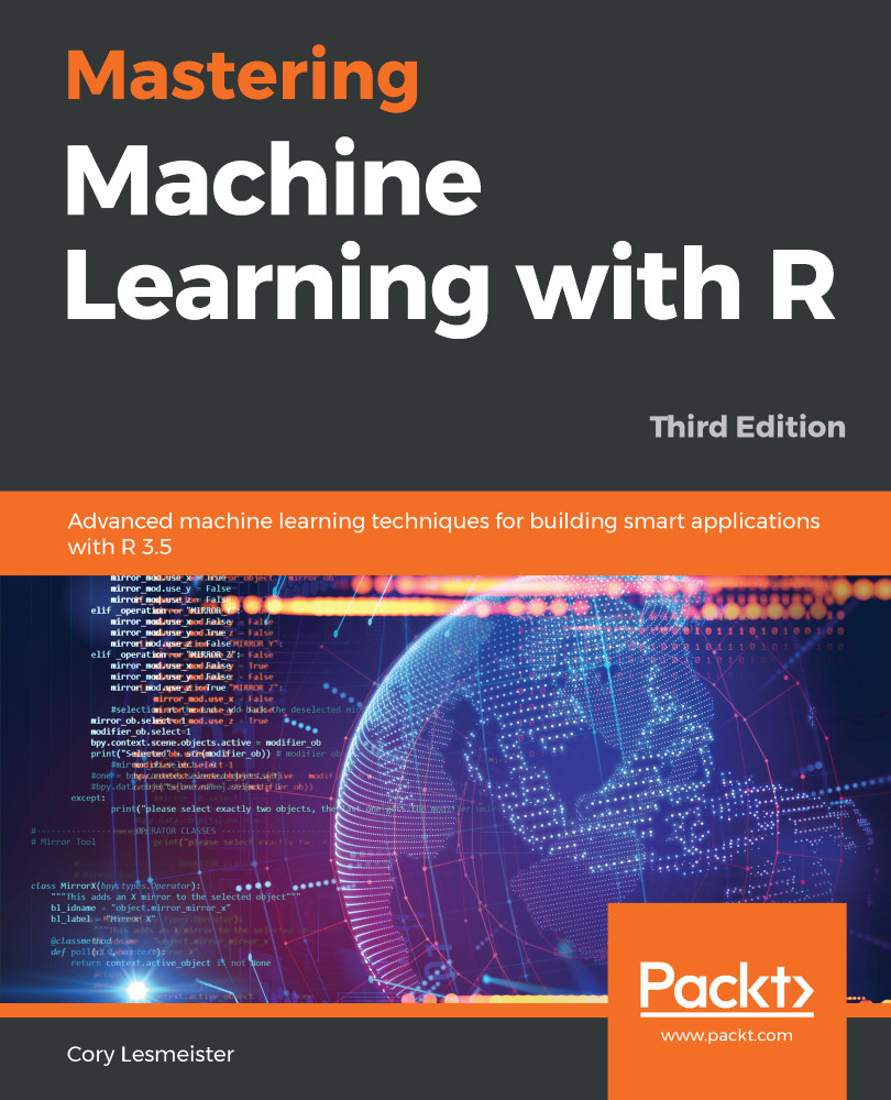
Mastering Machine Learning with R
$43.99
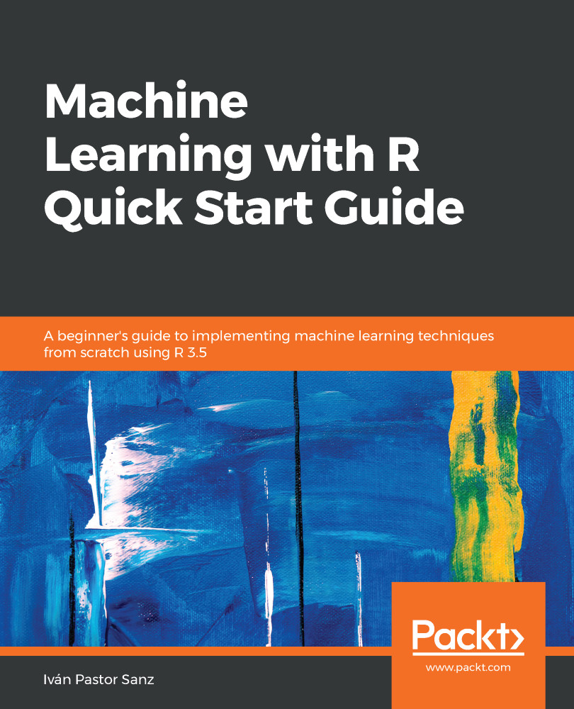
Machine Learning with R Quick Start Guide
$32.99
R Statistics Cookbook
$26.99
Total $ 103.97 Stars icon

Table of Contents

11 Chapters
Getting Started with R and Statistics Chevron down icon Chevron up icon
Univariate and Multivariate Tests for Equality of Means Chevron down icon Chevron up icon
Linear Regression Chevron down icon Chevron up icon
Bayesian Regression Chevron down icon Chevron up icon
Nonparametric Methods Chevron down icon Chevron up icon
Robust Methods Chevron down icon Chevron up icon
Time Series Analysis Chevron down icon Chevron up icon
Mixed Effects Models Chevron down icon Chevron up icon
Predictive Models Using the Caret Package Chevron down icon Chevron up icon
Bayesian Networks and Hidden Markov Models Chevron down icon Chevron up icon
Other Books You May Enjoy Chevron down icon Chevron up icon

Customer reviews

Rating distribution
Full star icon Full star icon Full star icon Half star icon Empty star icon 3.6
(5 Ratings)
5 star 40%
4 star 20%
3 star 20%
2 star 0%
1 star 20%
Leo Jul 02, 2023
Full star icon Full star icon Full star icon Full star icon Full star icon 5
Lots of examples provided.
Amazon Verified review Amazon
mark david walker Nov 04, 2020
Full star icon Full star icon Full star icon Full star icon Full star icon 5
A good guide to a range of statistical techniques in R. Recommend for someone wishing to deepen an introductory knowledge of R.
Amazon Verified review Amazon
Amazon Customer May 06, 2019
Full star icon Full star icon Full star icon Full star icon Empty star icon 4
understanding R with the help of algorithms
Amazon Verified review Amazon
Neha Oct 16, 2023
Full star icon Full star icon Full star icon Empty star icon Empty star icon 3
Book is nice
Subscriber review Packt
Papu Siameja Feb 06, 2024
Full star icon Empty star icon Empty star icon Empty star icon Empty star icon 1
I haven't been able to download and read a pdf copy of this book. I sent a message about this at the time of purchase but have not received a response. That is a disappointing. The one star is for the disappointing customer service, rather than the content of the book.
Feefo Verified review Feefo
Get free access to Packt library with over 7500+ books and video courses for 7 days!
Start Free Trial

FAQs

How do I buy and download an eBook? Chevron down icon Chevron up icon

Where there is an eBook version of a title available, you can buy it from the book details for that title. Add either the standalone eBook or the eBook and print book bundle to your shopping cart. Your eBook will show in your cart as a product on its own. After completing checkout and payment in the normal way, you will receive your receipt on the screen containing a link to a personalised PDF download file. This link will remain active for 30 days. You can download backup copies of the file by logging in to your account at any time.

If you already have Adobe reader installed, then clicking on the link will download and open the PDF file directly. If you don't, then save the PDF file on your machine and download the Reader to view it.

Please Note: Packt eBooks are non-returnable and non-refundable.

Packt eBook and Licensing When you buy an eBook from Packt Publishing, completing your purchase means you accept the terms of our licence agreement. Please read the full text of the agreement. In it we have tried to balance the need for the ebook to be usable for you the reader with our needs to protect the rights of us as Publishers and of our authors. In summary, the agreement says:

  • You may make copies of your eBook for your own use onto any machine
  • You may not pass copies of the eBook on to anyone else
How can I make a purchase on your website? Chevron down icon Chevron up icon

If you want to purchase a video course, eBook or Bundle (Print+eBook) please follow below steps:

  1. Register on our website using your email address and the password.
  2. Search for the title by name or ISBN using the search option.
  3. Select the title you want to purchase.
  4. Choose the format you wish to purchase the title in; if you order the Print Book, you get a free eBook copy of the same title. 
  5. Proceed with the checkout process (payment to be made using Credit Card, Debit Cart, or PayPal)
Where can I access support around an eBook? Chevron down icon Chevron up icon
  • If you experience a problem with using or installing Adobe Reader, the contact Adobe directly.
  • To view the errata for the book, see www.packtpub.com/support and view the pages for the title you have.
  • To view your account details or to download a new copy of the book go to www.packtpub.com/account
  • To contact us directly if a problem is not resolved, use www.packtpub.com/contact-us
What eBook formats do Packt support? Chevron down icon Chevron up icon

Our eBooks are currently available in a variety of formats such as PDF and ePubs. In the future, this may well change with trends and development in technology, but please note that our PDFs are not Adobe eBook Reader format, which has greater restrictions on security.

You will need to use Adobe Reader v9 or later in order to read Packt's PDF eBooks.

What are the benefits of eBooks? Chevron down icon Chevron up icon
  • You can get the information you need immediately
  • You can easily take them with you on a laptop
  • You can download them an unlimited number of times
  • You can print them out
  • They are copy-paste enabled
  • They are searchable
  • There is no password protection
  • They are lower price than print
  • They save resources and space
What is an eBook? Chevron down icon Chevron up icon

Packt eBooks are a complete electronic version of the print edition, available in PDF and ePub formats. Every piece of content down to the page numbering is the same. Because we save the costs of printing and shipping the book to you, we are able to offer eBooks at a lower cost than print editions.

When you have purchased an eBook, simply login to your account and click on the link in Your Download Area. We recommend you saving the file to your hard drive before opening it.

For optimal viewing of our eBooks, we recommend you download and install the free Adobe Reader version 9.