Using the right font size
When PowerPoint presentations became more common in board rooms and events, we often heard people complaining about having trouble reading text because it was too small. That also highlighted another problem: having too much text on slides! That problem arises because many presenters fear forgetting what they have to say. That is why we have Chapter 12, Using Presenter View, and Chapter 13, Using PowerPoint Live in Microsoft Teams. You won’t have an excuse for putting all your text on your slides ever again.
But back to our font size topic. When you present, your main goal should be that your audience can grasp quickly what is on screen so they can focus their attention back on you quickly. Human beings relate to other human beings, not words written on slides. That is why font size matters. Asking an audience to read your slides in a large venue does not require the same font size as when you are presenting in a boardroom or online.
Selecting the right font size has created many debates through the years. But in the end, the goal should always be to make it as easy as possible for everyone attending your presentation to read whatever text you have on your slides. My personal rule of thumb, whether I’m creating slides for someone else or myself, is as follows:
- Titles: Between 32 and 44 points
- Content: Between 28 and 32 points
I find these ranges adapt well to most presentation needs, even if I usually adapt sizes during my delivery practice in a venue or a virtual test run. If you present mostly in large venues and meeting rooms, I suggest you have a look at my friend Dave Paradi’s post on font size listed in the Further reading section at the end of the chapter. He put together tables that reduce the guesswork, making it easy to select your font size according to the size of the room and the screen.
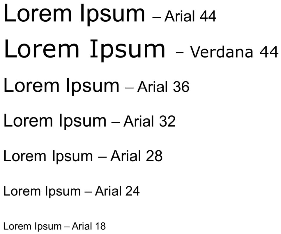
If you are doubting my size rule of thumb, have a look at what various sizes look like when compared to one another in Figure 2.3. Of course, the image has been downsized for the book. But it does a pretty good job at showing how difficult it can become to read Arial 18 points when looking at a presentation on a small screen. It also shows you that using a different font style can also change how its size is perceived.

Figure 2.3 – Font sizes comparison
Take some time to test font sizes before your presentation. Take even more time if you are presenting in a hybrid mode, such as having some participants in the venue and others watching from various screen sizes remotely. Now that we have discussed font styles and sizes, the next section on contrast will help us conclude important best practices that relate to fonts.


