Plotting multiple bar charts
When comparing several quantities and when changing one variable, we might want a bar chart where we have bars of one color for one quantity value.
How to do it...
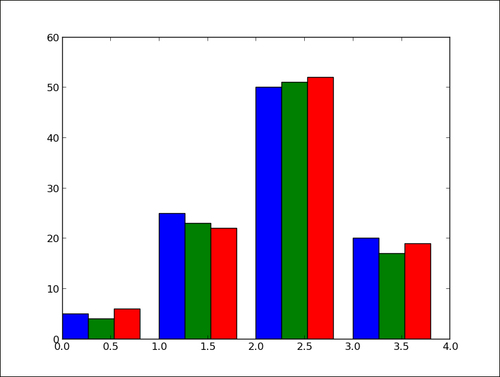
We can plot multiple bar charts by playing with the thickness and the positions of the bars as follows:
import numpy as np
import matplotlib.pyplot as plt

data = [[5., 25., 50., 20.],
  [4., 23., 51., 17.],
  [6., 22., 52., 19.]]

X = np.arange(4)
plt.bar(X + 0.00, data[0], color = 'b', width = 0.25)
plt.bar(X + 0.25, data[1], color = 'g', width = 0.25)
plt.bar(X + 0.50, data[2], color = 'r', width = 0.25)

plt.show()
The preceding script will produce the following graph:

How it works...
The data variable contains three series of four values. The preceding script will show three bar charts of four bars. The bars will have a thickness of 0.25 units. Each bar chart will be shifted 0.25 units from the previous one. Color has been added for clarity. This topic will be detailed in Chapter 2, Customizing the Color and Styles.
There's more...
The code shown in the preceding section is quite tedious as we repeat ourselves by shifting the three bar charts manually. We can do this better by using the following code:
import numpy as np
import matplotlib.pyplot as plt

data = [[5., 25., 50., 20.],
  [4., 23., 51., 17.],
  [6., 22., 52., 19.]]

color_list = ['b', 'g', 'r']
gap = .8 / len(data)
for i, row in enumerate(data):
  X = np.arange(len(row))
  plt.bar(X + i * gap, row,
    width = gap,
    color = color_list[i % len(color_list)])

plt.show()
Here, we iterate over each row of data with the loop for i, row in enumerate(data). The iterator enumerate returns both the current row and its index. Generating the position of each bar for one bar chart is done with a list comprehension. This script will produce the same result as the previous script, but would not require any change if we add rows or columns of data.


