Page structure
By using the same views on every page, Elgg makes it simple to maintain a consistent look and feel across the site. Creating a new theme often starts by styling or overriding these page views. They are organized into four divisions: page shells, layouts, elements, and components. They are all found in the /views/default/page/ directory.
Shells
A page shell defines the overall structure of a web page. The topbar, header, and footer are all included by the shell. Elgg is distributed with two primary shells. The default shell is used on user-facing pages and the admin shell is used in the administrative backend of Elgg.
Views: page/default, page/admin
Developers: If you wanted a few pages to have a very different layout that the rest of the site, then a good way to accomplish this is by creating a new page shell. The page shell is selected when calling elgg_view_page().
Themers: If you need to override the default page shell, then remember to include the "page/elements/foot" view as it is used by Elgg's JavaScript library for loading JavaScript files.
Layouts
While the page shell defines the areas that remain fairly constant across the site, the layout contains the dynamic content. Elgg has three structural layouts: one column, one sidebar, and two sidebars. The most common of these is the one sidebar layout with a main content area and a single sidebar that is on the right in the default theme.
In addition to the structural layouts, Elgg is distributed with admin, content, and widgets layouts. The content layout is used by all the major content plugins such as blogs and file. It adds additional structure to the one sidebar layout with action buttons and tabs (the filter menu). The following is an example of the content layout on a bookmarks page:
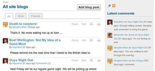
Views: page/layouts/*
Elements
Page elements are views that are typically used a single time when creating a page. Page shells and layouts use them to define the structure of a page. All of the views included in this section are in the views/default/page/elements directory except for the search box, which is in the search plugin.
Topbar
The topbar is the tool bar at the top of every screen. The links in the topbar are managed through the topbar menu, which is discussed later in the appendix.

View: page/elements/topbar
Themers: When overriding this view in your theme, consider whether you want to continue using the topbar menu, site menu, combine the two menus, or create a custom set of links. The decision that you make affects the integration of plugins. If a new plugin expects the topbar menu to exist and you have replaced it with a hard-coded menu, then you will need to manually update that menu.
Header
The header includes the site title, site navigation, and a search box. The search box can be removed with a call to elgg_unextend_view(). Content can be added to the header by extending its view or overriding it.

View: page/elements/header
Sidebar
The sidebar view contains the owner block and the page menu. It can be extended to add additional content.
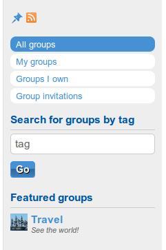
View: page/elements/sidebar
Footer
Many themes override this view to create a custom footer. Links are added to the footer through the footer menu described later.

View: page/elements/footer
Owner block
This view includes a profile photo of a person or group along with content links. It appears at the top of the sidebar in the default theme on some content pages.
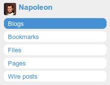
View: page/elements/owner_block
Developers: Links are added to the owner block by using the 'register', 'menu:owner_block' plugin hook.
Status messages
When a user performs an action (logging in, posting a comment), the next web page includes a status message at the top of the page that disappears after some time period.

View: page/elements/messages
Developers: The messages are queued by the functions system_message() and register_error().
Themers: Each message is an item in a list. The list has a class of .elgg-system-messages and the item's .elgg-message. An additional class on the item is used to distinguish between success and error messages (.elgg-state-success and .elgg-state-error).
Comments
The comments view provides a list of comments and an optional form for adding a new comment.
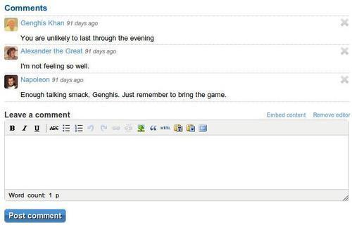
Views: page/elements/comments, annotation/generic_comment
Developers: Comments can be added to page through the convenience function elgg_view_comments().
Search box
The search bar view is in the search plugin. It is added to the header by extending the page/element/header view
.

View: search/search_box
Themers: The Submit button is hidden in the default theme using CSS.
Components
Just as software patterns exist, there are visual patterns found in website designs. Elgg has abstracted these patterns as reusable views paired with CSS markup. The view creates the HTML structure for a pattern. The CSS is divided between a base class that captures the shared styling and extension classes that describe the unique aspects of a particular instantiation of the pattern.
As an example, consider the module pattern which consists of a box with header and body:
<div class="elgg-module elgg-module-featured">
  <div class="elgg-head">
    <h3>My Module</h3>
  </div>
  <div class="elgg-body">
    My content
  </div>
</div>
The base CSS class is .elgg-module and .elgg-module-features is the extension. The entire look and feel of the module can be changed by changing the extension class. This approach to HTML and CSS encourages reuse of markup leading to consistent HTML and smaller CSS files.
The implementation of these components was inspired by the Object Oriented CSS Framework created by Nicole Sullivan. There is a description of the approach behind this framework in Chapter 9 of this book.
Gallery
The gallery pattern is popular on photo and e-commerce sites. It can be used interchangeably with the list pattern. The file plugin uses this view for displaying photos in a gallery.
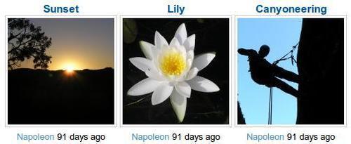
View: page/components/gallery
Developers: The gallery view requires fixed width content.
Themers: An inline-block approach is used on the unordered list to work around height differences in the list items. For more information on this, read http://blog.mozilla.com/webdev/2009/02/20/cross-browser-inline-block/.
Image block
The image block pattern appears on almost every web page in Elgg. It consists of an image on one side and a body of text on the other. The image is usually a user avatar or content icon. The image may appear on the left, right, or both sides of the body.

View:
page/components/image_block
Developers: elgg_view_image_block() is a convenience function for rendering an image block.
Themers: The body of the image block uses a space-filling div using this technique: http://www.stubbornella.org/content/2010/12/09/the-hacktastic-zoom-fix/.
List
Lists appear often in Elgg. Activity streams, content lists, and comments all use the list component.
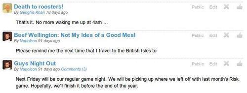
View:
page/components/list
Developers: It is rare that this view is used directly in a plugin. Instead, the view is called by the many list convenience functions provided by Elgg such as elgg_list_entities().
Themers: The list view, unsurprisingly, uses an HTML list element to structure the content. The base CSS class on the unordered list is .elgg-list, with each item having a class of .elgg-item.
Module
As already mentioned, a module consists of a box with a header and body. The module view also supports an optional footer.
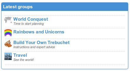
View:
page/components/module
Developers: elgg_view_module() is a convenience function for rendering a module.
Themers: The module does not support adding classes to the header, body, or footer. Instead, styling is accomplished through the extension classes on the module box, as follows:
.elgg-module-feature > .elgg-head {
  border: 1px solid #4690D6;
}


