


Foundations for building visualizations
When you first connect to a data source such as the coffee chain data, Tableau will display the data connection and the fields in the Data window in the sidebar on the left-hand side. Fields can be dragged from the Data window onto various parts of the view on the right-hand side. Fields can be dropped onto the canvas area or onto various shelves, such as Rows, Columns, Color, or Size. The placement of the fields will result in different encodings of the data based on the type of field.
The fields from the data source are visible in the Data window and are divided into Measures and Dimensions. Understanding the difference between Measures and Dimensions is essential.
Note
Measures are values that are aggregated. That is, they can be summed, averaged, counted, or they can have a minimum or maximum.
Dimensions are values that determine the level of detail at which measures are aggregated. You can think of them as slicing the measures or creating groups into which the measures fit. The combination of dimensions used in the view defines the view's basic level of detail.
As an example, consider a view created using the Sales and Market fields from the coffee chain connection.
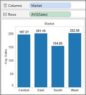
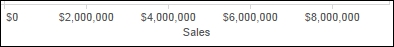
The Sales field is used as a measure in this view. Specifically, it is aggregated as an average. When you use a field as a measure in the view, the type aggregation (for example, SUM, MIN, and MAX) will be shown on the active field. Note in the preceding example that the active field on Rows clearly indicates the average aggregation of sales: AVG(Sales).
The Market field is a dimension with one of four values for each record of data: Central, East, South, or West. When the field is used as a dimension in the view, it slices the measure. So instead of an overall average, the view in the preceding example shows you the average sales for each market.
Note
Tableau makes it easy to recategorize fields and change default aggregations.
You can recategorize a field in the Data window as a dimension or measure by simply dragging the field from Measures to Dimensions or vice versa.
You can recategorize a field in the view as a dimension or measure by right-clicking on the field in the view and then selecting Dimensions or Measures.
You can change the default type of the aggregation of a measure by right-clicking on a Measures field in the Data window and navigating to Default Properties | Aggregation.
You can change the type of aggregation of a field in the view by right-clicking on the field in the view, selecting Measures, and then selecting the desired type of aggregation.
Another important distinction to make with fields is whether a field is being used as discrete or continuous. Tableau will give you a visual indication of the default for a field (the color of the icon in the Data window) and how it is being used in the view (the color of the active field on a shelf). Discrete fields are blue; continuous fields are green.
Whether a field is discrete or continuous, it determines how Tableau visualizes it based on where it is used in the view.
Note
Discrete (blue) fields have values that are shown as distinct and separate from each other. Discrete values can be reordered and still make sense.
When a discrete field is used on the Rows or Columns shelves, the field defines row or column headers.
When used for color, a discrete field defines a discrete color palette in which each color describes a distinct value of the field.
Continuous (green) fields have values that are shown as flowing from one field to another. Numeric and date fields are often used as continuous fields in the view. The values of these fields have an order that it would make no sense to change.
When used on Rows or Columns, a continuous field defines an axis.
When used for colors, a continuous field defines a gradient.

Most dimensions are discrete by default, and most measures are continuous by default. However, any numeric or date field, whether dimension or measure, can be used as a continuous field in the view. Any field, whether dimension or measure, can be used as a discrete field in the view.
Tip
To change the default of a field, right-click on the field in the Data window and select Convert to Discrete or Convert to Continuous.
To change how a field is used in the view, right-click on the field in the view and select Discrete or Continuous.
As you work through the examples in this chapter, pay attention to the fields you are using to create the visualizations, whether they are dimensions or measures, and whether they are discrete or continuous. Experiment with changing fields in the view from continuous to discrete and vice versa to gain an understanding of the difference in the visualization.


