Search icon CANCEL
Subscription
0
Cart icon
Your Cart (0 item)
Close icon
You have no products in your basket yet
Arrow left icon
Explore Products
Best Sellers
New Releases
Books
Videos
Audiobooks
Learning Hub
Free Learning
Arrow right icon
Arrow up icon
GO TO TOP
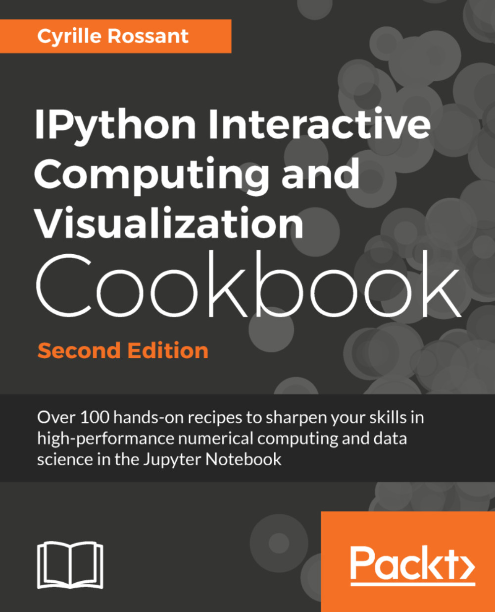
IPython Interactive Computing and Visualization Cookbook

You're reading from   IPython Interactive Computing and Visualization Cookbook Over 100 hands-on recipes to sharpen your skills in high-performance numerical computing and data science in the Jupyter Notebook

Arrow left icon
Product type Paperback
Published in Jan 2018
Publisher Packt
ISBN-13 9781785888632
Length 548 pages
Edition 2nd Edition
Languages
Tools
Arrow right icon
Author (1):
Arrow left icon
Cyrille Rossant Cyrille Rossant
Author Profile Icon Cyrille Rossant
Cyrille Rossant
Arrow right icon
View More author details
Toc

Table of Contents (17) Chapters Close

Preface 1. A Tour of Interactive Computing with Jupyter and IPython FREE CHAPTER 2. Best Practices in Interactive Computing 3. Mastering the Jupyter Notebook 4. Profiling and Optimization 5. High-Performance Computing 6. Data Visualization 7. Statistical Data Analysis 8. Machine Learning 9. Numerical Optimization 10. Signal Processing 11. Image and Audio Processing 12. Deterministic Dynamical Systems 13. Stochastic Dynamical Systems 14. Graphs, Geometry, and Geographic Information Systems 15. Symbolic and Numerical Mathematics Index

Creating statistical plots easily with seaborn


seaborn is a library that builds on top of Matplotlib and Pandas to provide easy-to-use statistical plotting routines. In this recipe, we give a few examples, adapted from the official documentation, of the types of statistical plot that can be created with seaborn.

How to do it...

  1. Let's import NumPy, Matplotlib, and seaborn:

    >>> import numpy as np
        from scipy import stats
        import matplotlib.pyplot as plt
        import seaborn as sns
        %matplotlib inline
  2. seaborn comes with built-in datasets, which are useful when making demos. The tips dataset contains bills and tips for taxi journeys:

    >>> tips = sns.load_dataset('tips')
        tips
  3. seaborn implements easy-to-use functions to visualize the distribution of datasets. Here, we plot the histogram, Kernel Density Estimation (KDE), and a gamma distribution fit for our dataset:

    >>> # We create two subplots sharing the same y axis.
        f, (ax1, ax2) = plt.subplots(1, 2,
         ...
lock icon The rest of the chapter is locked
Register for a free Packt account to unlock a world of extra content!
A free Packt account unlocks extra newsletters, articles, discounted offers, and much more. Start advancing your knowledge today.
Unlock this book and the full library FREE for 7 days
Get unlimited access to 7000+ expert-authored eBooks and videos courses covering every tech area you can think of
Renews at $19.99/month. Cancel anytime
Banner background image