Search icon CANCEL
Subscription
0
Cart icon
Your Cart (0 item)
Close icon
You have no products in your basket yet
Save more on your purchases! discount-offer-chevron-icon
Savings automatically calculated. No voucher code required.
Arrow left icon
Explore Products
Best Sellers
New Releases
Books
Videos
Audiobooks
Learning Hub
Free Learning
Arrow right icon
Arrow up icon
GO TO TOP
Building Interactive Dashboards in Microsoft 365 Excel

You're reading from   Building Interactive Dashboards in Microsoft 365 Excel Harness the new features and formulae in M365 Excel to create dynamic, automated dashboards

Arrow left icon
Product type Paperback
Published in Feb 2024
Publisher Packt
ISBN-13 9781803237299
Length 420 pages
Edition 1st Edition
Languages
Tools
Arrow right icon
Author (1):
Arrow left icon
Michael Olafusi Michael Olafusi
Author Profile Icon Michael Olafusi
Michael Olafusi
Arrow right icon
View More author details
Toc

Table of Contents (18) Chapters Close

Preface 1. Part 1 – Dashboards and Reports in Modern Excel FREE CHAPTER
2. Chapter 1: Dashboards, Reports, and M365 Excel 3. Chapter 2: Common Dashboards in Lsarge Companies 4. Part 2 – Keeping Your Eyes on Automation
5. Chapter 3: The Importance of Connecting Directly to the Primary Data Sources 6. Chapter 4: Power Query: the Ultimate Data Transformation Tool 7. Chapter 5: PivotTable and Power Pivot 8. Chapter 6: Must-Know Legacy Excel Functions 9. Chapter 7: Dynamic Array Functions and Lambda Functions 10. Part 3 – Getting the Visualization Right
11. Chapter 8: Getting Comfortable with the 19 Excel Charts 12. Chapter 9: Non-Chart Visuals 13. Chapter 10: Setting Up the Dashboard's Data Model 14. Chapter 11: Perfecting the Dashboard 15. Chapter 12: Best Practices for Real-World Dashboard Building 16. Index 17. Other Books You May Enjoy

Line chart

A line chart shows trends – how a metric performs over a date/time range. It is, perhaps, the second most used chart after the column chart. It’s the same process you’re already familiar with for creating column and bar charts. It also has the clustered, stacked, and 100% stacked options. Figure 8.16 shows an example of a line chart to visualize yearly sales for a company:
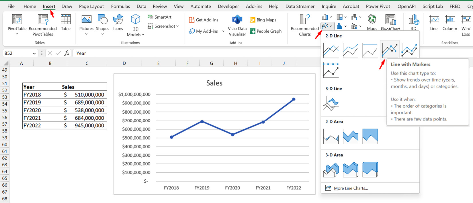
Figure 8.16 – Line chart of yearly sales

Figure 8.16 – Line chart of yearly sales

You will notice that, in addition to a plain line chart option, there’s a Line with Markers option. We have selected the clustered line with markers option for the chart in Figure 8.16.

Something to note about the line chart is that the trendline chart element display option it has can be more relevant than in the column and bar charts. Trendlines are meaningful for seeing the general trend of performance over time, so it is naturally relevant for line charts that already show the performance of...

lock icon The rest of the chapter is locked
Register for a free Packt account to unlock a world of extra content!
A free Packt account unlocks extra newsletters, articles, discounted offers, and much more. Start advancing your knowledge today.
Unlock this book and the full library FREE for 7 days
Get unlimited access to 7000+ expert-authored eBooks and videos courses covering every tech area you can think of
Renews at $19.99/month. Cancel anytime
Banner background image