Search icon CANCEL
Subscription
0
Cart icon
Your Cart (0 item)
Close icon
You have no products in your basket yet
Save more on your purchases! discount-offer-chevron-icon
Savings automatically calculated. No voucher code required.
Arrow left icon
Explore Products
Best Sellers
New Releases
Books
Videos
Audiobooks
Learning Hub
Free Learning
Arrow right icon
Arrow up icon
GO TO TOP
Building Interactive Dashboards in Microsoft 365 Excel

You're reading from   Building Interactive Dashboards in Microsoft 365 Excel Harness the new features and formulae in M365 Excel to create dynamic, automated dashboards

Arrow left icon
Product type Paperback
Published in Feb 2024
Publisher Packt
ISBN-13 9781803237299
Length 420 pages
Edition 1st Edition
Languages
Tools
Arrow right icon
Author (1):
Arrow left icon
Michael Olafusi Michael Olafusi
Author Profile Icon Michael Olafusi
Michael Olafusi
Arrow right icon
View More author details
Toc

Table of Contents (18) Chapters Close

Preface 1. Part 1 – Dashboards and Reports in Modern Excel FREE CHAPTER
2. Chapter 1: Dashboards, Reports, and M365 Excel 3. Chapter 2: Common Dashboards in Lsarge Companies 4. Part 2 – Keeping Your Eyes on Automation
5. Chapter 3: The Importance of Connecting Directly to the Primary Data Sources 6. Chapter 4: Power Query: the Ultimate Data Transformation Tool 7. Chapter 5: PivotTable and Power Pivot 8. Chapter 6: Must-Know Legacy Excel Functions 9. Chapter 7: Dynamic Array Functions and Lambda Functions 10. Part 3 – Getting the Visualization Right
11. Chapter 8: Getting Comfortable with the 19 Excel Charts 12. Chapter 9: Non-Chart Visuals 13. Chapter 10: Setting Up the Dashboard's Data Model 14. Chapter 11: Perfecting the Dashboard 15. Chapter 12: Best Practices for Real-World Dashboard Building 16. Index 17. Other Books You May Enjoy

Building the sales performance dashboard

We will build on the data model we created in the previous chapter for the sales dashboard, and you can see what it looks like in the following screenshot:
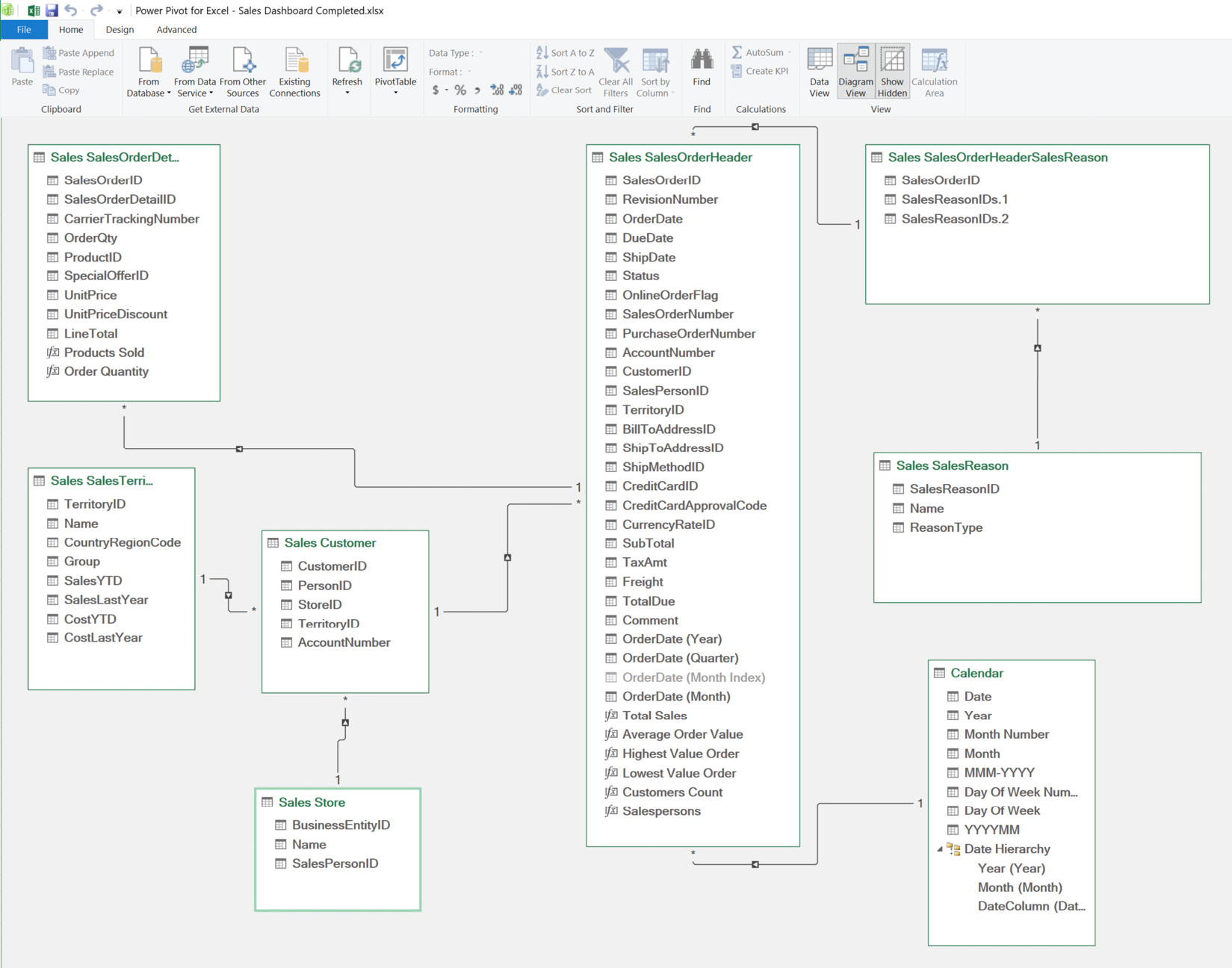
Figure 11.14 – An overview of the sales dashboard data model

Figure 11.14 – An overview of the sales dashboard data model

We will take the steps we followed in creating the HR dashboard – inserting PivotTables, inserting PivotCharts, and inserting illustrations (pictures and shapes). However, in addition to those steps, we will insert slicers, insert a timeline, and create calculation measures. So, this will involve more steps than the HR dashboard, and you will enjoy taking these new steps, as they will empower you with the knowledge to create very robust dashboards that meet business decision makers’ needs.

We will start by creating the calculation measures.

Creating measures

Measures are formulas you create within a table in Power Pivot to output one result for the entire table. They are...

lock icon The rest of the chapter is locked
Register for a free Packt account to unlock a world of extra content!
A free Packt account unlocks extra newsletters, articles, discounted offers, and much more. Start advancing your knowledge today.
Unlock this book and the full library FREE for 7 days
Get unlimited access to 7000+ expert-authored eBooks and videos courses covering every tech area you can think of
Renews at $19.99/month. Cancel anytime
Banner background image