Exploring the Blender 3D interface
In the early days of Blender, the developers took a different approach to their user interface, and time has proven that it is a very productive way to work. Instead of assigning fixed areas for certain tasks or creating a stack of windows, they decided on a flexible system of non-overlapping windows that could be resized interactively to give the user maximum control of their workspace.
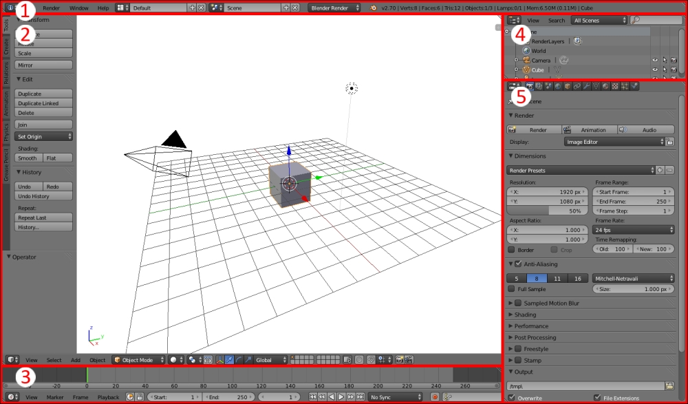
When you start your copy of Blender as you did in Chapter 1, Introducing Blender and Animation, your screen will show a big central window surrounded by a number of boxes with text and buttons. There are five windows in total. I drew boxes around the windows so that you could see how the default Blender window is organized.

Breaking down the interface bit by bit will make it easy to understand. Remember, you don't have to understand how to use every single control to do a lot of great work with Blender. No one knows it all. You will go through it step by step giving you a...


