Line charts
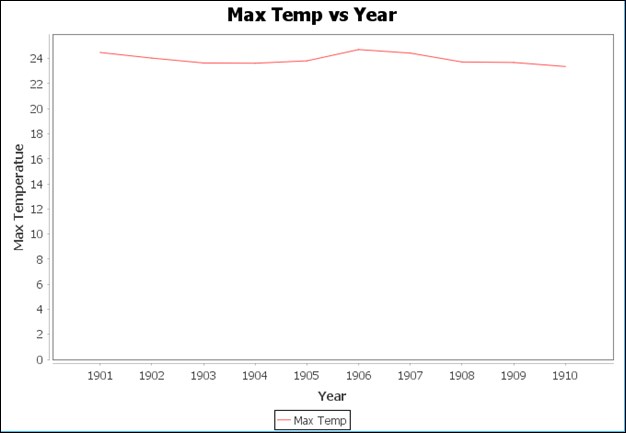
These types of charts are useful in regression techniques as we will see later. It's a simple chart represented by a line that shows the changes in data either by time or some other value. Even Time Series charts are a type of line chart. Here is an example of a Time Series chart:

This line chart is a simple chart showing Max Temp versus Year, In this case, max temperatures are from 1901 to 1910. The chart shows that the temperature did not change drastically within these 10 years.
To build this line chart, we have used the same All India seasonal and annual min/max temperature series dataset as explained in the preceding Time Series charts. For building the charts, the steps are again the same:
Loading the chart dataset and creating a JFreeChart-specific dataset.
We will create a similar
createDatasetmethod and return ourDefaultCategoryDatasetobjectprivate DefaultCategoryDataset createDataset() { DefaultCategoryDataset dataset = new DefaultCategoryDataset();Next, we go...


