Search icon CANCEL
Subscription
0
Cart icon
Your Cart (0 item)
Close icon
You have no products in your basket yet
Save more on your purchases! discount-offer-chevron-icon
Savings automatically calculated. No voucher code required.
Arrow left icon
Explore Products
Best Sellers
New Releases
Books
Videos
Audiobooks
Learning Hub
Newsletter Hub
Free Learning
Arrow right icon
timer SALE ENDS IN
0 Days
:
00 Hours
:
00 Minutes
:
00 Seconds
Arrow up icon
GO TO TOP
matplotlib Plotting Cookbook

You're reading from   matplotlib Plotting Cookbook Discover how easy it can be to create great scientific visualizations with Python. This cookbook includes over sixty matplotlib recipes together with clarifying explanations to ensure you can produce plots of high quality.

Arrow left icon
Product type Paperback
Published in Mar 2014
Publisher Packt
ISBN-13 9781849513265
Length 222 pages
Edition Edition
Languages
Arrow right icon
Author (1):
Arrow left icon
Alexandre Devert Alexandre Devert
Author Profile Icon Alexandre Devert
Alexandre Devert
Arrow right icon
View More author details
Toc

Table of Contents (15) Chapters Close

matplotlib Plotting Cookbook
Credits
About the Author
About the Reviewers
www.PacktPub.com
Preface
1. First Steps FREE CHAPTER 2. Customizing the Color and Styles 3. Working with Annotations 4. Working with Figures 5. Working with a File Output 6. Working with Maps 7. Working with 3D Figures 8. User Interface Index

Adding a label to each axis


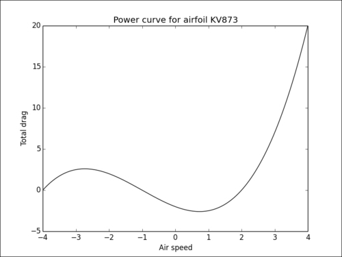
After a title, a proper description of the figure's axis helps a great deal for users understand a graphic. In this recipe, we will show you how to get a label next to each axis of a figure.

How to do it...

Adding such annotations is very simple, as demonstrated in the following example:

import numpy as np
import matplotlib.pyplot as plt

X = np.linspace(-4, 4, 1024)
Y = .25 * (X + 4.) * (X + 1.) * (X - 2.)

plt.title('Power curve for airfoil KV873')
plt.xlabel('Air speed')
plt.ylabel('Total drag')

plt.plot(X, Y, c = 'k')
plt.show()

The figure will be the same as the one obtained in the first recipe of this chapter. However, both the axes will feature a legend.
How it works...

We use the pyplot.xlabel() and pyplot.ylabel()functions to add a description of the horizontal axis and the vertical axis, respectively. As for the pyplot.title() function, this function accepts the LaTeX notation. These functions are available for any kind of graphic; you would use the same...

lock icon The rest of the chapter is locked
Register for a free Packt account to unlock a world of extra content!
A free Packt account unlocks extra newsletters, articles, discounted offers, and much more. Start advancing your knowledge today.
Unlock this book and the full library FREE for 7 days
Get unlimited access to 7000+ expert-authored eBooks and videos courses covering every tech area you can think of
Renews at $19.99/month. Cancel anytime
Banner background image