Data visualization with Kibana
So far, we have used Kibana to discover data, manage indices in Elasticsearch, use developer tools to develop queries, and use a few other features. We also saw the pre-populated visualization charts from NetFlow, which gave us the top talker pair from our data. In this section, we will walk through the steps of creating our own graphs. We will start by creating a pie chart.
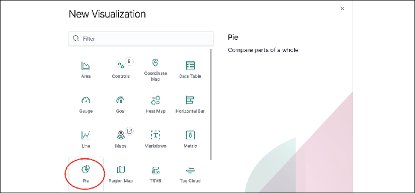
A pie chart is great at visualizing a portion of the component in relation to the whole. Let's create a pie chart based on the Filebeat index that graphs the top 10 source IP addresses based on the number of record counts. We will select Visualization -> New Visualization -> Pie:

Figure 21: Kibana pie chart
Then we will type netflow in the search bar to pick our [Filebeat NetFlow] indices:

Figure 22: Kibana pie chart source
By default, we are given the total count of all the records in the default time range. The time range can be dynamically changed...


