The Responsive Design tab
When working on the Design tab, the canvas, usually, you are working on the UI Builder tab, choosing components, and adding them to the screen. Now, if you want to check what your layout looks like in different screen sizes, you can do this by simply selecting the Responsive tab, which is also called Responsive mode.
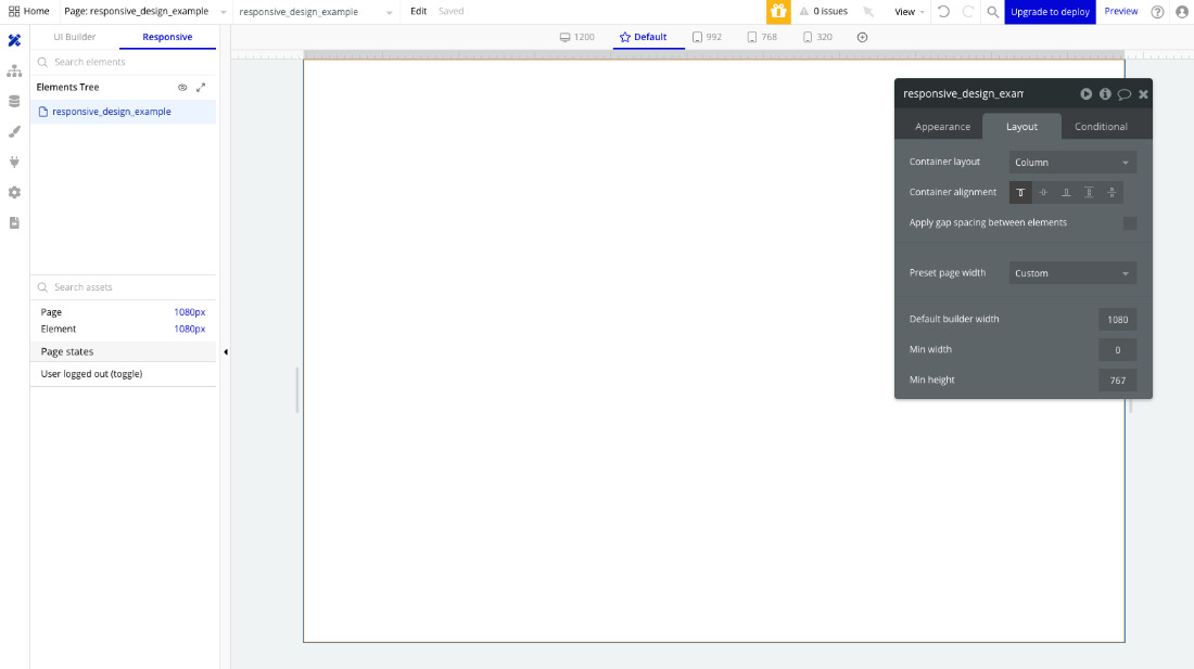
The Bubble interface inside the Responsive tab is shown here:

Figure 6.3: Responsive Mode in Bubble.io
Notice that the responsive mode is very similar to the previous mode, but with a few differences – let’s break it down. In this mode, we still have the Elements Tree section, which works the same way as you’ve learned before. We also have a list of elements added to the page and their current size. We have a new section called Page states, where we can see conditional states in our application so we can test different view modes. One that comes by default is User logged out (toggle) so you...


