Working with keyboards and keyboard toolbars
When a textfield or textarea control gains focus in either an iPhone or an Android phone, the default keyboard is what you see spring up on the screen. There will be times, however, when you wish to change this behavior; for example, you may only want to have the user input numeric characters into a textfield when they are providing a numerical amount (such as their age or a monetary value). Additionally, keyboard toolbars can be created to appear above the keyboard itself, which will allow you to provide the user with other options, such as removing the keyboard from the window, or allowing copy and paste operations via a simple button tap.
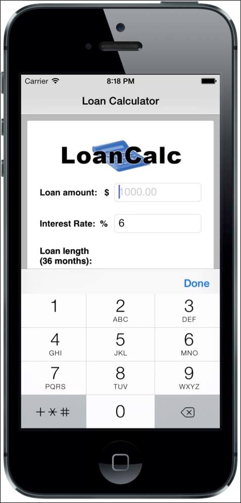
In the following recipe, we're going to create a toolbar that contains both a system button and another system component called flexiblespace. These will be added at the top of our numeric keyboard, which will appear whenever the TextField for amount or interest rate gains focus. Note that in this example, we have updated the tfAmount and tfInterestRate textfield objects to contain the keyboardType and returnKeyType properties.
Getting started
Note that toolbars are iOS-specific, and currently they may not be available for Android in the Titanium SDK.
How to do it...
Open your app.js file and type the following code. If you have been following along from the previous recipe, this code should replace the previous recipe's code for adding the amount and interest rate textfields:
//flexible space for button bars
var flexSpace = Ti.UI.createButton({
  systemButton:Ti.UI.iPhone.SystemButton.FLEXIBLE_SPACE
});

//done system button
var buttonDone = Ti.UI.createButton({
    systemButton:Ti.UI.iPhone.SystemButton.DONE,
    bottom: 0
});

//add the event listener 'click' event to our done button
buttonDone.addEventListener('click', function(e){
    tfAmount.blur();
    tfInterestRate.blur();
    interestRate = tfInterestRate.value;
});

//creating the textfield for our loan amount input
var tfAmount = Ti.UI.createTextField({
    width: 140,
    height: 30,
    right: 20,
    borderStyle:Ti.UI.INPUT_BORDERSTYLE_ROUNDED,
    returnKeyType:Ti.UI.RETURNKEY_DONE,
    hintText: '1000.00',
    keyboardToolbar: [flexSpace,buttonDone],
    keyboardType:Ti.UI.KEYBOARD_PHONE_PAD
});
amountRow.add(tfAmount);

//creating the textfield for our percentage interest rate //input
var tfInterestRate = Ti.UI.createTextField({
    width: 140,
    height: 30,
    right: 20,
    borderStyle:Ti.UI.INPUT_BORDERSTYLE_ROUNDED,
    returnKeyType:Ti.UI.RETURNKEY_DONE,
    value: interestRate,
    keyboardToolbar: [flexSpace,buttonDone],
    keyboardType:Ti.UI.KEYBOARD_PHONE_PAD
});

interestRateRow.add(tfInterestRate);
How it works...
In this recipe, we created a textfield and added it to our view. You should have noticed by now how many properties are universal among the different UI components: width, height, top, and right are just four properties that are used in our textfield called tfAmount and were used in previous recipes for other components.
Many touchscreen phones do not have physical keyboards; however, we are using a touchscreen keyboard to gather our input data. Depending on the data you require, you may not need a full keyboard with all the QWERTY keys, and you may want to just display a numeric keyboard, for example, if you were using the telephone dialing features on your iPhone or Android device.
Additionally, you may require the QWERTY keys, but in a specific format. A custom keyboard makes the user input quicker and less frustrating for the user by presenting custom options, such as keyboards for inputting web addresses and e-mails with all the www and @ symbols in convenient touch locations.
In this example, we're setting keyboardType to Ti.UI.KEYBOARD_PHONE_PAD, which means that whenever the user clicks on that field, they see a numeric keypad.
In addition, we are specifying the keyboardToolbar property to be an array of our Done button as well as the the flexspace button, so we get a toolbar with the Done button. The event listener added to the Done button ensures that we can pick up the click, capture the values, and blur the field, essentially hiding the keypad.
Tip
Downloading the example code
You can download the example code files from your account at http://www.packtpub.com for all the Packt Publishing books you have purchased. If you purchased this book elsewhere, you can visit http://www.packtpub.com/support and register to have the files e-mailed directly to you.

There's more
Try experimenting with other keyboard styles in your Titanium app!
Experimenting with keyboard styles
Other possible values are shown here:
Ti.UI.KEYBOARD_DEFAULT
Ti.UI.KEYBOARD_EMAIL
Ti.UI.KEYBOARD_ASCII
Ti.UI.KEYBOARD_URL
Ti.UI.KEYBOARD_NUMBER_PAD
Ti.UI.KEYBOARD_NUMBERS_PUNCTUATION
Ti.UI.KEYBOARD_PHONE_PAD


