Microsoft 365 user interface
Microsoft 365 comes with a very simple and intuitive user interface. You are presented with a landing page that looks like this when you first log in to the Microsoft 365 home page at www.office.com:
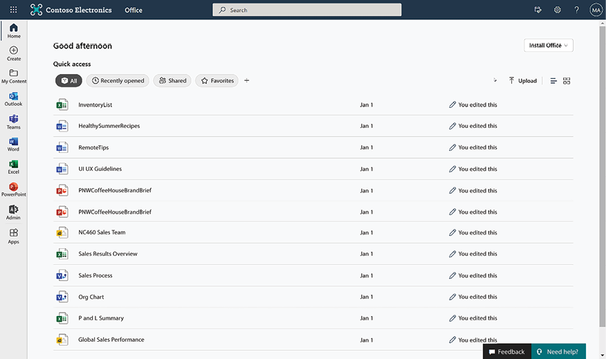
Figure 1.2: Microsoft 365 landing page
Let’s look at the various sections of this page in a bit more detail.
Page header – the suite bar
The suite bar appears at the top of all Microsoft 365 apps. The suite bar has the following links:

Figure 1.3: Microsoft 365 suite bar
- The set of squares on the extreme left is known as the Microsoft 365 app launcher (also called the waffle). It is the Start menu equivalent to Windows 10. The waffle displays your frequently used Microsoft 365 apps. In addition to the Microsoft 365 apps, your organization can add their own apps in this section. You can then navigate to your apps from here. In addition, you will also see your recent documents if you scroll all the way to the bottom of the app launcher. You can also click All apps toward the bottom of the app launcher panel to be taken to a page that shows you a listing of all the apps that you have access to:
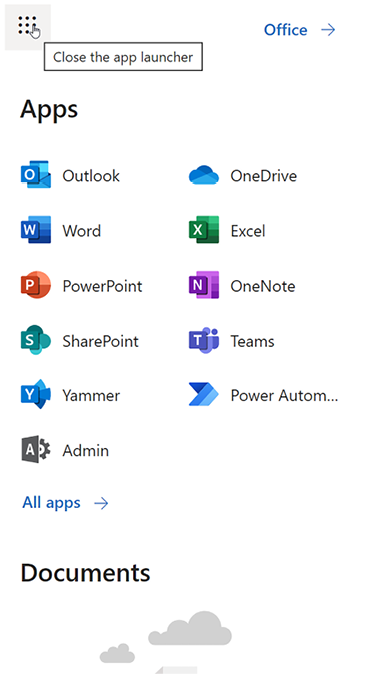
Figure 1.4: Accessing apps
- The Microsoft 365 Search box in the middle lets you search across your organization’s entire Microsoft 365 tenant. Search allows you to find relevant content from across all SharePoint sites and OneDrive. We will cover Search in much more detail in subsequent chapters, but it is worth mentioning here that Search will always only show you content that you have access to.
- Next to the Search box are three Microsoft 365 icons:
- Notification icon: Notifies you when you receive an email.
- Settings icon: This is explained in the following section.
- Help icon: To get help on Microsoft 365. The help icon is context-aware; clicking this icon will show you help relevant to the area or page that you were browsing when you clicked it.
- On the right side of the screen is the profile picture (or your initials, if the picture is unavailable). You can update your contact details by clicking on the profile picture and then selecting My Office Profile. You can also view your subscriptions and license information and update your account details (privacy settings, password, and so on) from here.
Settings icon
The Settings menu is represented by the gear icon. The settings icon lets you change your personal preferences, including your notification settings and your password for Microsoft 365, as shown in the following screenshot:
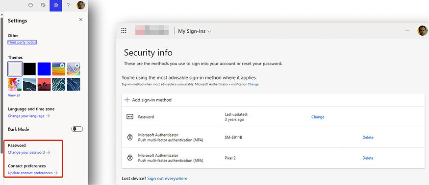
Figure 1.5: Update personal preferences
You can update the following from here:
- Your personal Microsoft 365 look and feel (if your organization allows this)
- Certain Microsoft 365 notification preferences
- Your organization account password
- Additional security and privacy settings
Further, the settings panel is context-aware, meaning that the settings that you see in this panel will depend on the Microsoft 365 workload or app within which you are working. For example, when you are viewing the settings panel from within a page in SharePoint, you will see settings that are relevant to that specific page or area in SharePoint. We will cover the settings for individual apps separately in the chapters for these apps.
Page content
While the header consistently appears across all the Microsoft 365 workloads, the content for the individual apps varies depending on the type of app. The Microsoft 365 home page contains the following sections (from top to bottom).
The Install Office option in the top right-hand corner lets you install Office applications (such as Word, Excel, and PowerPoint) on your machine. This link is visible only if your subscription plan lets you install Office applications.
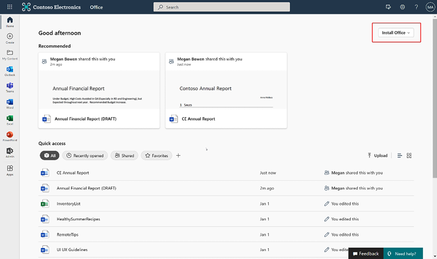
Figure 1.6: Microsoft 365 landing page components
The Recommended section displays all the documents that might be relevant to you. Microsoft 365 uses machine learning and artificial intelligence to create a personalized list for each user based on the projects that you are working on and the people you are working with.
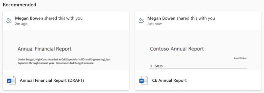
Figure 1.7: Recommended results
The quick access bar lets you add one or more content filters. Content filters let you refine your content based on metadata. It comes with four standard filters: All, Recently opened, Shared, and Favorites.
The Recently opened link displays the documents in descending order of the last accessed date. This feature is very useful because it lets you start working on documents in order of when you last accessed or updated them.

Figure 1.8: Recently opened documents
The Shared view displays the documents that have been shared with you by your colleagues.

Figure 1.9: Shared documents
Toward the bottom of quick access, you will find the See all My Content link, which lets you expand your search and filter on specific content using the filters on the left.
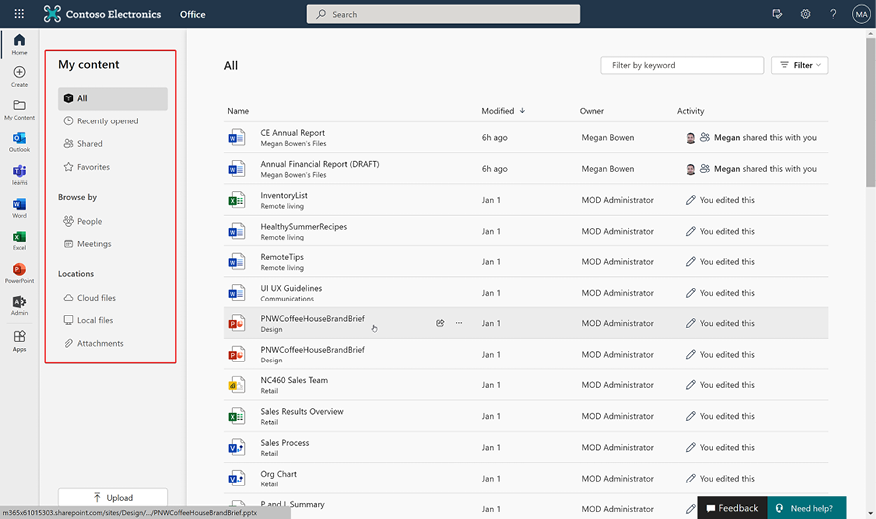
Figure 1.10: Document refinement panel


