UI Buttons
UI Buttons are objects that are meant to be clicked, but they can also respond to other actions, for example, when the mouse hovers over them; the following screenshot shows the Button component:
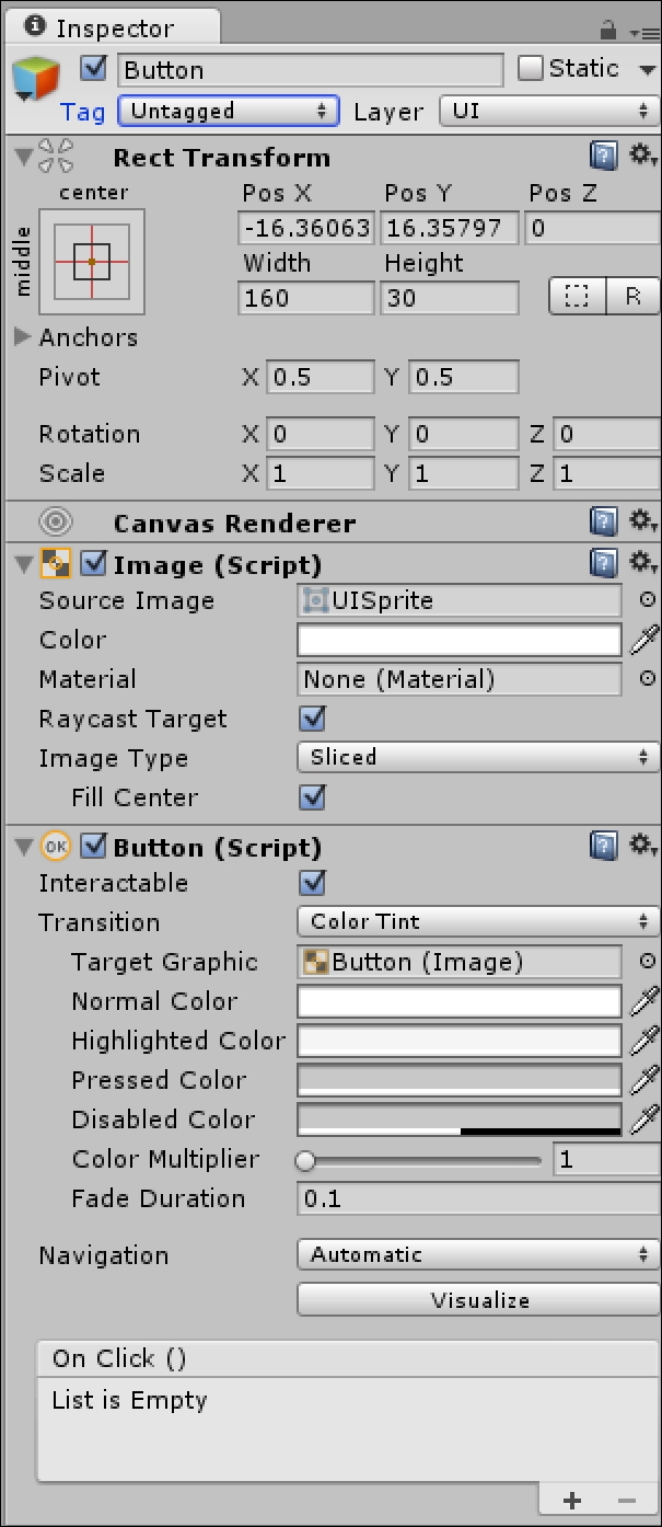
When you create a UI button, the Button component is automatically added to it, but an Image component is also automatically added to it. This determines what the Button will look like in its normal state.
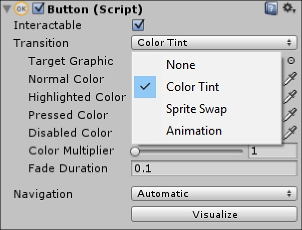
Transition types
By selecting from the Transition drop-down menu, you can determine how the button reacts to being pressed, when it is hovered over, or when it is disabled. The three Transition options are Color Tint, Sprite Swap, and Animation, as shown in the following screenshot:
Text child
When a UI Button is created, a Text child is automatically added to the Button, as shown in the following screenshot:
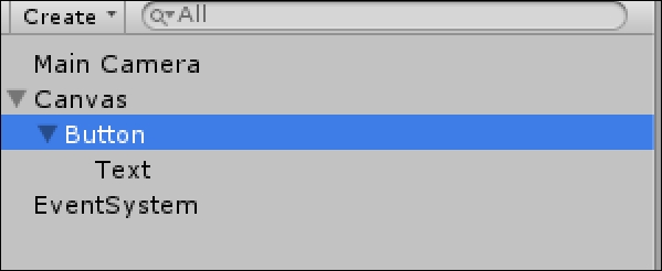
This child gives the button a Text label. If you don't want it, you can simply delete the child. In the following screenshot, the Button object's Text child is selected and its...


