Search icon CANCEL
Subscription
0
Cart icon
Your Cart (0 item)
Close icon
You have no products in your basket yet
Save more on your purchases! discount-offer-chevron-icon
Savings automatically calculated. No voucher code required.
Arrow left icon
Explore Products
Best Sellers
New Releases
Books
Videos
Audiobooks
Learning Hub
Free Learning
Arrow right icon
Arrow up icon
GO TO TOP
Mastering Data Visualization with Microsoft Visio Professional 2016

You're reading from   Mastering Data Visualization with Microsoft Visio Professional 2016 Master the art of presenting information visually using Microsoft Visio Professional 2016 and Visio Pro for Office365

Arrow left icon
Product type Paperback
Published in May 2016
Publisher Packt
ISBN-13 9781785882661
Length 334 pages
Edition 1st Edition
Arrow right icon
Author (1):
Arrow left icon
John Marshall John Marshall
Author Profile Icon John Marshall
John Marshall
Arrow right icon
View More author details
Toc

Table of Contents (13) Chapters Close

Preface 1. Data within Visio Essentials 2. Understanding How Data Is Stored within Visio FREE CHAPTER 3. Linking Data to Shapes 4. Using the Built-In Data Graphics 5. Using the Pivot Diagram Add-On 6. Creating Custom Master Shapes 7. Creating Custom Data Graphics 8. Validating and Extracting Information 9. Automating Structured Diagrams 10. Sharing Data Diagrams 11. Choosing a Deployment Methodology Index

Choosing a data source


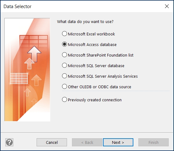
A Pivot Diagram can be started from the Business | PivotDiagram template or from the Insert PivotDiagram ribbon button, which can be added using the Customize the Ribbon… tool. The Data Selector dialog that is presented is almost identical to the one opened by Data | Custom Import, except for the additional Microsoft SQL Server Analysis Services option, as seen in the following screenshot:
The queryPersonnel query from the Microsoft Access database, OrgData.accdb, that was used in Chapter 3, Linking Data to Shapes, has been used for the following example. The next screenshot demonstrates how any numerical and date columns are automatically presented as options in the Add Total box in the PivotDiagram window:
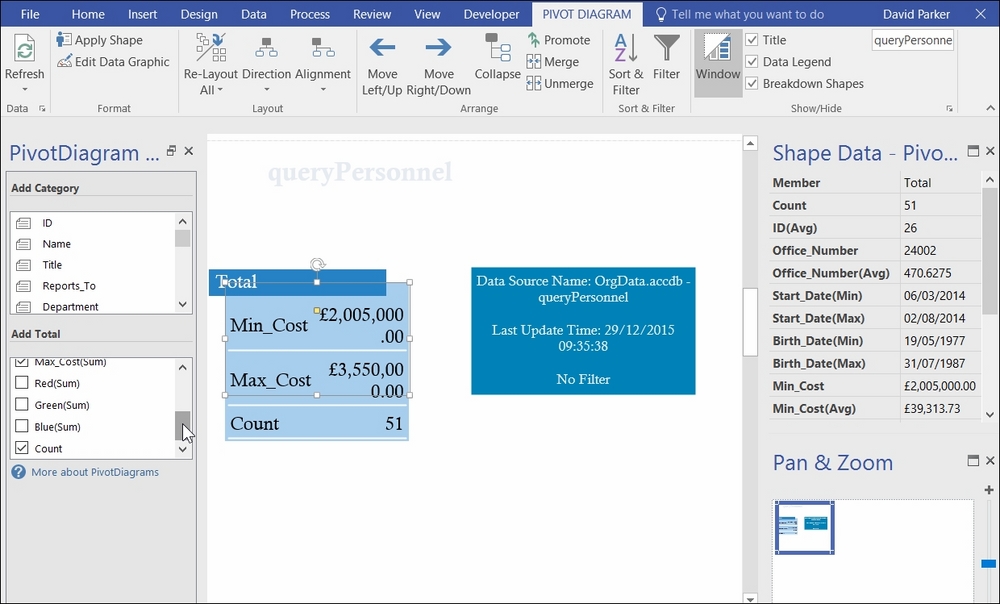
Ticking and unticking columns in the Add Total box will cause the Data Graphics on the Total shape to change. This shape is actually an instance of a master called Pivot Node, which is present in the document stencil.

The add-on has its own ribbon tab labeled PIVOT...

lock icon The rest of the chapter is locked
Register for a free Packt account to unlock a world of extra content!
A free Packt account unlocks extra newsletters, articles, discounted offers, and much more. Start advancing your knowledge today.
Unlock this book and the full library FREE for 7 days
Get unlimited access to 7000+ expert-authored eBooks and videos courses covering every tech area you can think of
Renews at $19.99/month. Cancel anytime
Banner background image