


R visualizations in Jupyter
A common use of R is to use several visualizations, which are available depending on the underlying data. In this section, we will go over some of them to see how R interacts with Jupyter.
R 3D graphics in Jupyter
One of the packages available for 3D graphics is persp. The persp package draws perspective plots over a 2D space.
We can enter a basic persp command in a new notebook and have something like this:
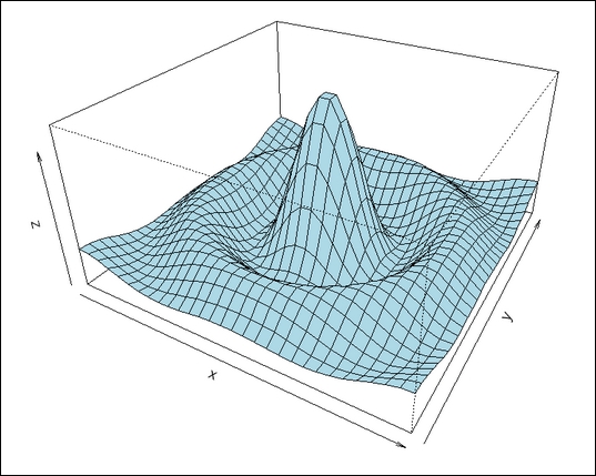
Once we run the step (Cell | Run All), we can see the display in the following screenshot. The first part is the script involved to generate the graphic (this is part of the example code):

Then we see the following graphic display:
R 3D scatterplot in Jupyter
The R lattice package has a cloud function that will produce 3D scatterplots.
The script we will use is as follows:
# make sure lattice package is installed
install.package("lattice")
# in a standalone R script you would have a command to download the lattice library - this is not needed in Jupyter
library...


