Using the horizontal drop-down menu as the main menu
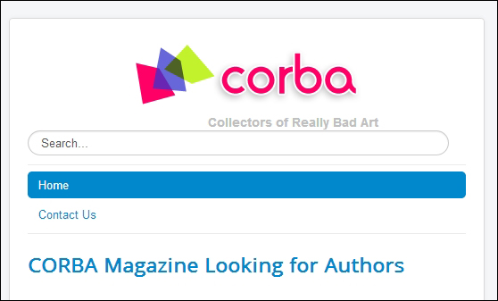
In Joomla 3.5, the horizontal top menu is in fact the most important site menu. Not only is it visually prominent, it's also the menu that will remain visible even if the website is shown on the small screen of a smartphone or tablet computer. Joomla's default template, Protostar, is set up to automatically adapt to such small screens. However, the content layout does change when the site is displayed on a smaller screen—you can try that out now by resizing the browser window:

As you can see, the top menu remains visible, but the right-hand side column (containing the This Site menu) has disappeared. In fact, the right column content is still there, but you need to scroll down all the way to the bottom of the screen to see it.
This means that in our current site (using the default site template), it would be better if we were to use the top menu as our default site menu. Right now, that's not the case, but it&apos...


