


Adding a reference band
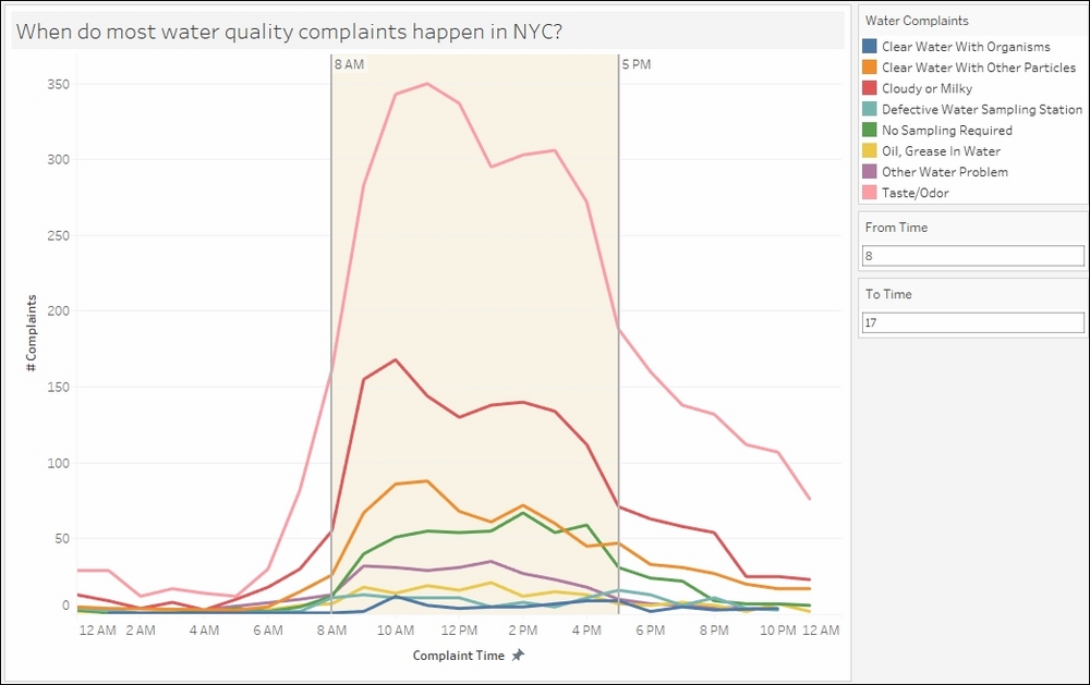
A reference band creates a banded or shaded area in a chart, and can show if other points fall within a range or interest or not.
In this recipe, will highlight the time range when water quality complaints are filed using a reference band:
Getting ready
To follow this recipe, open B05527_06 – STARTER.twbx. Use the worksheet called Reference Band and connect to the NYC Water Quality Complaints data source:
How to do it...
The following are the steps to create the time series graph with reference band in this recipe:
From Dimensions, right-click and drag Created Date DT to Columns and select Discrete Hour:

Right-click on the HOUR(Created Date DT) field in Columns and select Continuous.
Right-click on the HOUR(Created Date DT) field in Columns, and select Format. On the side bar, under Scale, choose 12-Hour format for Dates:

Right-click on the Created Date DT axis to edit axis. Change the axis title to # Complaints.
From Measures, drag Number of Records to Rows.
Edit the Number...


