What is WinUI?
The WinUI library is a set of controls and UI components that have been extracted from the Windows SDK. After this separation, many controls have been enhanced and others have been added. The libraries have been made available as open source on GitHub and are maintained by Microsoft and the Windows developer community.
So, if these WinUI libraries came from UWP libraries in the Windows SDK, you may be wondering why you should choose WinUI as your UI framework instead of UWP. UWP has been around since the launch of Windows 10 and is quite robust and stable. There are actually several very good reasons to consider WinUI.
Choosing WinUI brings with it all the benefits of open source. Open source software (OSS) is typically very reliable. When software is developed in the open by an active developer community, issues are found and resolved quickly. In fact, if you find an issue with an open source package, you can fix it yourself and submit a pull request to have the fix made available to the rest of the community. Open source projects can iterate quickly without having to remain in sync with product groups in a large enterprise such as the Windows team. Windows releases feature updates on a regular cadence now, but this is still less frequent than with a typical control library.
The best reason to use WinUI is its backward compatibility. When using a UWP control, the features and fixes in a specific version of the control cannot be deployed in apps to older versions of Windows. With WinUI, so long as you are targeting the minimum version of Windows supported by WinUI as a whole, you can use those new controls and features in multiple Windows versions. Controls not previously available to UWP developers on one version of Windows are now available there as WinUI controls.
For instance, Microsoft did not introduce the Fluent UI design to Windows until the Fall 2017 release (version 16299). However, WinUI controls can be included in apps targeting a minimum Windows version of 10.0.15063.0, the Spring 2017 release. The controls in WinUI support Fluent UI styles. WinUI adds controls and other features that are not available at all in UWP and the Windows SDK.
The first WinUI release
The first version of WinUI was released in July 2018 as a preview release for Windows developers. It was released as the following two NuGet packages:
Microsoft.UI.Xaml: The WinUI controls and Fluent UI styles.Microsoft.UI.Xaml.Core.Direct: Components for middleware developers to access theXamlDirectAPI.
3 months later, WinUI 2.0 was released. Despite the version number, it was the first production release of WinUI. The release included more than 20 controls and brushes. A few notable controls included the following:
TreeView: A staple of any UI library.ColorPicker: A rich visual color picker with a color spectrum.DropDownButton: A button with the ability to open a menu.PersonPicture: An image control for displaying an avatar. It has the ability to fall back to displaying initials or a generic placeholder image.RatingControl: Allows users to enter star ratings for items.
Let's add a few of these controls to our WinUI project and see how they look. Change the contents of the StackPanel to look like this:
<StackPanel Grid.Row="1" Grid.Column="1" Margin="0,4,0,0"
            HorizontalAlignment="Right"
            VerticalAlignment="Top"
            Orientation="Horizontal">
    <PersonPicture Initials="MS" Margin="0,0,8,0"/>
    <DropDownButton Content="Submit" Margin="0,0,4,0">
        <DropDownButton.Flyout>
            <MenuFlyout Placement="Bottom">
                <MenuFlyoutItem Text="Submit + Print"/>
                <MenuFlyoutItem Text="Submit + Email"/>
            </MenuFlyout>
        </DropDownButton.Flyout>
    </DropDownButton>
    <Button Content="Cancel"/>
</StackPanel>
A PersonPicture control with the initials MS has been added as the first item in the StackPanel, and the first of the two buttons has been replaced by a DropDownButton control. The Submit DropDownButton control has a FlyoutMenu serving as a drop-down list, and there are two MenuFlyoutMenuItem elements. Now, users can simply click the Submit button, or they can select Submit + Print or Submit + Email from the drop-down list.
Note
DropDownButton is only available in Windows 10 version 1809 and later. If you use this control in a production application, you should set this as your minimum version for the project.
This is how the new window appears with the DropDownButton menu shown:
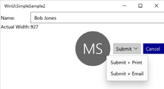
Figure 1.8 – Adding a PersonPicture and DropDownButton control
We're only scratching the surface of what the first release can do for Windows developers. Don't worry, as we will dive much deeper in the chapters ahead. Let's briefly look at what was added in subsequent versions leading to WinUI 3.0.
The road to WinUI 3.0
There have been five additional minor releases of WinUI following v2.0, in addition to many incremental bug fixes and prerelease versions.
WinUI 2.1
The WinUI 2.1 release brought a number of new controls and features to the library. These are some highlights:
TeachingTip: Think ofTeachingTipas a rich, context-sensitive tooltip. It is linked to another element on the page and displays informative details about the target element to help guide users with non-intrusive content as needed.AnimatedVisualPlayer: This hosts Lottie animations. Lottie files are a popular animation format created in Adobe After Effects used by designers across Windows, the web, and mobile platforms. There are libraries available to host Lottie animations for most modern development frameworks.Note
Get more information about Lottie files on their website at https://airbnb.design/lottie/ and check out this great repository of Lottie animation files: https://lottiefiles.com/
CompactDensity: Adding this resource dictionary to your app can provide the ability to switch between Compact and Normal display modes.CompactDensitywill reduce the spacing within and between elements on the page, providing up to 33% more visible content to users. This Fluent UI design concept was introduced to developers at Microsoft's Build 2018 conference.
WinUI 2.2
This release brought many enhancements to existing features. However, the single new control added to the library is one that many Windows developers will find useful.
The TabView control creates a familiar tabbed user experience on the screen. Each tab can host a page in your WinUI project.
WinUI 2.2 enhancements
A few of the notable updated controls and libraries in version 2.2 are listed here:
- NavigationView: The
NavigationViewcontrol was enhanced to allow the back button to remain visible when the panel is collapsed. Other visual updates maximize the viewable content of the control. - Visual Styles: Many of the WinUI visual styles were updated, including
CornerRadius,BorderThickness,CheckBox, andRadioButton. The updates all make the WinUI visuals more consistent and in line with Fluent UI design guidelines.
WinUI 2.3
In the WinUI 2.3 release, the ProgressBar received some updates, and a couple of new controls were added to the library.
There are now two modes available when creating a Progress Bar in a WinUI application: Determinate and Indeterminate. A determinate progress bar has a known amount of the task to complete and a known current state of the task. An indeterminate control indicates that a task is ongoing without a known completion time. Its purpose to similar to that of a busy indicator.
New controls in WinUI 2.3
The following are a few new controls in this update:
NumberBox: ANumberBoxcontrol is an input editor that makes it easy to support numeric formatting, up/down incrementing buttons, and inline mathematic calculations. It is a seemingly simple but practical and powerful control.RadioButtons: You might be thinking: Radio buttons have always been available. How is this a new control?RadioButtonsis actually a control that groups a set ofRadioButton(singular) controls, making it easier to work with them as a single unit.
WinUI 2.4
When it was released in May 2020, two new features were made available in WinUI 2.4: a RadialGradientBrush visual and a ProgressRing control.
The brush is similar in use to the RadialGradientBrush used by WPF developers. It makes it easy to add a gradient to a visual element that radiates out from a central point.
The ProgressRing control, as it sounds, recreates progress bar functionality in a circular format. The control is available with a determinate state and an indeterminate state in version 2.4. An indeterminate ProgressRing control displays a repeating animation and is the default state of the control.
Several controls were updated in version 2.4. The TabView control was updated to provide more control over how tabs are rendered, including Compact, Equal, and Size to Content modes. TextBox controls received a dark mode enhancement to keep the content area of the control dark, with white text by default. Finally, the NavigationView control was updated with hierarchical navigation, with Left, Top, and LeftCompact modes.
WinUI 2.5
WinUI 2.5 was released in December 2020 and included a new InfoBar control. Several control enhancements and bug fixes were also included in the release.
The InfoBar control provides a way to display important status messages to users. The control can display an alert or informational icon, a status message, and a link or button allowing users to take action on a message. There is also an option to display a close button to the right of the message. By default, the control includes an icon, message, and close button. Microsoft Docs provides usage guidelines for this new control: https://docs.microsoft.com/en-us/windows/uwp/design/controls-and-patterns/infobar.
Several updates are also available in version 2.5. The ProgressRing control received enhancements to the determinate state of the control. The NavigationView control was updated to provide customizable FooterMenuItems. In previous versions of the NavigationView control, the footer area could be shown or hidden but not customized.
We've seen what was available to UWP developers in WinUI 2.x. Now, let's see what you get with WinUI 3.0.


