


Visualizing the Russian election data
We previously saw that a histogram of the UK election turnout was approximately normal (albeit with light tails). Now that we've loaded and transformed the Russian election data, let's see how it compares:
(defn ex-1-30 []
  (-> (i/$ :turnout (load-data :ru-victors))
      (c/histogram :x-label "Russia turnout"
                   :nbins 20)
      (i/view)))
The preceding example generates the following histogram:
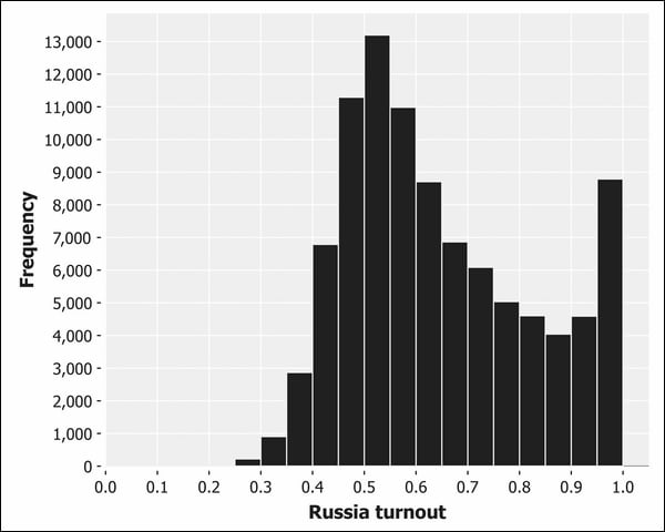
This histogram doesn't look at all like the classic bell-shaped curves we've seen so far. There's a pronounced positive skew, and the voter turnout actually increases from 80 percent towards 100 percent—the opposite of what we would expect from normally-distributed data.
Given the expectations set by the UK data and by the central limit theorem, this is a curious result. Let's visualize the data with a Q-Q plot instead:
(defn ex-1-31 []
  (->> (load-data :ru-victors)
       (i/$ :turnout)
       (c/qq-plot)
       (i/view)))
This returns the following plot:
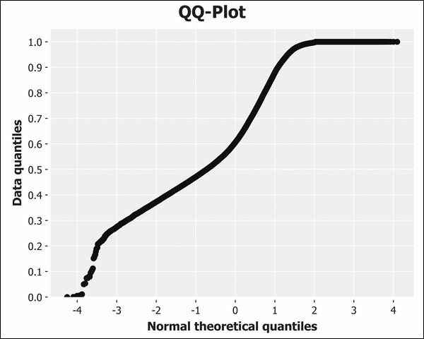
This Q-Q plot is neither a straight line nor a particularly S-shaped curve. In fact, the Q-Q plot suggests a light tail at the top end of the distribution and a heavy tail at the bottom. This is almost the opposite of what we see on the histogram, which clearly indicates an extremely heavy right tail.
In fact, it's precisely because the tail is so heavy that the Q-Q plot is misleading: the density of points between 0.5 and 1.0 on the histogram suggests that the peak should be around 0.7 with a right tail continuing beyond 1.0. It's clearly illogical that we would have a percentage exceeding 100 percent but the Q-Q plot doesn't account for this (it doesn't know we're plotting percentages), so the sudden absence of data beyond 1.0 is interpreted as a clipped right tail.
Given the central limit theorem, and what we've observed with the UK election data, the tendency towards 100 percent voter turnout is curious. Let's compare the UK and Russia datasets side-by-side.


