Always Give Icons a Text Label
Now, I don’t mean text on the icon (see #37, Never Use Text on Icons)—I mean a text label near the icon, not just an icon on a button on its own.
Small, nondescript buttons, with obscure mystery icons on them, are next to useless and consistently perform terribly in user tests.

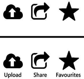
Figure 38.1: Which is easier to understand?
Let’s go back to the original purpose of an icon—to provide a quick visual shorthand by which the user can instantly recognize a control, and to provide a target for the user to click or tap. The icon isn’t meant to describe a button the first time that the user sees it—the user will need a text label for that. However, if the icon is distinct and recognizable, then the user will locate the control and recall its purpose more quickly with it.
Our old favorites, the Nielsen Norman Group, have a great shortcut for this, the “5-second rule”:
If it takes...


