Using the new Settings screen
If you work in IT and have been using Windows 10 on a client machine for any amount of time, it's a sure bet that you have stumbled across the new Settings interface. Perhaps accidentally, as was the case for me, the first time I saw it. I have watched a number of people now bump into the Settings interface for the first time when trying to view or configure Windows Updates. You see, settings in Windows Server 2016 are just what the name implies, an interface from which you configure various settings within the operating system. What's so hard or confusing about that? Well, we already have a landing platform for all of the settings contained inside Windows that has been around for a zillion years. It's called Control Panel.
The Settings menu inside Windows isn't a brand new idea, but looks and feels quite new for Server 2016. Our predecessor, Windows Server 2012 and 2012 R2, had a quasi-presence of settings that as far as I know went largely unused by systems administrators. I believe that to be the effect of poor execution as the Settings menu in 2012 was accessed and hidden behind the Charms bar, which most folks have decided was a terrible idea. Not to spend too much time on technology of the past, but the Charms bar in Server 2012 was a menu that presented itself when you swiped your finger in from the right edge of the screen. Yes, you are correct, servers don't have touchscreens. Not any that I have ever worked on, anyway. So the Charms bar also presented when you hovered the mouse up near the top-right of the screen. It was quite difficult to access, yet seemed to show up whenever you didn't want it to, like when you were trying to click on something near the right of the desktop and instead you clicked on something inside the Charms bar that suddenly appeared.
I am only giving you this background information in order to segue into this next idea. Much of the user interface in Windows 10, and therefore Windows Server 2016, can be considered a small step backward from the realm of finger swipes and touch screens. Windows 8 and Server 2012 were so focused on big app buttons and finger swipes that a lot of people got lost in the shuffle. It was so different than what we had ever seen before and difficult to use at an administrative level. Because of feedback received from that release, the graphical interface and user controls, including both the Start menu and the Settings menu in Windows Server 2016, are sort of smack-dab in the middle between Server 2008 and Server 2012. This backwards step was the right one, and I have heard nothing but praise so far on the new user interface.
So, getting back to the Settings menu, if you click on your Start button, then All Apps, and then on Settings, you will see this new interface:

There are many settings and pieces of the operating system that you can configure in this new Settings menu. Some settings in Windows now only exist in this interface, but many can still be accessed either here or through the traditional Control Panel. The goal seems to be a shift toward all configurations being done through the new menu in future releases, but for now we can still administer most setting changes through our traditional methods if we so choose. I mentioned Windows Updates earlier; that is a good example to look over. Traditionally, we would configure our Windows Update settings via the Control Panel, but they have now been completely migrated over to the new Settings menu in Windows Server 2016. Search the Control Panel for Windows Update, and the only result is that you can view currently installed updates. But if you search the new Settings menu for Windows Update, you'll find it right away.
Tip
Remember, you can always use the Windows search feature to look for any setting! Hit your WinKey and type Windows Update and you'll be given quick links that take you straight into the appropriate Settings menu.
For the moment, you will have to use a combination of Control Panel and the Settings menu in order to do your work. It gets confusing occasionally. Sometimes you will even click on something inside the Settings menu, and it will launch a Control Panel window! Try it out. Open up the Settings menu and click on Network & Internet. Click on Ethernet in the left column. Here you can see the status of your network cards, but you can't change anything, such as changing an IP address. Then, you notice the link for Change adapter options. Oh yeah, that sounds like what I want to do. Click on Change adapter options, and you are taken right into the traditional Network Connections screen:

Two ways to do the same thing
Potentially confusing as well, until you get used to navigating around in here, is that you can sometimes accomplish the same task in either Control Panel or Settings menu, but the process that you take in each interface can have a vastly different look and feel. Sometimes you can actually accomplish the same task, and sometimes you just think that you can. What do I mean by that? A good example we can follow is to create a new user account.
Creating a new user through the Control Panel
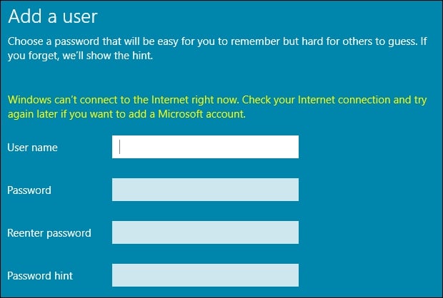
You are probably pretty familiar with this. Open Control Panel and click on User Accounts. Then, click on the User Accounts heading. Now, click on the link to Manage another account. Inside this screen is your option to Add a user account. Click on that and you get the dialog box where you enter a username and password for your new user.

Creating a new user through the Settings menu
Let's take this thing for a test drive. Open the Settings menu, and click on Accounts. Now, click on Other People in the left column. There is clearly an option here that looks like it will allow us to create a new user. I can even see the new testing user account that I created a minute ago with Control Panel. Go ahead and click on Add someone else to this PC.

So we also have here the ability to add a new user to this server, but by using the more traditional Iusrmgr tool.
We walked through this simple example of attempting to do the same function through two different interfaces to showcase that there are some items which can and must be performed within the new Settings menu context, but there are many functions within Windows that still need to be accomplished through our traditional interfaces. While Control Panel continues existence, and probably will for a very long time, you should start navigating your way around the Settings menu and figure out what is available inside so that you can start to shape your ideas for the best combination of both worlds in order to manage your servers effectively.
Just one last thing to point out as we start getting comfortable with the way that the new Settings menu looks. Many of the settings that we configure in our servers are on/off types of settings. By that I mean we are setting something to either one option or another. Typically, these kinds of configurations are handled by either drop-down menus or by radio buttons. That is normal; that is expected; that is Windows. Now you will start to see little swipe bars, or sliders, that allow you to switch settings on or off, like a light switch. Anyone who has used the settings interface of any smart phone knows exactly what I am talking about. This user interface behavior has now made its way into the full Windows operating systems, and is likely here to stay. Just to give you an idea of what it looks like inside the context of the new Settings menu, here is a screenshot of the Windows Defender page inside the Update & Security settings:


