Search icon CANCEL
Arrow left icon
Explore Products
Best Sellers
New Releases
Books
Videos
Audiobooks
Learning Hub
Conferences
Free Learning
Arrow right icon
Arrow up icon
GO TO TOP
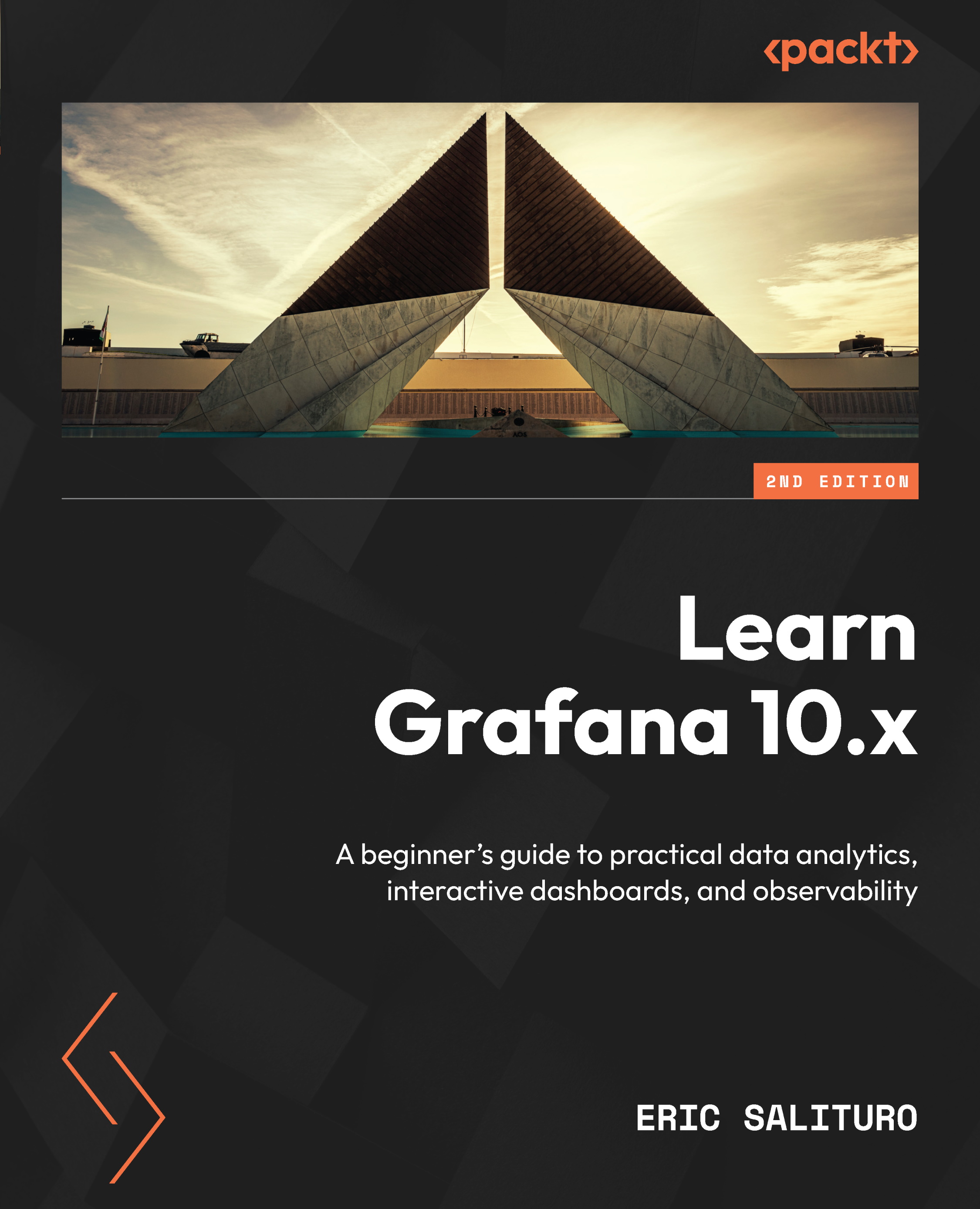
Learn Grafana 10.x

You're reading from   Learn Grafana 10.x A beginner's guide to practical data analytics, interactive dashboards, and observability

Arrow left icon
Product type Paperback
Published in Dec 2023
Publisher Packt
ISBN-13 9781803231082
Length 542 pages
Edition 2nd Edition
Languages
Tools
Arrow right icon
Author (1):
Arrow left icon
Eric Salituro Eric Salituro
Author Profile Icon Eric Salituro
Eric Salituro
Arrow right icon
View More author details
Toc

Table of Contents (23) Chapters Close

Preface 1. Part 1 – Getting Started with Grafana
2. Chapter 1: Introducing Data Visualization with Grafana FREE CHAPTER 3. Chapter 2: Touring the Grafana Interface 4. Chapter 3: Diving into Grafana's Time Series Visualization 5. Part 2 – Real-World Grafana
6. Chapter 4: Connecting Grafana to a Prometheus Data Source 7. Chapter 5: Extracting and Visualizing Data with InfluxDB and Grafana 8. Chapter 6: Shaping Data with Grafana Transformations 9. Chapter 7: Surveying Key Grafana Visualizations 10. Chapter 8: Surveying Additional Grafana Visualizations 11. Chapter 9: Creating Insightful Dashboards 12. Chapter 10: Working with Advanced Dashboard Features and Elasticsearch 13. Chapter 11: Streaming Real-Time IoT Data from Telegraf Agent to Grafana Live 14. Chapter 12: Monitoring Data Streams with Grafana Alerts 15. Chapter 13: Exploring Log Data with Grafana’s Loki 16. Part 3 – Managing Grafana
17. Chapter 14: Organizing Dashboards and Folders 18. Chapter 15: Managing Permissions for Users, Teams, and Organizations 19. Chapter 16: Authenticating Grafana Logins Using LDAP or OAuth 2 Providers 20. Chapter 17: Cloud Monitoring AWS, Azure, and GCP 21. Index 22. Other Books You May Enjoy

Reviewing the table visualization

Our first visualization is one of the least graphically interesting of the visualizations you will encounter in Grafana. We introduced it in the previous chapter, mostly to expedite the visualization of raw data. However, there is more to the table visualization, so let’s see how it is not simply a tool for displaying raw data (although it does do that too).

As you may know, the table visualization provides a spreadsheet-like data grid that is useful if you want to see the rows of actual data, along with any aggregations. When rolling up your data series into an aggregation or troubleshooting transformation functions, the table visualization can be more useful than the table view.

Comparing aggregations

To give you an idea of how the table visualization compares to the time series visualization legend table, let’s create a panel and have it display a set of common aggregations. Create a new panel and select Table from the visualization...

lock icon The rest of the chapter is locked
Register for a free Packt account to unlock a world of extra content!
A free Packt account unlocks extra newsletters, articles, discounted offers, and much more. Start advancing your knowledge today.
Unlock this book and the full library FREE for 7 days
Get unlimited access to 7000+ expert-authored eBooks and videos courses covering every tech area you can think of
Renews at AU $24.99/month. Cancel anytime