Search icon CANCEL
Arrow left icon
Explore Products
Best Sellers
New Releases
Books
Videos
Audiobooks
Learning Hub
Conferences
Free Learning
Arrow right icon
Arrow up icon
GO TO TOP
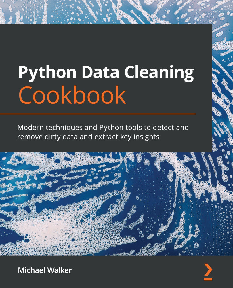
Python Data Cleaning Cookbook

You're reading from   Python Data Cleaning Cookbook Modern techniques and Python tools to detect and remove dirty data and extract key insights

Arrow left icon
Product type Paperback
Published in Dec 2020
Publisher Packt
ISBN-13 9781800565661
Length 436 pages
Edition 1st Edition
Languages
Tools
Arrow right icon
Authors (2):
Arrow left icon
Michael B Walker Michael B Walker
Author Profile Icon Michael B Walker
Michael B Walker
Michael Walker Michael Walker
Author Profile Icon Michael Walker
Michael Walker
Arrow right icon
View More author details
Toc

Table of Contents (12) Chapters Close

Preface 1. Chapter 1: Anticipating Data Cleaning Issues when Importing Tabular Data into pandas 2. Chapter 2: Anticipating Data Cleaning Issues when Importing HTML and JSON into pandas FREE CHAPTER 3. Chapter 3: Taking the Measure of Your Data 4. Chapter 4: Identifying Missing Values and Outliers in Subsets of Data 5. Chapter 5: Using Visualizations for the Identification of Unexpected Values 6. Chapter 6: Cleaning and Exploring Data with Series Operations 7. Chapter 7: Fixing Messy Data when Aggregating 8. Chapter 8: Addressing Data Issues When Combining DataFrames 9. Chapter 9: Tidying and Reshaping Data 10. Chapter 10: User-Defined Functions and Classes to Automate Data Cleaning 11. Other Books You May Enjoy

Using grouped boxplots to uncover unexpected values in a particular group

We saw in the previous recipe that boxplots are a great tool for examining the distribution of continuous variables. They can also be useful when we want to see if those variables are distributed differently for parts of our dataset: salaries for different age groups; number of children by marital status; litter size for different mammal species. Grouped boxplots are a handy and intuitive way to view differences in variable distribution by categories in our data.

Getting ready

We will work with the NLS and the Covid case data. You will need Matplotlib and Seaborn installed on your computer to run the code in this recipe.

How to do it...

We generate descriptive statistics of weeks worked by highest degree earned. We then use grouped boxplots to visualize the spread of the weeks worked distribution by degree, and of Covid cases by region:

  1. Import the pandas, matplotlib, and seaborn libraries...
lock icon The rest of the chapter is locked
Register for a free Packt account to unlock a world of extra content!
A free Packt account unlocks extra newsletters, articles, discounted offers, and much more. Start advancing your knowledge today.
Unlock this book and the full library FREE for 7 days
Get unlimited access to 7000+ expert-authored eBooks and videos courses covering every tech area you can think of
Renews at €18.99/month. Cancel anytime