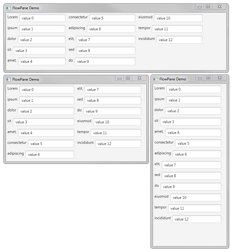
Despite all the listed practices, you can only shrink elements so much. So the next option will be to rearrange them once space becomes a bigger issue.
The easiest thing to adapt is text. It can be naturally split into words into separate lines saving width at the price of height. Most controls which contain text support wrapText property to control that behavior.
Default button behavior is to show ellipses (...) if the text is too long. It can be changed using wrapTextProperty() value:

For other nodes, similar behavior is provided by the FlowPane layout manager.
Note that it doesn't work ideally for all configurations and fluid UI structure may confuse users. Property pages are one convenient example, as shown in the following screenshot:

To create such a UI, we use FlowPane and populate it with properties:
// chapter7/resizing/FlowLayoutDemo.java
FlowPane...


