Gallery controls are designed to allow the consistent repetition of data to be displayed on the screen, for example, when displaying data from a data source. Galleries can be used to display multiple types of data using multiple types of controls to build up a feature-rich display within your app. Changes to the layout are made within the gallery template, which is the first item within the gallery. Any changes that you make within the template are automatically reflected through each repeating section, which means that you don't have to manually update every single row.
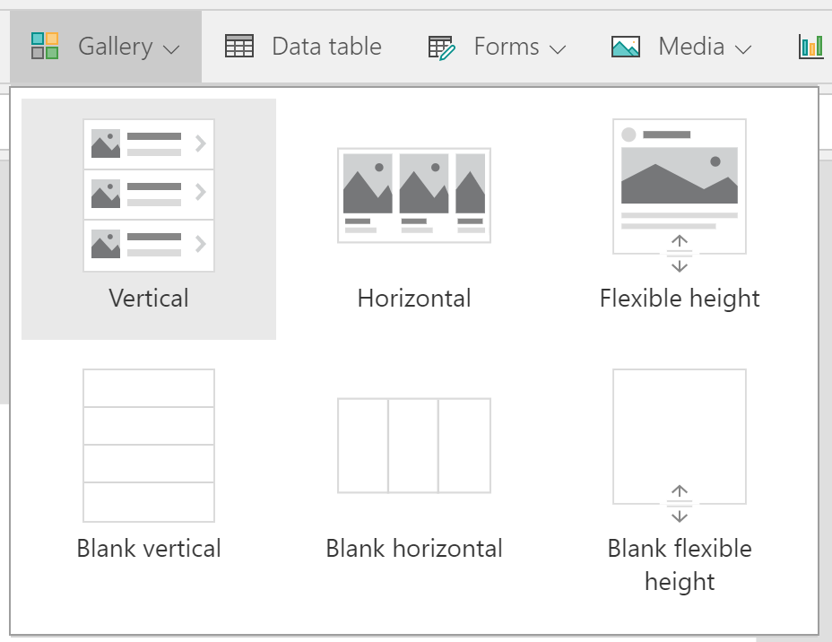
Gallery controls allow you to use three different types of layout within your app:
- Vertical: Each row of data is displayed vertically down the canvas.
- Horizontal: Each row of data is displayed horizontally across the canvas.
- Flexible height: Each row of data is displayed vertically down the page. Here, the row's height will grow with the content:

Figure 5.16: The display options that are...


