Modifying the Explore screen section header
Let’s see what the collection view section header for the Explore screen looks like in the app tour:

Figure 13.1: The collection view section header for the completed Let’s Eat app
There are four elements in this collection view section header: two labels (title and subtitle), a button, and a view (the gray line underneath the title and button).
You have already added a button to the collection view section header of the Explore screen’s collection view in Chapter 11, Building Your User Interface. You will now add labels and views and then modify all elements to match the collection view section header shown in the app tour. Follow these steps:
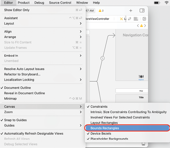
- First, turn on bounds rectangles in the Editor area. This will highlight the bounds of the user interface elements in blue and make them easier to see. Choose Canvas | Bounds Rectangles from the Editor menu to turn them on:

Figure 13.2...


