Android application structure
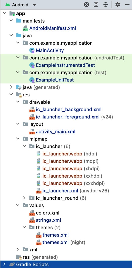
Now that we have covered how the Gradle build tool works, we’ll explore the rest of the project. The simplest way to do this is to examine the folder structure of the app. There is a tool window at the top left of Android Studio called Project, which allows you to browse the contents of your app.
By default, it is set to open/selected when your Android project is first created. When you select it, you will see a view similar to the screenshot in Figure 1.19. If you can’t see any window bars on the left-hand side of the screen, then go to the top toolbar and select View | Appearance | Tool Window Bars and make sure it is ticked.
There are many different options for how to browse your project, but Android will be pre-selected. This view neatly groups the app folder structure, so let’s take a look at it.
Here is an overview of these files with more detail about the most important ones. On opening it, you will see that it consists of the following folder structure:

Figure 1.19 – Overview of the files and folder structure in the app
The Kotlin file (MainActivity), which you’ve specified as running when the app starts, is as follows:
package com.example.myapplication
import androidx.appcompat.app.AppCompatActivity
import android.os.Bundle
class MainActivity : AppCompatActivity() {
    override fun onCreate(savedInstanceState: Bundle?) {
        super.onCreate(savedInstanceState)
        setContentView(R.layout.activity_main)
    }
}
The import statements include the libraries and the source of what this activity uses. The class MainActivity : AppCompatActivity() class header creates a class that extends AppCompatActivity. In Kotlin, the : character is used for both deriving from a class (also known as inheritance) and implementing an interface.
MainActivity derives from androidx.appcompat.app.AppCompatActivity, which is the backward-compatible activity designed to make your app work on older devices.
Android activities have many callback functions you can override at different points of the activity’s life. This is known as the activity lifecycle. For this activity, as you want to display a screen with a layout, you override the onCreate function as shown here:
override fun onCreate(savedInstanceState: Bundle?)
The override keyword in Kotlin specifies that you are providing a specific implementation for a function defined in the parent class. The fun keyword (as you may have guessed) stands for function. The savedInstanceState: Bundle? parameter is Android’s mechanism for restoring previously saved state. For this simple activity, you haven’t stored any state, so this value will be null. The question mark, ?, that follows the type declares that this type can be null.
The super.onCreate(savedInstanceState) line calls through to the overridden method of the base class, and finally, setContentView(R.layout.activity_main) loads the layout we want to display in the activity; otherwise, it would be displayed as a blank screen as no layout has been defined.
Let’s have a look at some other files (Figure 1.19) present in the folder structure:
ExampleInstrumentedTest: This is an example UI test. You can check and verify the flow and structure of your app by running tests on the UI when the app is running.ExampleUnitTest: This is an example unit test. An essential part of creating an Android app is writing unit tests to verify that the source code works as expected.ic_launcher_background.xmlandic_launcher_foreground.xml: These two files together make up the launcher icon of your app in vector format, which will be used by theic_launcher.xmllauncher icon file in Android API 26 (Oreo) and above.activity_main.xml: This is the layout file that was created by Android Studio when we created the project. It is used byMainActivityto draw the initial screen content, which appears when the app runs:<?xml version="1.0" encoding="utf-8"?> <androidx.constraintlayout.widget.ConstraintLayout xmlns:android= "http://schemas.android.com/apk/res/android" xmlns:app="http://schemas.android.com/apk/res-auto" xmlns:tools="http://schemas.android.com/tools" android:layout_width="match_parent" android:layout_height="match_parent" tools:context=".MainActivity"> <TextView android:layout_width="wrap_content" android:layout_height="wrap_content" android:text="Hello World!" app:layout_constraintBottom_toBottomOf="parent" app:layout_constraintEnd_toEndOf="parent" app:layout_constraintStart_toStartOf="parent" app:layout_constraintTop_toTopOf="parent" /> </androidx.constraintlayout.widget.ConstraintLayout>
Screen displays in Android can be created using XML or Jetpack Compose, which uses a declarative API to dynamically build your UI. You will learn Jetpack Compose in Chapter 9. For XML, the documents start with an XML header followed by a top-level ViewGroup (which here is ConstraintLayout) and then one or more nested Views and ViewGroups.
The ConstraintLayout ViewGroup allows very precise positioning of views on a screen, constraining views with parent and sibling views, guidelines, and barriers. Detailed documentation on ConstraintLayout can be found at https://developer.android.com/reference/androidx/constraintlayout/widget/ConstraintLayout.
TextView, currently the only child view of ConstraintLayout, displays text on the screen through the android:text attribute. The horizontal positioning of the view is done by constraining the view to both the start and end of the parent, which centers the view horizontally as both constraints are applied.
From start to end, left-to-right languages (ltr) are read left to right, while non ltr languages are read right to left. The view is positioned vertically in the center by constraining the view to both the top and the bottom of its parent. The result of applying all four constraints centers TextView both horizontally and vertically within ConstraintLayout.
There are three XML namespaces in the ConstraintLayout tag:
xmlns:android: This refers to the Android-specific namespace and it is used for all attributes and values within the main Android SDK.xmlns:app: This namespace is for anything not in the Android SDK. So, in this case,ConstraintLayoutis not part of the main Android SDK but is added as a library.xmnls:tools: This refers to a namespace used for adding metadata to the XML, which indicates where the layout is used (tools:context=".MainActivity"). It is also used to show sample text visible in previews.
The two most important attributes of an Android XML layout file are android:layout_width and android:layout_height.
These can be set to absolute values, usually of density-independent pixels (known as dip or dp) that scale pixel sizes to be roughly equivalent on different density devices. More commonly, however, these attributes have the wrap_content or match_parent values set for them. wrap_content will be as big as required to only enclose its contents. match_parent will be sized according to its parent.
There are other ViewGroups you can use to create layouts. For example, LinearLayout lays out views vertically or horizontally, FrameLayout is usually used to display a single child view, and RelativeLayout is a simpler version of ConstraintLayout, which lays out views positioned relative to the parent and sibling views.
The ic_launcher.webp files are the .webp launcher icons that have an icon for every different density of devices. This image format was created by Google and has greater compression compared to the .png images. As the minimum version of Android we are using is API 21: Android 5.0 (Jelly Bean), these .webp images are included, as support for the launcher vector format was not introduced until Android API 26 (Oreo).
The ic_launcher.xml file uses the vector files (ic_launcher_background.xml and ic_launcher_foreground.xml) to scale to different density devices in Android API 26 (Oreo) and above.
Note
To target different density devices on the Android platform, besides each one of the ic_launcher.png icons, you will see in brackets the density it targets. As devices vary widely in their pixel densities, Google created density buckets so that the correct image would be selected to be displayed depending on how many dots per inch the device has.
The different density qualifiers and their details are as follows:
nodpi: Density-independent resourcesldpi: Low-density screens of 120 dpimdpi: Medium-density screens of 160 dpi (the baseline)hdpi: High-density screens of 240 dpixhdpi: Extra-high-density screens of 320 dpixxhdpi: Extra-extra-high-density screens of 480 dpixxxhdpi: Extra-extra-extra-high-density screens of 640 dpitvdpi: Resources for televisions (approx 213 dpi)
The baseline density bucket was created at 160 dots per inch for medium-density devices and is called mdpi. This represents a device where an inch of the screen is 160 dots/pixels, and the largest display bucket is xxxhdpi, which has 640 dots per inch. Android determines the appropriate image to display based on the individual device.
So, the Pixel 6 emulator has a density of approximately 411dpi, so it uses resources from the extra-extra-high-density bucket (xxhdpi), which is the closest match. Android has a preference for scaling down resources to best match density buckets, so a device with 400dpi, which is halfway between the xhdpi and xxhdpi buckets, is likely to display the 480dpi asset from the xxhdpi bucket.
To create alternative bitmap drawables for different densities, you should follow the 3:4:6:8:12:16 scaling ratio between the six primary densities. For example, if you have a bitmap drawable that’s 48x48 pixels for medium-density screens, all the different sizes should be as follows:
36x36(0.75x) for low density (ldpi)48x48(1.0xbaseline) for medium density (mdpi)72x72(1.5x) for high density (hdpi)96x96(2.0x) for extra-high density (xhdpi)144x144(3.0x) for extra-extra-high density (xxhdpi)192x192(4.0x) for extra-extra-extra-high density (xxxhdpi)
For a comparison of these physical launcher icons per density bucket, refer to the following table:

Figure 1.20 – Comparison of principal density bucket launcher image sizes
Note
Launcher icons are made slightly larger than normal images within your app as they will be used by the device’s launcher. As some launchers can scale up the image, this ensures there is no pixelation and blurring of the image.
Now you are going to look at some of the resources the app uses. These are referenced in XML files and keep the display and formatting of your app consistent.
In the colors.xml file, you define the colors you want to use in your app in hexadecimal format:
<?xml version="1.0" encoding="utf-8"?>
<resources>
    <color name="purple_200">#FFBB86FC</color>
    <color name="purple_500">#FF6200EE</color>
    <color name="purple_700">#FF3700B3</color>
    <color name="teal_200">#FF03DAC5</color>
    <color name="teal_700">#FF018786</color>
    <color name="black">#FF000000</color>
    <color name="white">#FFFFFFFF</color>
</resources>
The format is based on the ARGB color space, so the first two characters are for Alpha (transparency), the next two for Red, the next two for Green, and the last two for Blue. For Alpha, #00 is completely transparent through to #FF, which is completely opaque. For the colors, #00 means none of the color is added to make up the composite color, and #FF means all of the color is added.
If no transparency is required, you can omit the first two characters. So, to create fully blue and 50% transparent blue colors, here’s the format:
    <color name="colorBlue">#0000FF</color>
    <color name=
        "colorBlue50PercentTransparent">#770000FF</color>
The strings.xml file displays all the text displayed in the app:
<resources>
    <string name="app_name">My Application</string>
</resources>
You can use hardcoded strings in your app, but this leads to duplication and also means you cannot customize the text if you want to make the app multilingual. By adding strings as resources, you can also update the string in one place if it is used in different places in the app.
Common styles you would like to use throughout your app are added to the themes.xml file:
<resources xmlns:tools="http://schemas.android.com/tools">
    <!-- Base application theme. -->
    <style name="Theme.MyApplication" parent=
        "Theme.MaterialComponents.DayNight.DarkActionBar">
        <!-- Primary brand color. -->
        <item name="colorPrimary">@color/purple_500</item>
        <item name="colorPrimaryVariant">@color/purple_700
            </item>
        <item name="colorOnPrimary">@color/white</item>
        <!-- Secondary brand color. -->
        <item name="colorSecondary">@color/teal_200</item>
        <item name="colorSecondaryVariant">@color/teal_700
            </item>
        <item name="colorOnSecondary">@color/black</item>
        <!-- Status bar color. -->
        <item name="android:statusBarColor"
            tools:targetApi="l">?attr/colorPrimaryVariant
                </item>
        <!-- Customize your theme here. -->
    </style></resources>
It is possible to apply style information directly to views by setting android:textStyle="bold" as an attribute on TextView. However, you would have to repeat this in multiple places for every TextView you wanted to display in bold. Furthermore, when you start to have multiple style attributes added to individual views, it adds a lot of duplication and can lead to errors when you want to make a change to all similar views and miss changing a style attribute in one view.
If you define a style, you only have to change the style, and it will update all the views that have that style applied to them. A top-level theme was applied to the application tag in the AndroidManifest.xml file when you created the project and is referred to as a theme that styles all views contained within the app.
The colors you have defined in the colors.xml file are used here. In effect, if you change one of the colors defined in the colors.xml file, it will now propagate to style the app as well.
You’ve now explored the core areas of the app. You have added the TextView views to display labels, headings, and blocks of text. In the next exercise, you will be introduced to UI elements allowing the user to interact with your app.
Exercise 1.05 – adding interactive UI elements to display a bespoke greeting to the user
The goal of this exercise is to add the capability of users to add and edit text and then submit this information to display a bespoke greeting with the entered data. You will need to add editable text views to achieve this. The EditText view is typically how this is done and can be added in an XML layout file like this:
<EditText
    android:id="@+id/full_name"
    style="@style/TextAppearance.AppCompat.Title"
    android:layout_width="wrap_content"
    android:layout_height="wrap_content"
    android:hint="@string/first_name" />
This uses an Android TextAppearance.AppCompat.Title style to display a title, as shown in Figure 1.21:

Figure 1.21 – EditText with a hint
Although this is perfectly fine to enable the user to add/edit text, the TextInputEditText material and its wrapper TextInputLayout view give some polish to the EditText display. Here’s how EditText can be updated:
    <com.google.android.material.textfield.TextInputLayout
        android:id="@+id/first_name_wrapper"
        style="@style/text_input_greeting"
        android:layout_width="match_parent"
        android:layout_height="wrap_content"
        android:hint="@string/first_name_text">
        <com.google.android.material.textfield
            .TextInputEditText
            android:id="@+id/first_name"
            android:layout_width="match_parent"
            android:layout_height="wrap_content" />
    </com.google.android.material.textfield.TextInputLayout>
The output is as follows:

Figure 1.22 – The TextInputLayout/TextInputEditText material with a hint
TextInputLayout allows us to create a label for the TextInputEditText view and does a nice animation when the TextInputEditText view is focused (moving to the top of the field) while still displaying the label. The label is specified with android:hint.
You will change the Hello World text in your app so a user can enter their first and last name and further display a greeting by pressing a button. To do this, perform the following steps:
- Create a new Android Studio project as you did in Exercise 1.01, Creating an Android Studio project for your app, called My Application.
- Create the labels and text you are going to use in your app by adding these entries to
app|src|main|res|values|strings.xml:<string name="first_name_text">First name:</string> <string name="last_name_text">Last name:</string> <string name="enter_button_text">Enter</string> <string name="welcome_to_the_app">Welcome to the app</string> <string name="please_enter_a_name">Please enter a full name!</string>
- Next, we will update our styles to use in the layout by adding the following styles to the
app|src|main|res|values|themes.xmltheme:<style name="text_input_greeting" parent="Widget.MaterialComponents.TextInputLayout.OutlinedBox"> <item name="android:layout_margin">8dp</item> </style> <style name="button_greeting"> <item name="android:layout_margin">8dp</item> <item name="android:gravity">center</item> </style> <style name="greeting_display" parent="@style/TextAppearance.MaterialComponents.Body1"> <item name="android:layout_margin">8dp</item> <item name="android:gravity">center</item> <item name="android:layout_height">40dp</item> </style> <style name="screen_layout_margin"> <item name="android:layout_margin">12dp</item> </style>
Note
The parents of some of the styles refer to Material styles, so these styles will be applied directly to the views and the styles specified.
- Now that we have added the styles we want to apply to views in the layout and the text, we can update the layout in
activity_main.xmlin theapp|src|main|res|layoutfolder:<?xml version="1.0" encoding="utf-8"?> <androidx.constraintlayout.widget.ConstraintLayout xmlns:android= "http://schemas.android.com/apk/res/android" xmlns:app="http://schemas.android.com/apk/res-auto" xmlns:tools="http://schemas.android.com/tools" android:layout_width="match_parent" android:layout_height="match_parent" style="@style/screen_layout_margin" tools:context=".MainActivity"> <com.google.android.material.textfield.TextInputLayout android:id="@+id/first_name_wrapper" style="@style/text_input_greeting" android:layout_width="match_parent" android:layout_height="wrap_content" android:hint="@string/first_name_text" app:layout_constraintTop_toTopOf="parent" app:layout_constraintStart_toStartOf="parent"> <com.google.android.material.textfield. TextInputEditText android:id="@+id/first_name" android:layout_width="match_parent" android:layout_ height="wrap_content" /> </com.google.android.material.textfield.TextInputLayout> <com.google.android.material.textfield.TextInputLayout android:id="@+id/last_name_wrapper" style="@style/text_input_greeting" android:layout_width="match_parent" android:layout_height="wrap_content" android:hint="@string/last_name_text" app:layout_constraintTop_toBottomOf="@id/first_name_ wrapper" app:layout_constraintStart_toStartOf="parent"> <com.google.android.material.textfield. TextInputEditText android:id="@+id/last_name" android:layout_width="match_parent" android:layout_ height="wrap_content" /> </com.google.android.material.textfield.TextInputLayout> <com.google.android.material.button.MaterialButton android:layout_width="match_parent" android:layout_height="wrap_content" style="@style/button_greeting" android:id="@+id/enter_button" android:text="@string/enter_button_text" app:layout_constraintTop_toBottomOf="@id/last_name_ wrapper" app:layout_constraintStart_toStartOf="parent"/> <TextView android:id="@+id/greeting_display" android:layout_width="match_parent" style="@style/greeting_display" app:layout_constraintTop_toBottomOf="@id/enter_ button" app:layout_constraintStart_toStartOf="parent" /> </androidx.constraintlayout.widget.ConstraintLayout>
- Run the app and see the look and feel. You have added IDs for all the views so they can be constrained against their siblings and also provide a way in the activity to get the values of the
TextInputEditTextviews. Thestyle="@style.."notation applies the style from thethemes.xmlfile.
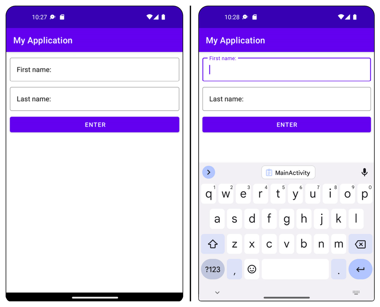
If you select one of the TextInputEditText views, you’ll see the label animated and move to the top of the view:

Figure 1.23 – The TextInputEditText fields with label states with no focus and with focus
- Now, we must add the interaction with the view in our activity. The layout by itself doesn’t do anything other than allow the user to enter text into the
EditTextfields. Clicking the button at this stage will not do anything. You will accomplish this by capturing the entered text by using the IDs of the form fields when the button is pressed and then using the text to populate aTextViewmessage. - Open
MainActivityand complete the next steps to process the entered text and use this data to display a greeting and handle any form input errors. - In the
onCreatefunction, set aClickListeneron the button so we can respond to the button click and retrieve the form data by updatingMainActivityto what is displayed in the following code block:package com.example.myapplication import androidx.appcompat.app.AppCompatActivity import android.os.Bundle import android.view.Gravity import android.widget.Button import android.widget.TextView import android.widget.Toast import com.example.myapplication.R import com.google.android.material.textfield.TextInputEditText class MainActivity : AppCompatActivity() { override fun onCreate(savedInstanceState: Bundle?) { super.onCreate(savedInstanceState) setContentView(R.layout.activity_main) findViewById<Button>(R.id.enter_button)?. setOnClickListener { //Get the greeting display text val greetingDisplay = findViewById<TextView>(R.id.greeting_ display) //Get the first name TextInputEditText value val firstName = findViewById<TextInputEditText>(R. id.first_name) ?.text.toString().trim() //Get the last name TextInputEditText value val lastName = findViewById<TextInputEditText>(R. id.last_name) ?.text.toString().trim() //Add code below this line in step 9 to Check names are not empty here: } } } - Then, check that the trimmed names are not empty and format the name using Kotlin’s string templates:
if (firstName.isNotEmpty() && lastName.isNotEmpty()) { val nameToDisplay = firstName.plus(" ") .plus(lastName) //Use Kotlin's string templates feature to display the name greetingDisplay?.text = " ${getString(R.string. welcome_to_the_app)} ${nameToDisplay}!" } - Finally, show a message if the form fields have not been filled in correctly:
else {
    Toast.makeText(this, getString(R.string.please_
        enter_a_name), Toast.LENGTH_LONG)
        .apply {
            setGravity(Gravity.CENTER, 0, 0)
            show()
        }
}
The Toast specified is a small text dialog that appears above the main layout for a short time to display a message to the user before disappearing.
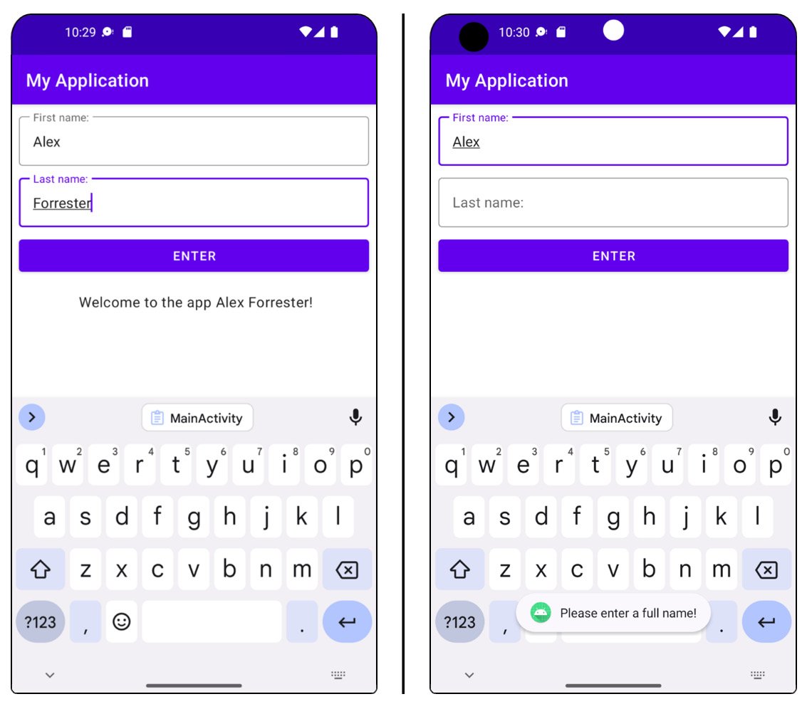
- Run the app and enter text into the fields and verify that a greeting message is shown when both text fields are filled in, and a pop-up message appears with why the greeting hasn’t been set if both fields are not filled in. You should see the following display for each one of these cases:

Figure 1.24 – The app with the name filled in correctly and with an error
The full exercise code can be viewed at https://packt.link/UxbOu.
The preceding exercise introduced you to adding interactivity to your app with the EditText fields that a user can fill in, adding a click listener to respond to button events, and performing some validation.
Accessing Views in layout files
The established way to access Views in layout files is to use findViewById with the name of the View’s ID. So the enter_button button is retrieved by the findViewById<Button>(R.id.enter_button) syntax after the layout has been set in setContentView(R.layout.activity_main) in the Activity.
You will use this technique in this course. Google has also introduced ViewBinding to replace findViewById, which creates a binding class to access Views and has the advantage of null and type safety. You can read about this at https://developer.android.com/topic/libraries/view-binding.
Further input validation
Validating user input is a key concept in processing user data, and you must have seen it in action many times when you’ve not filled in a required field in a form. This is what the previous exercise validated when it checked that the user had entered values into both the first name and last name fields.
There are other validation options that are available directly within XML view elements. Let’s say, for instance, you wanted to validate an IP address entered into a field. You know that an IP address can be four numbers separated by periods/dots where the maximum length of a number is three.
So, the maximum number of characters that can be entered into the field is 15, and only numbers and periods/dots can be entered. Two XML attributes can help us with the validation:
android:digits="0123456789.": This restricts the characters that can be entered into the field by listing all the permitted individual charactersandroid:maxLength="15": This restricts the user from entering more than the maximum number of characters an IP address will consist of
So, this is how you can display this in a form field:
<com.google.android.material.textfield.TextInputLayout style="@style/Widget.MaterialComponents.TextInputLayout.OutlinedBox"
    android:layout_width="match_parent"
    android:layout_height="wrap_content">
    <com.google.android.material.textfield.TextInputEditText  android:id="@+id/ip_address"
    android:digits="0123456789."
    android:layout_width="match_parent"
    android:layout_height="wrap_content"
    android:maxLength="15" />
</com.google.android.material.textfield.TextInputLayout>
This validation restricts the characters that can be input and the maximum length. Additional validation would be required on the sequence of characters and whether they are periods/dots or numbers, as per the IP address format, but it is the first step to assist the user in entering the correct characters. There is also an android:inputType XML attribute, which can be used to specify permitted characters and configure the input options, android:inputType="textPassword", for example, ensures that the characters entered are hidden. android:inputType="Phone" is the input method for a phone number.
With the knowledge gained from the chapter, let’s start with the following activity.
Activity 1.01 – producing an app to create RGB colors
In this activity, we will look into a scenario that uses validation. Suppose you have been tasked with creating an app that shows how the RGB channels of red, green, and blue are added together in the RGB color space to create a color.
Each RGB channel should be added as two hexadecimal characters, where each character can be a value of 0–9 or A–F. The values will then be combined to produce a six-character hexadecimal string that is displayed as a color within the app.
This activity aims to produce a form with editable fields in which the user can add two hexadecimal values for each color. After filling in all three fields, the user should click a button that takes the three values and concatenates them to create a valid hexadecimal color string. This should then be converted to a color and displayed in the UI of the app.
The following steps will help you to complete the activity:
- Create a new Android Studio project as you did in Exercise 1.01, Creating an Android Studio project for your app.
- Add a
Titleconstrained to the top of the layout. - Add a brief description to the user on how to complete the form.
- Add three material
TextInputLayoutfields wrapping threeTextInputEditTextfields that appear underTitle. These should be constrained so that each view is above the other (rather than to the side). Name theTextInputEditTextfieldsRed Channel,Green Channel, andBlue Channel, respectively, and add a restriction to each field to allow entry only of two characters and add hexadecimal characters. - Add a button that takes the inputs from the three color fields.
- Add a view that displays the produced color in the layout.
- Finally, display the RGB color created from the three channels in the layout when the button is pressed and all input is valid.
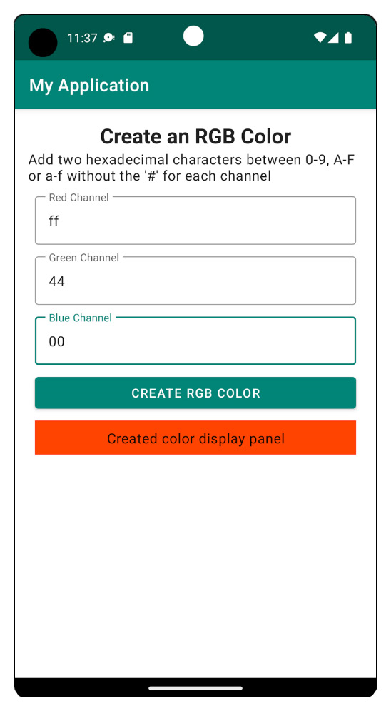
The final output should look like this (the color will vary depending on the inputs):

Figure 1.25 – Output when the color is displayed
Note
The solution to this activity can be found at https://packt.link/By7eE.
Note
When loading all completed projects from the GitHub repository for this course into Android Studio for the first time, do not open the project using File | Open from the top menu. Always use File | New | Import Project. This ensures the app builds correctly. When opening projects after the initial import, you can use File | Open or File | Open Recent.


