Search icon CANCEL
Subscription
0
Cart icon
Your Cart (0 item)
Close icon
You have no products in your basket yet
Save more on your purchases! discount-offer-chevron-icon
Savings automatically calculated. No voucher code required.
Arrow left icon
Explore Products
Best Sellers
New Releases
Books
Videos
Audiobooks
Learning Hub
Newsletter Hub
Free Learning
Arrow right icon
Arrow up icon
GO TO TOP
Unreal Engine 5 Game Development with C++ Scripting

You're reading from   Unreal Engine 5 Game Development with C++ Scripting Become a professional game developer and create fully functional, high-quality games

Arrow left icon
Product type Paperback
Published in Aug 2023
Publisher Packt
ISBN-13 9781804613931
Length 384 pages
Edition 1st Edition
Languages
Tools
Arrow right icon
Author (1):
Arrow left icon
ZHENYU GEORGE LI ZHENYU GEORGE LI
Author Profile Icon ZHENYU GEORGE LI
ZHENYU GEORGE LI
Arrow right icon
View More author details
Toc

Table of Contents (18) Chapters Close

Preface 1. Part 1 – Getting Started with Unreal C++ Scripting
2. Chapter 1: Creating Your First Unreal C++ Game FREE CHAPTER 3. Chapter 2: Editing C++ Code in Visual Studio 4. Chapter 3: Learning C++ and Object-Oriented Programming 5. Chapter 4: Investigating the Shooter Game’s Generated Project and C++ Code 6. Part 2 – C++ Scripting for Unreal Engine
7. Chapter 5: Learning How to Use UE Gameplay Framework Base Classes 8. Chapter 6: Creating Game Actors 9. Chapter 7: Controlling Characters 10. Chapter 8: Handling Collisions 11. Chapter 9: Improving C++ Code Quality 12. Part 3: Making a Complete Multiplayer Game
13. Chapter 10: Making Pangaea a Network Multiplayer Game 14. Chapter 11: Controlling the Game Flow 15. Chapter 12: Polishing and Packaging the Game 16. Index 17. Other Books You May Enjoy

Creating the UI widgets

To create UI widgets, first, select the All | Content | TopDown | Blueprints folder (or wherever you want to place the new widgets in the Content Drawer). Then, right-click in the empty area and choose User Interface | Widget Blueprint from the pop-up menu:
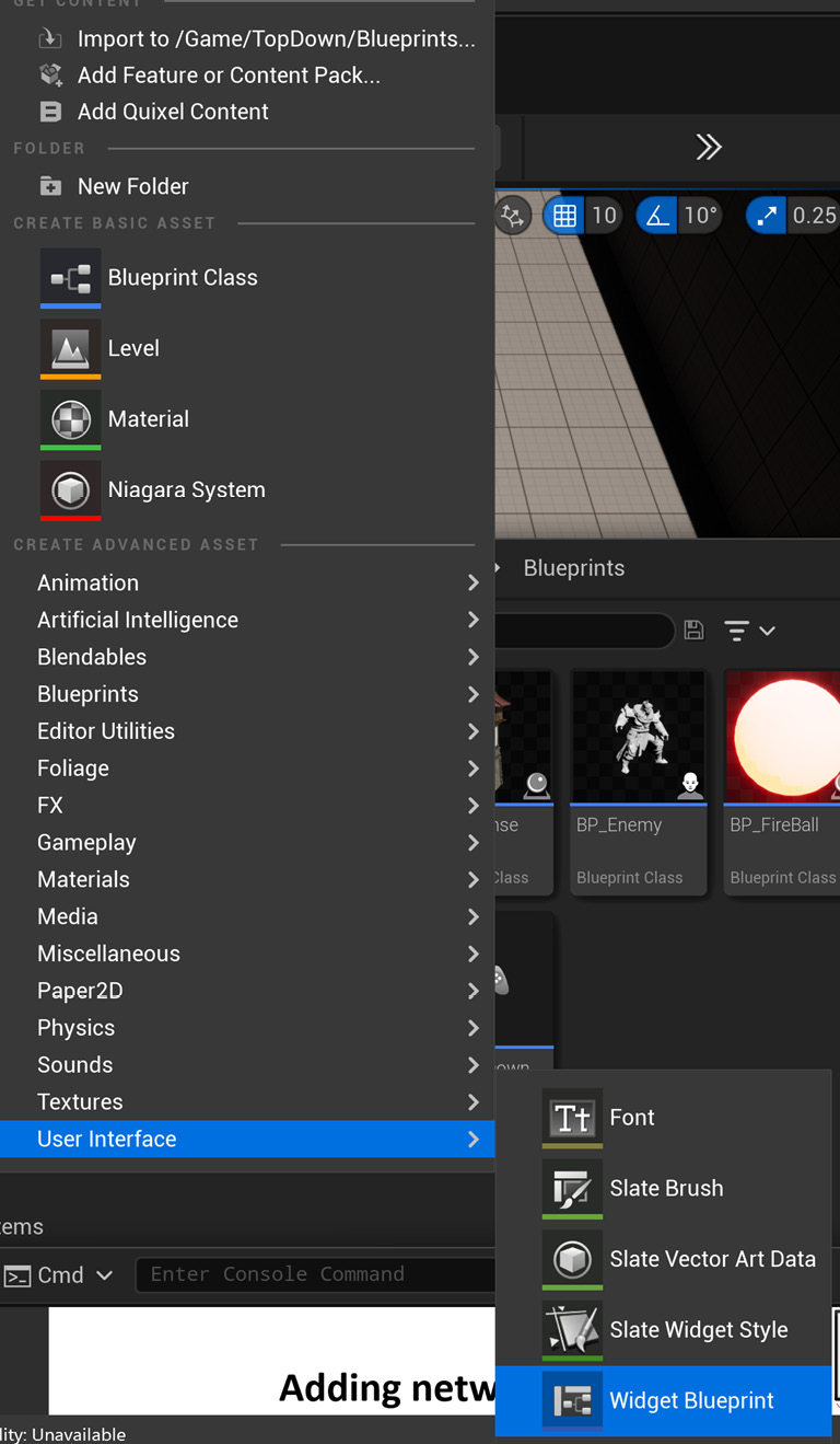
Figure 11.2 – Creating a UI widget from the editor pop-up menu

Figure 11.2 – Creating a UI widget from the editor pop-up menu

Now, click the User Widget button to pick the root widget:
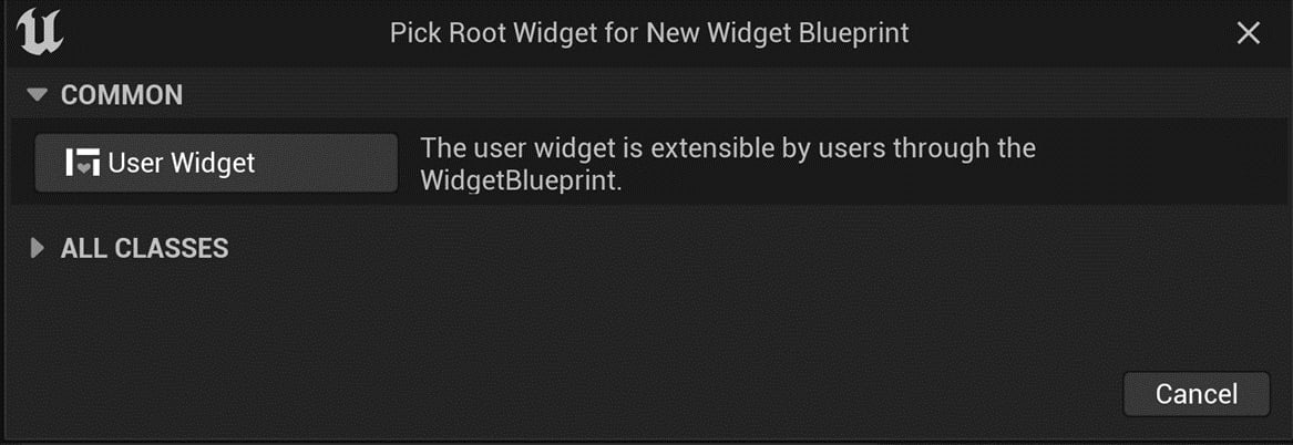
Figure 11.3 – Clicking the User Widget button to create the widget

Figure 11.3 – Clicking the User Widget button to create the widget

After picking the root widget, you should see a new item named NewWidgetBlueprint in the folder:
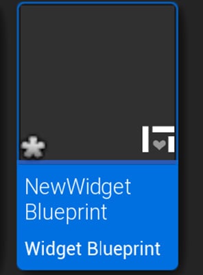
Figure 11.4 – The new widget blueprint

Figure 11.4 – The new widget blueprint

Rename the new widget to the name you want – I will choose BP_LobbyWidget. Then, repeat these steps and create two more widgets called BP_HUDWidget and BP_GameOver.

Now, let’s edit these widgets’ settings.

Creating BP_LobbyWidget

With BP_LobbyWidget created, double-click to open it in the Widget Editor. Now, you can design the user interface, as seen in Figure 11.5. To do this, follow these steps:

  1. Drag and drop a Canvas Panel property onto the screen design area.
  2. Place an Image control onto the screen with the following settings:
    • Name: BGImage
    • Anchors: Stretch Both
    • Alignment: (0.0, 0.0)
    • Brush | Image: LobbyBG (you can download LobbyBG.png from this book’s GitHub/PangaeaAssets folder and import it into the project)
  3. Add a button to the screen with the following settings:
    • Name: ButtonHost
    • Alignment: (0.0, 0.0)
    • Anchors: Center
    • Position X: 1000.0
    • Position Y: 500.0
    • Size X: 500.0
    • Size Y: 120.0
  4. Add a TextBox control as the child of ButtonHost with the following settings:
    • Horizontal Alignment: Center Align Horizontally
    • Vertical Alignment: Center Align Vertically
    • Text: "Host"
    • Color and Opacity (RGBA): (0.04, 0.15, 0.5, 1.0)
    • Font:
      • Font Family: Roboto
      • Type Face: Bold
      • Size: 48
  5. Add one more button to the screen with the following settings:
    • Name: ButtonJoin
    • Anchors: Center
    • Alignment: (0.0, 0.0)
    • Position X: 1000.0
    • Position Y: 700.0
    • Size X: 500.0
    • Size Y: 120.0
  6. Add a TextBox control as the child of ButtonJoin and set it up with the same settings as step 4, except substitute Host with Join.
  7. Add an EditableTextBox control to the screen with the following settings:
    • Name: InputAddress
    • Anchors: Center
    • Alignment: (0.0, 0.0)
    • Position X: 1000.0
    • Position Y: 700.0
    • Size X: 500.0
    • Size Y: 120.0
    • Text: "127.0.0.1" (the default is the local server IP address)
    • Justfication: Align Text Center

Again, you can see the result in Figure 11.5:

Figure 11.5 – Designing BP_LobbyWidget in the Widget Editor

Figure 11.5 – Designing BP_LobbyWidget in the Widget Editor

Creating BP_HUDWidget

Now, with BP_HUDWidget created, open it in the Widget Editor. Then, design the user interface as seen in Figure 11.6. To do so, follow these steps:

  1. Drag and drop a Canvas Panel property onto the screen design area.
  2. Place a TextBox control in the top-left corner with the following settings:
    • Name: Timer
    • Anchors: Top-left
    • Alignment: (0.0, 0.0)
    • Position X: 50.0
    • Position Y: 50.0
    • Size X: 300.0
    • Size Y: 60.0
    • Justification: Align Text Left
    • Color and Opacity (RGBA): (0.04, 0.15, 0.5, 1.0)
    • Font:
      • Font Family: Roboto
      • Type Face: Bold
      • Size: 48
  3. Add a button to the screen with the following settings:
    • Name: ButtonLeave
    • Anchors: Top-right
    • Alignment: (1.0, 0.0)
    • Position X: -50.0
    • Position Y: 50.0
    • Size X: 200.0
    • Size Y: 80.0
  4. Add a TextBox control as the child of ButtonLeave with the following settings:
    • Horizontal Alignment: Center Align Horizontally
    • Vertical Alignment: Center Align Vertically
    • Text: "Leave"
    • Color and Opacity (RGBA): (0.04, 0.15, 0.5, 1.0)
    • Font:
      • Font Family: Roboto
      • Type Face: Bold
      • Size: 48

Again, you can see the result in Figure 11.6:

Figure 11.6 – Designing BP_HUDWidget in the Widget Editor

Figure 11.6 – Designing BP_HUDWidget in the Widget Editor

Creating BP_GameOverWidget

For the last widget, with BP_GameOverWidget created, open it in the Widget Editor. Then, design the user interface as seen in Figure 11.7. To do so, follow these steps:

  1. Drag and drop a Canvas Panel property onto the screen design area.
  2. Place an Image control on the screen with the following settings:
    • Name: Background
    • Anchors: Stretch Both
    • Alignment: (0.0, 0.0)
    • Brush | Image: None
    • Color and Opacity (RGBA): (0.0, 0.0, 0.0, 0.5)
  3. Drag and drop another Image control on the screen with the following settings:
    • Name: Panel
    • Anchors: Center
    • Position X: 0.0
    • Position Y: 0.0
    • Alignment: (0.5, 0.5)
    • Brush | Image: None
    • Color and Opacity (RGBA): (0.2, 0.2, 0.2, 0.5)
  4. Add a TextBox control to the screen with the following settings:
    • Name: Title
    • Anchors: Center
    • Alignment: (0.5, 0.5)
    • Position X: 0.0
    • Position Y: -200.0
    • Size X: 800.0
    • Size Y: 100.0
    • Justification: Align Text Left
    • Color and Opacity (RGBA): (1.0, 1.0, 1.0, 1.0)
    • Font:
      • Font Family: Roboto
      • Type Face: Bold
      • Size: 64
  5. Add one more TextBox control to the screen with the following settings:
    • Name: Result
    • Anchors: Center
    • Alignment: (0.5, 0.5)
    • Position X: 0.0
    • Position Y: 0.0
    • Size X: 800.0
    • Size Y: 80.0
    • Justification: Align Text Left
    • Color and Opacity (RGBA): (1.0, 1.0, 1.0, 1.0)
    • Font:
      • Font Family: Roboto
      • Type Face: Bold
      • Size: 48
  6. Add a button to the screen with the following settings:
    • Name: ButtonLobby
    • Anchors: Center
    • Alignment: (0.5, 0.5)
    • Position X: 0.0
    • Position Y: 200.0
    • Size X: 600.0
    • Size Y: 80.0
  7. Add a TextBox control as the child of ButtonLobby with the following settings:
    • Horizontal Alignment: Center Align Horizontally
    • Vertical Alignment: Center Align Vertically
    • Text: "Go to Lobby"
    • Color and Opacity (RGBA): (0.0, 0.0, 0.0, 1.0)
    • Font:
      • Font Family: Roboto
      • Type Face: Bold
      • Size: 32

The results can be seen in Figure 11.7:

Figure 11.7 – Designing BP_GameOverWidget in the Widget Editor

Figure 11.7 – Designing BP_GameOverWidget in the Widget Editor

While designing the three UI widgets, we added four buttons to the screen: ButtonHost, ButtonJoin, ButtonLeave, and ButtonLobby. To make these four buttons functional, we need to create three functions (StartListenServer, JoinAsClient, and LeaveGame) and hook them to these button events (ButtonLeave and ButtonLobby share the LeaveGame function).

lock icon The rest of the chapter is locked
Register for a free Packt account to unlock a world of extra content!
A free Packt account unlocks extra newsletters, articles, discounted offers, and much more. Start advancing your knowledge today.
Unlock this book and the full library FREE for 7 days
Get unlimited access to 7000+ expert-authored eBooks and videos courses covering every tech area you can think of
Renews at $19.99/month. Cancel anytime
Banner background image