Introduction
Are you an Excel user looking to push your data analysis capabilities beyond the familiar cells and formulas? If so, you're about to embark on a transformative journey. With the integration of R and Python, you can elevate Excel into a powerhouse of advanced data analysis and visualization. In this blog post, inspired by the book "Extending Excel with Python and R," co-authored by myself and David Kun, we will dive deep into practical implementation, focusing on how to automate data visualization in Excel using these powerful programming languages.
Practical Implementation: Creating Advanced Data Visualizations
In the world of data analysis, visual representation is key to understanding complex datasets. Excel, while equipped with basic charting tools, often requires enhancement for more sophisticated visuals. By integrating R and Python, you can create dynamic and detailed graphs that bring your data to life.
Task: Automating Data Visualization with Python and R
Step-by-Step Guide
Step 1: Set Up Your Environment
Before jumping into visualization, ensure you have the necessary tools installed. You will need:
Excel: Ensure you have a version that supports VBA (Visual Basic for Applications).
Python: Install Python on your computer. You can download it from the official Python website.
R: Similarly, install R from the Comprehensive R Archive Network (CRAN).
Libraries: For Python, install `pandas`, `matplotlib`, and `openpyxl` using pip. For R, install `ggplot2` and `readxl`.
Step 2: Importing Data
Begin by importing your Excel data into Python or R. Here’s a Python snippet using pandas:

In R, use readxl:

Step 3: Creating Visualizations
Python Example
Using Matplotlib, you can create a simple line plot:
Python Example

Unlock access to the largest independent learning library in Tech for FREE!
Get unlimited access to 7500+ expert-authored eBooks and video courses covering every tech area you can think of.
Renews at €18.99/month. Cancel anytime
R Example
With ggplot2, the process is equally straightforward where df is some data frame loaded in:

Step 4: Integrating Visualizations into Excel
Once your visualization is created, the next step is to integrate it back into Excel. This can be done manually, or you can automate it using VBA or an API endpoint.
Python Integration
Using openpyxl, you can embed images:

R Integration
For R, you might automate this process using R scripts that interact with Excel via VBA or other packages like `officer`.
Step 5: Automating the Entire Workflow
To automate, consider using Python scripts executed from Excel VBA or R scripts called through Excel's RExcel plugin. This way, you can refresh data and update visualizations with minimal effort.
Conclusion
By integrating R and Python with Excel, you unlock a realm of possibilities for data visualization and analysis, turning Excel from a simple spreadsheet tool into a comprehensive data analytics suite. This guide provides a snapshot of what you can achieve, and with further exploration, the potential is limitless.
Author Bio
Steven Sanderson is a Manager of Applications with a deep passion for data and its compliments: cleaning, analysis, visualization and communication. He is known primarily for his work in R.
After his MPH, Steven continued his work in the healthcare industry as a clinical decision support analyst working his way up to Manager of Applications at Stony Brook Medicine for Patient Financial Services. He currently is focused on expanding functions in his healthyverse suite of packages while also slimming them down and expanding their robustness. He also now enjoys helping mentor junior employees to set them up for success.
David Kun is a mathematician and actuary who has always worked in the gray zone between quantitative teams and ICT, aiming to build a bridge. He is a co-founder and director of Functional Analytics, the creator of the ownR infinity platform. As a data scientist, he also uses ownR for his daily work. His projects include time series analysis for demand forecasting, computer vision for design automation, and visualization.
Looking to Master Excel with Python and R?
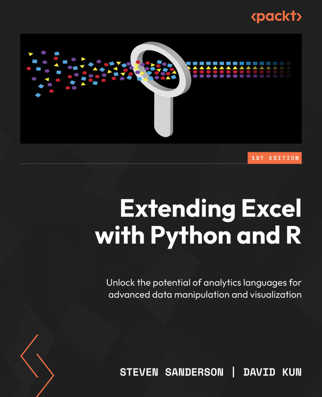
If you're excited about extending Excel’s capabilities with powerful tools like Python and R, Extending Excel with Python and R, authored by Steven Sanderson, David Kun, offers an in-depth guide to seamlessly integrating these languages into your Excel workflow. It covers everything from automating data tasks to advanced visualizations, all tailored for Excel enthusiasts.

 United States
 Great Britain
 India
India
 Germany
 France
 Canada
 Russia
 Spain
Spain
 Brazil
 Australia
 Singapore
 Hungary
 Ukraine
 Luxembourg
 Estonia
 Lithuania
 South Korea
 Turkey
 Switzerland
 Colombia
 Taiwan
 Chile
Chile
 Norway
 Ecuador
 Indonesia
 New Zealand
 Cyprus
 Denmark
 Finland
 Poland
 Malta
Malta
 Czechia
 Austria
 Sweden
 Italy
Italy
 Egypt
Egypt
 Belgium
 Portugal
 Slovenia
 Ireland
 Romania
 Greece
 Argentina
 Netherlands
 Bulgaria
 Latvia
 South Africa
 Malaysia
 Japan
Japan
 Slovakia
 Philippines
 Mexico
 Thailand


