Search icon CANCEL
Subscription
0
Cart icon
Your Cart (0 item)
Close icon
You have no products in your basket yet
Arrow left icon
Explore Products
Best Sellers
New Releases
Books
Videos
Audiobooks
Learning Hub
Conferences
Free Learning
Arrow right icon
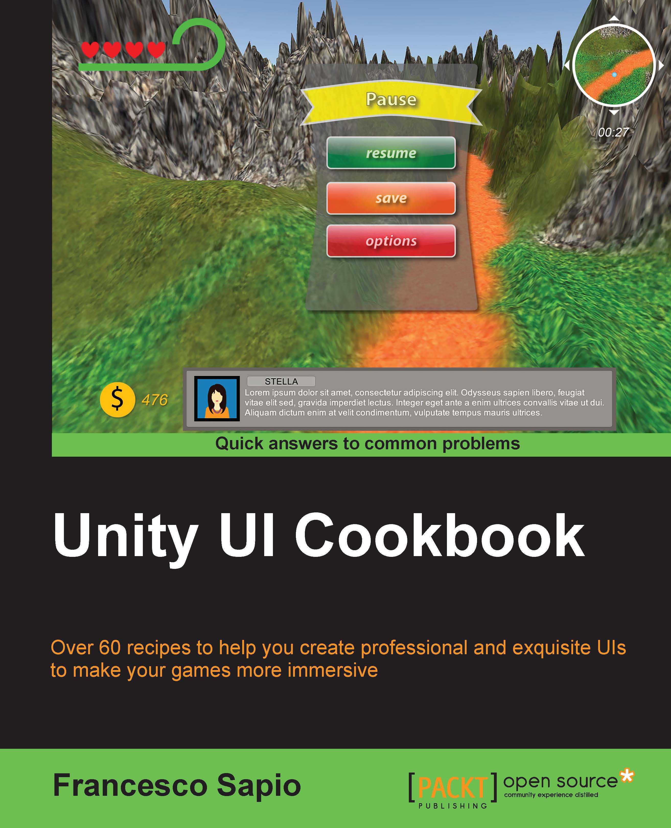
Unity UI Cookbook
Unity UI Cookbook

Unity UI Cookbook: Over 60 recipes to help you create professional and exquisite UIs to make your games more immersive

eBook
€8.99 €32.99
Paperback
€41.99
Subscription
Free Trial
Renews at €18.99p/m

What do you get with eBook?

Product feature icon Instant access to your Digital eBook purchase
Product feature icon Download this book in EPUB and PDF formats
Product feature icon Access this title in our online reader with advanced features
Product feature icon DRM FREE - Read whenever, wherever and however you want
OR
Modal Close icon
Payment Processing...
tick Completed

Billing Address

Table of content icon View table of contents Preview book icon Preview Book

Unity UI Cookbook

Chapter 1. UI Essentials

In this chapter, we will cover the following recipes:

  • Setting up a 2D texture to be a bordered sprite
  • Resizing the UI according to screen size and resolution
  • Adding and placing an image in the UI
  • Adding a circular mask to an image
  • Making an image scrollable
  • Making text scrollable with a vertical slider
  • Selecting buttons through the keyboard
  • Using UI layout components

Introduction

This chapter explains how to use the essential tools for creating more complex interfaces. These tools include placing and scaling UI elements, using masks to shape figures, and making images and text scrollable along with sliders.

We start by creating a sprite with a border. It can be scaled up or down without distorting. Then, we will proceed with explaining how to make our UI resizable according to the resolution of our screen.

Later, we will introduce the most used UI component — the Image (Script). Then, you will learn how to implement more complex transformations, such as masking it or making it scrollable.

We will also see how to select buttons using the input from the keyboard by introducing how we can develop scripts that are able to interact with our UI.

Finally, we will look at the UI layout components that allow us to easily create and structure a very wide UI.

Getting ready

To get started with this chapter, we will need to have Unity 5 running, and we must create a new project. The project can be set in 3D or 2D, depending on which one better suits the game that we wish to make. However, if it is set in 2D, Unity will automatically import our images as sprites. Lastly, ensure that you have some nice images of your choice for use in the examples, such an ancient map.

Setting up a 2D texture to be a bordered sprite

To properly scale a 2D texture to the screen size, we may need to make it bordered. This allows us to force the resolution, but not scale all the parts of our image, in order to maintain the original appearance of the image. Buttons are often bordered because their appearance depends strongly on how corners are scaled, and we don't generally want them to scale.

How to do it...

  1. To begin, we need to import our image. We can do this by right-clicking on the Project panel and then selecting Import new asset....
  2. Using the navigation menu on your computer, locate an image and import it. As a result, the image will be in our project and it can be used everywhere within the current project.

    Tip

    Another way to add images to the project is by dragging and dropping them into the Project panel.

  3. Next, we need to select our image in the Project panel. In fact, this allows us to display all the import settings in the Inspector window, which we can then tweak.
  4. In order to use images as part of the UI, Texture Type must to be set in Sprite (2D and UI). This can be changed through the Inspector window after we have selected them. However, if our project is set as a 2D project, the image in the project will have already been imported with Texture Type set correctly.
  5. Once we have done this, we click on the Sprite Editor button.
  6. In each side of the figure, we can find four green points. By dragging them, it is possible to divide the image into sections. By doing this, we create the borders of our image. Therefore, let's drag them a bit inside the picture so that we can see the borders. We have to pay attention when we have curved corners, which can be the case if we are working on a button. In fact, we need to ensure that all the green lines that belong to the border are beyond the curvatures of the corners. Otherwise, they will not be scaled as they should.
  7. Finally, we can click on the Apply button in the top-right corner of the Sprite Editor to save all our changes. After this, we can close the Sprite Editor, since we don't need it anymore.
  8. As a result, the image has borders, and therefore can be scaled as it should. How to properly place this inside our UI, since it requires us to set the Image (Script) component to Sliced.

How it works...

Sometimes, some components of our UI need to be scaled. However, not all of them can be scaled freely. Otherwise, it could look different from what we thought it should be. Therefore, bordered images are used to scale everything as it should be. Borders tell Unity how it has to scale the picture. When we drag the green points in the Sprite Editor, we are dividing the image into nine sections. Each of these sections is scaled differently. The central sections are scaled in both x and y directions (vertically and horizontally). The side sections are scaled in only one direction: vertically for the right/left sections and horizontally for the upper/lower sections). Finally, the corners do not scale at all. You can see these nine sections and the scales in the following image:

How it works...

Let's consider an example to understand why a bordered sprite is important for the UI. Imagine that we have a button like the one in the preceding image and we have placed it on the screen. When the game runs on different devices, the resolutions will be different and Unity will scale our UI accordingly (see the next recipe for more information). Ideally, we want the button to look like the original one that we have designed as much as possible. This means, for instance, that we want to preserve the original curvatures of the corners, and therefore, we need to force them not to scale. This can be communicated to Unity using borders. In this way, the rest of the button can scale along with the screen size in order to fit it, but as a result, the button will look like the original one.

There's more...

The next subtopic will show us how to slice the sprite without using all of the nine sections.

Slicing with less than nine sections

As you have learned so far, we can use the nine sections of the border to define the scaling setting of an image properly. But we are not constrained to use all of them. In fact, it is possible to segment the image into fewer sections. This is useful when we have some UI elements that are attached to the border of the screen. In fact, in this case, the image will scale differently according to only those sections that have been defined. To do this, we need to drag only some of the green points from the corners, instead of what we did in steps 5 and 6, where we dragged all them. By tweaking these, we can achieve different ways of scaling our UI, and the right one depends on how we want our game to look in different resolutions. For instance, we can create something similar to this:

Slicing with less than nine sections

See also

  • Since having a bordered image is very important when the UI is scaled on different resolutions and platforms, maybe it could be worthwhile taking a deeper look at resolution scaling. The following recipe, Resizing the UI according to the screen size and resolution, will explain how to resize the UI according to the screen resolution.
  • Moreover, it is possible to learn more about how to place an image in the UI in the Adding and placing an image in the UI recipe.

Resizing the UI according to the screen size and resolution

One of the most difficult things to do in the older versions of Unity was scaling the UI (or GUI, the old Unity user interface system). In fact, the system was hard to learn, and most of the features had to be implemented by scripts, including scaling. However, in Unity 5, scaling the UI is much easier with the Canvas Scaler (Script) component. This component will take care of the scale of all UI elements that are contained in Canvas.

How to do it...

  1. If we check the previous recipe, we can see in the Hierarchy panel that Canvas is already present in our scene. This is because whenever we create a UI element and Canvas is not present in the scene, Unity will create it for us. Of course, we can also create it on our own, and this can be done by right-clicking on the Hierarchy panel and then navigating to UI | Canvas.
  2. Now that we have created Canvas, we can select it. In the Inspector, we can see all its properties and parameters, including all the components attached to it. By default, when a Canvas is created, the Canvas Scaler (Script) component is attached on it. Since this component can be removed, it may happen that it is not present anymore. In such cases, we can add it again by clicking inside the Inspector window on Add Component and then going to Layout | Canvas Scaler.
  3. Next, we have to change the Ui Scale Mode property to Scale With Screen Size and ensure that Screen Match Mode is set to Match Width Or Height. Furthermore, we can adjust the Match variable; for example, we can move the slider to the middle by changing the value to 0.5. We should now see this:
    How to do it...
  4. As a result, every UI element inside Canvas will be scaled according to our project's screen resolution, and they will all adapt to the device on which the game is running.

How it works...

In the Unity UI system, Canvas is a special game object. This is because all the UI elements must be contained inside it. In fact, elements that are not in it will not be rendered. By default, Canvas comes with three components attached to it. One of these three is Canvas Scaler (Script). This component controls how all the UI elements that are contained in that specific Canvas will be scaled. By tweaking some of its properties, it is possible to achieve a scale setting that best suits our needs. In particular, we have set the Match slider, which allows us to proportionally crop the width and height of the view in order to adapt it to the resolution of the platform on which the game is running.

See also

Adding and placing an image in the UI

Since our UIs mostly consist of images, it's very important to learn how to handle them with the Image (Script) components in Unity. In fact, we will use them a lot in all the recipes of this book. In particular, here you can understand how to create a new image and properly place it in your UI.

How to do it...

  1. Let's start by importing the image into our project, as we did in the first recipe of this chapter. We can do this by right-clicking on the Project panel and selecting Import new asset. Of course, it is also possible to drag the asset into the same panel and skip the next step.
  2. We can navigate through our files to select the image that we want to import.
  3. If we select our image in the Project panel, it is possible to see all its properties in the Inspector.
  4. In order to use our image as Source Image of our UI, we need to change Texture Type to Sprite (2D and UI) in the Inspector. As you learned in the first recipe, if our project is set in 2D, all the images will have already been imported as sprites.
  5. Now, in the Inspector, there are different import settings. There is no need to change the settings for this recipe; it is important to understand these features so that we can properly import all our images into the project. These features include the format, along with the size and the compression method. If, for instance, we need to make the image file size smaller for performance. You can find references to them in the See also section of this recipe. Then, when we are satisfied with our choices, we can click on the Apply button so that the import settings are applied. This could take some minutes if you have changed the settings of many different images at once.
  6. Next, we need to create the UI image that will be in the UI. In order to add it to the scene, we have to right-click on the Hierarchy panel and then navigate to UI | Image. We should also ensure that it is inside the Canvas object.

    Tip

    UI components that are outside Canvas will not be drawn by Unity, so ensure that every UI component is always inside Canvas!

    If they are not, we can drag and drop them onto the Canvas object so that they become children, and they appear again.

  7. Inside the Image (Script) component, which we can find in the Inspector, we drag the image that we have imported inside the Source Image variable.

    Tip

    If our image is sliced, as we saw in the first recipe of this chapter, we also need to set Image Type to Sliced.

  8. As a result, our image appears in the UI, but it has taken the dimensions and scaling of the Image object that we have created. Therefore, if we need to keep its original dimensions, we can click on Set Native Size in order to set them again.
  9. So that it is easier to work with the UI, set your scene view to 2D, as shown in the following screenshot, and zoom out and pan until you can clearly see your Canvas. At this stage, it is very large, so don't worry if you zoom out too much. Otherwise, you can use the hotkey F (or double-click on the image in the Hierarchy panel) to focus the camera on it:
    How to do it...

    In order to scale and place the image, we select the last Transform Tool, which we can find in top-left corner of Unity, as shown in the next screenshot. It is called the Rect Tool, and it can easily be selected by pressing the hotkey T. While we need different tools to translate, rotate, and scale 3D objects, since they have many degrees of freedom, we can perform all of these operations with just one tool when we deal with a 2D object:

    How to do it...
  10. After we have selected the image from the scene view, four blue points appear on the corners. These are the control points of the Rect Tool.
  11. We can drag one of them to scale the image.

    Tip

    If you want to keep the images' original proportions, you can hold down Shift while you are dragging the blue points.

    Furthermore, if you hold down Alt instead of Shift, you can simultaneously scale the object in two directions symmetrically.

    Finally, you can also resize the image by clicking on the edges instead of the corners and dragging them.

  12. In conclusion, we can place the image wherever we want to by clicking anywhere inside the rectangle and dragging. Again, keep in mind that all the UI elements, including the image, must be inside the Canvas in order to be drawn by Unity and displayed to the player.

How it works...

The new UI system of Unity allows us to add images to the UI in a very simple way. The Image (script) component takes a Source Image and draws it on the screen. However, this happens only if the object to which this component is attached is inside Canvas. In fact, Unity calls functions to draw the UI only if they are inside Canvas.

In the preceding examples, we used the Rect Tool to scale and place the image, because every UI element is represented as a rectangle for the purpose of this layout.

There's more...

Rotating an image it's crucial in designing good UIs. Moreover, all the rotations depends by the pivot point. Thus, the aim of the following section is to give an overview of the concepts to start to experiment and learn how to use properly this tools.

Rotating the image and changing the pivot point

We can also rotate the image by slightly moving the cursor away from the corners until it looks like a rotation symbol. Then, we can click and drag it in either direction to rotate the image. We can also change the pivot point. After selecting the image in the scene view, just click and drag the blue circle at the center of the image. By doing this, we can rotate images in different ways. You can better understand this concept by paying attention to the following image, which shows the same rectangle rotated with two different pivot points:

Rotating the image and changing the pivot point

Tip

The four black squares are our referring points to understand the difference. Both the rectangles are rotated by the same angle. In the upper rectangle, the pivot point (blue circle) is in the middle, whereas in the lower rectangle, it is moved to the left side.

Furthermore, changing the pivot point could lead to an interesting variation in our UI when this is animated or controlled by scripts. For instance, we should definitely try to experiment with different locations of pivot points in the Creating an extendable element with a final fade effect and Creating an extendable and rotating element with a final fade effect recipes in Chapter 5, Decorating the UI.

Adding a circular mask to an image

Often in games, UI elements are not designed to be rectangular. Thus, a quick way to change their shape is through masking. One of the basic shapes is a circle. Therefore, in this recipe, you will learn how to make an image circular. This could be useful, for example, to surround a character icon circularly or to create special circular buttons. In order to achieve this, we will use the Mask component.

How to do it...

  1. First of all, we need to create a mask, which in this case should be circular. Since the mask is just another image, let's open a graphic program that we have. Then, we need to create a new image with the same pixels for the height and width so that the drawing canvas is a square.
  2. This step and the following step depend on the graphics program that you are using. Now, we have to draw a white circle in the middle of the image.
  3. Furthermore, we should also ensure that the background is transparent. From the following screenshot, you can get an idea of what the final outcome will look like (the program used for this is Photoshop):
    How to do it...

    Tip

    If you are using Photoshop, you can easy create this mask using the ellipse tool. While holding down the Shift key, click on the top-left corner and drag it to the bottom-right corner.

    If you don't have a graphics program or you don't want to use a graphics program, you can use the image provided along with the code featured in this book.

  4. The next step is to import this mask into the project. To do this, right-click on the Project panel and select Import new asset.
  5. Unity will ask us to select the mask that we have just created. Therefore, locate the folder where you saved it and then import it.
  6. In order to see the settings of the imported mask as an image in the Inspector, we need to select it in the Project panel.
  7. Thus, if our project is not set in 2D, we should change the Texture Type in Sprite (2D and UI) in the Inspector and then click on Apply.
  8. Now, we need to create a new panel. We can do this by right-clicking on the Hierarchy panel and then going to UI | Panel. We should also ensure that we have it inside the Canvas object.
  9. Inside the Image (Script) component, we need to set our mask to the Source Image variable.
  10. In order to get the exact shape that we created in our graphics program, we need to bring the image back to its original proportions. This can be done by clicking on Set Native Size and then scaling uniformly (keeping Shift pressed) if needed.
  11. The next thing to do is transform our panel into a mask. So, we need to add the Mask (Script) component to our panel.
  12. Then, we need an image to put the mask on. Therefore, let's create an image inside the panel. To do this, we need to right-click on the Hierarchy panel and then go to UI | Image.
  13. Inside the Image (Script) component of the image, we need to select the picture that we want to mask. This can be done by dragging it into the Source Image variable of the component. As a result, it will be masked with a circle.
  14. If needed, we can click on Set Native Size and scale it uniformly.
  15. In this case, by using an ancient map, we can see what the final outcome should look like in the following picture:
    How to do it...

How it works...

As we have seen, Unity uses another image to create the mask. This is the reason the Mask (Script) component is attached to the object that has an Image (Script) component. As a result, it is possible to create any shape that we want for the mask. In fact, the only thing we need to keep in mind is that the white sections of the mask texture will be the parts that are visible.

See also

Making an image scrollable

Many fantasy games have huge worlds, along with very large maps, so in order to show them in the UI, they are usually scrollable. This allows the player to explore the map in sections without showing it entirely at once.

This recipe explains how to achieve this using the Mask (Script) component, which we have already used in the previous recipe, and the Scroll Rect (Script) component. The latter will handle the logic that will allow the UI elements to be scrollable.

How to do it...

  1. So that we don't have to start over again, we can use the mask that we created in the previous recipe. In fact, we can change what we have done there to achieve this scrollable effect.
  2. To begin, we need to add the Scroll Rect (Script) component to the panel.
  3. Keeping the panel selected, drag the image that is parented to the panel into the Content variable inside Scroll Rect (Script).
  4. By default, the image is set to have an elastic effect, which, in most cases, is quite nice. However, since we are using a circle instead of a rectangle, it is better that the image doesn't go out of the circle. This is because the image may appear distorted and affect the overall aesthetic experience, which may even prove to be uncomfortable to the player. Therefore, to solve this, change Movement Type to Clamped.
  5. Finally, it is possible to modify the effect to better suit our needs by changing Deceleration Rate and Scroll Sensitivity. Thus, take time to test which values are best for you.
  6. Once you have finished altering the values, your Inspector should look similar to this:
    How to do it...

How it works...

First of all, we took the previous image, which is already masked. In fact, scrollable images are often used along with masks. This is because masks allow us to focus on specific locations within large images or text without overwhelming the player, as well as allow larger objects to feature within the UI in more compact ways. Once we had taken the outcome from the previous recipe, we then added a Scroll Rect (Script) component to the parent of our image. This component does the work, and it can be controlled by several options or parameters.

For example, we can change the Movement Type variable. Clamped is where the content is confined to the Scroll Rect bounds, Elastic means the content bounds when it reaches the edge, and Unrestricted means that there are no limitations. In addition to this, we can tweak Deceleration Rate, but only if Inertia is checked. This determines how much time it takes for the content to come to a complete stop. At a rate of 0, the movement will stop immediately, whereas at a rate of 1, it will never slow down. Among the most important parameters of this component is Scroll Sensitivity. This is, as the name suggests, the sensitivity when the content is scrolled.

See also

Making text scrollable with a vertical slider

Sometimes, we might have a large amount of text, such as a story in a book within our game, and we may want to show this to the player. One solution for improving the accessibility of reading text could be to add a slider so that the player can drag it in order to quickly scroll through text and immediately know which part of the text he is reading. Similar to what we did in the previous recipe, we need to make this text scrollable, and we also need to add the slider, which will be vertical in this example.

By the end of this recipe, we will be able to use the Scroll Rect (Script) and Scrollbar (Script) components to control scrollable text by using the slider.

How to do it...

  1. In the first step, we create a new panel within our UI. Right-click on the Hierarchy panel and then go to UI | Panel.
  2. Next, we should resize the panel until we have a scene view that is similar to this:
    How to do it...
  3. It's always good practice to have all the files within our project ordered. Hence, we can rename the panel to Text Scroller.
  4. As we did in the last two recipes, let's add a Mask (Script) component. In order to view the scene without visual constraints, for the moment, we can disable it.
  5. Next, right-click on Text Scroller and then select Create Empty. By doing this, we create an empty child game object inside Text Scroller. Also, we should rename it to Text Content.
  6. On this last one, we need to add a Scroll Rect (Script) component. Then we need to create the text. This can be done by right-clicking on Text Content and going to UI | Text.
  7. Now we can write (or copy and paste long text) inside the Text variable of the component.
  8. Using the Rect Tool, we should resize the text area in order to obtain a rectangle. This rectangle must have a width narrower than Text Scroller and a larger height. We need to continue to increase its height until all of the text is contained inside of the rectangle. You can refer to the screenshot after step 10 to get a better idea of how it should appear at this stage.
  9. Now, right-click again on Text Scroller, and this time, go to UI | Scrollbar. Now our Hierarchy panel should look similar to this one:
    How to do it...
  10. Next, we need to change the Direction variable of the Scrollbar (Script) component to Bottom To Up. Then, resize and place the scroll bar in the remaining space of the panel, as shown in this screenshot:
    How to do it...
  11. We also need to link the scroll bar to the text. To do this, select Text Content and drag the scrollbar inside the Vertical Scrollbar variable. We also have to uncheck the Horizontal variable in order to force the text to scroll vertically.
  12. Finally, we can enable the mask on Text Scroller (the one that we have disabled in order to work better) and click on play to test what we have done. If you prefer, you can disable the elastic effect, as was done in the previous recipe. To do this, just change Movement Type to Clamped on the Scroll Rect (Script) component.
  13. We are now able to scroll the text within Text Scroller. As a result, we should see something like this:
    How to do it...

How it works...

The entire process works in a way similar to the previous recipe. In fact, we created a mask for text, instead of images as we had previously done. Then we temporarily hid the mask, which made it easier to place the text. In order to make the text scrollable, we added a Scroll Rect (Script). Ultimately, we had to resize the text to display it correctly on the screen. We also added a scroll bar and linked it to Scroll Rect (Script). Since the Scroll Rect (Script) will do the needful for us, we don't need to update the scroll bar. As in this example, the text will scroll vertically, since we have disabled horizontal scrolling on Scrollbar (Script). Finally, we enabled the mask again in order to show only a portion of text at once.

There's more...

The following two sections will introduce us to new ways for scrolling the text so that it can better suit the design of our game.

Scrolling multiple columns at once

What happens if we want different kinds of text, such as a heading or a second column? We need to make a few changes.

First of all, we need to create a new empty game object and parent it with the Text Scroller. Next, we add a Scroll Rect (Script) component to this object and set the Text Content object that we created before in the Content variable by dragging it. Then we remove the Scroll Rect (Script) component from Text Content. Lastly, we can add an arbitrary number of UI text objects inside Text Content, and as a result, all of the text will be scrollable. If we add five of them, the Hierarchy panel should look like what is shown here:

Scrolling multiple columns at once

Remember that in order to properly place the text on the screen, we can temporarily disable the mask attached to Text Scroller. By doing this, we are able to see all the objects inside the mask without its constraints.

At the end, we should have something that looks like this:

Scrolling multiple columns at once

Tip

Resizing all the components could be needed in order to fit the text and the panel properly. As a result, the scroll effect will appear natural and as we have planned.

Scrolling horizontally

Even though using a horizontal slider is unusual, we can transform the slider that we already have and change its orientation. This is often used to implement inventory systems of point-and-click game genres.

To achieve this, we can begin by changing what we did in step 8. This time, we have to stretch the text, making its height a little smaller than the height of Text Scroller and the width as long as the text itself. Then, in step 10, instead to selecting Bottom To Up, change the Direction variable to Left To Right. Finally, in step 11, we need to link the Horizontal Scrollbar variable (instead of Vertical Scrollbar) with our scroll bar, so uncheck the Vertical variable.

Since horizontal scrolling becomes hard to read when the width of the Content is large, it could be helpful to split the text into more than one column. We can easily achieve this by creating different UI text elements inside the Content object and distributing them in order to form as many columns as we like. We can see an example of this in the following screenshot:

Scrolling horizontally

Tip

Again, resizing all the components could be needed in order to fit the text and the panel properly. As a result, the scroll effect will appear natural and as we have planned.

Selecting buttons through the keyboard

Often in games, there are menus that have shortcuts as well. For example, if the player has to use a skill quickly, he needs an easier way to access it. In general, where there is the possibility within the UI to choose more than one selectable element, such as buttons and toggles, it is possible to select them using a keyboard shortcut.

This recipe will teach you how to detect when a key is pressed and select a specific UI element by creating a script that is able to be generic enough to be placed on every UI element without changing the code.

How to do it...

  1. To begin, create a new panel. Right-click on Hierarchy panel and then go to UI | Panel. We can also rename it to keep the project names ordered.
  2. Next, we need to create a button inside the panel. We can do this by right-clicking on the panel and then navigating to UI | Button.
  3. In order to better see, which button is currently selected, let's change some properties of the Button (Script) component. For instance, we could choose a different color for Normal Color, Highlighted Color, and Pressed Color. In this example, let's set Highlighted Color to red and Pressed Color to green, and leave Normal Color as white. Finally, we also need to change Navigation to Vertical.
  4. In order to have the ability to choose among different buttons, we need different buttons in the scene. We can achieve this by duplicating the button. This can be done by pressing Ctrl + D and then placing the duplicated buttons below the original one. Rename the first of these to Button 1 and the second to Button 2. Repeat the same with the Text variable inside the Text (Script) component on the child of the button. As a result, we will be able to distinguish buttons on the screen as well. Finally, repeat this step at least two more times to get three buttons. Once we are done, our scene should look similar to the following:
    How to do it...
  5. Now it's time to create our first script. To begin, in the Inspector, go to Add Component | New Script and name it ButtonThroughKeySelection. Then click on Create and Add. While doing this, ensure that the language selected is C Sharp.
  6. Double-click on the script in order to open it in MonoDevelop.
  7. Every time we work with some UI classes, we need to add a using clause on top of our script. This will ensure that we don't have any compilation error when the script is compiled by Unity. Furthermore, since we are also using events, we need to add another using clause. Therefore, at the beginning of our script, we need to get these:
    using UnityEngine.UI;
    using UnityEngine.EventSystems;
    using UnityEngine;
    using System.Collections;
  8. Moreover, we need to add a variable for the key that has been chosen. By doing this, we can set that variable in the Inspector:
    public class ButtonThroughKeySelection: MonoBehaviour {
    
      public string key;
  9. Since we don't need to set the initial variables, we can erase the Start() function. In order to implement the detection of the pressed key and change the selected button, we need to write the Update() function in the following way:
    public void Update()
      if (Input.GetKeyDown (key))
      {
         EventSystem.current.SetSelectedGameObject(
                  this.gameObject);
      }
    }
  10. Now we can save the script and add it to one of the three buttons.
  11. Next, set the Key variable with a string that represents a key, for example, space for the spacebar. Once we have done this, we should see something like this:
    How to do it...
  12. Finally, we can click on the play button and see whether everything works. After our button is selected, by pressing the key bounded by the variable, we can move through the others with the arrow keys. However, if we re-press our key, which in this example is the spacebar, the selection returns to our button.

How it works...

To get started, we have created three buttons in the scene, which are our test buttons. We also had to change some of the buttons' properties in order to clearly see the effect that our script had on the buttons. Since we had distributed our buttons vertically, we set the Navigation variable to Vertical.

At the beginning of the script that we wrote, we added the using UnityEngine.UI; and the using UnityEngine.EventSystems; statements. The former needs to use UI elements inside our scripts, and it will be the most used through all the recipes of this book. The latter needs to use the Event System directly in our script.

As part of the next step in this recipe, we added a public string variable. It is public so that it can be set in the Inspector later. As a result, we can choose an arbitrary key to bind the specific button where the script is collocated.

Now, in the Update() function, we checked through if (Input.GetKeyDown (key)) to find out whether our key is pressed. In fact, the Input.GetKeyDown(string) function returns true if the key specified as a string is pressed, and false if it is not. It's important to remember that the Key variable is set in the Inspector, so it could change according to the design of our game. Check out the See also section for more information about key press detection.

Finally, if our key is pressed, we need to select a specific button. This can be done with the EventSystem.current.SetSelectedGameObject(this.gameObject); line. The first part, EventSystem.current, returns the current event system that is used. Then, we call on the SetSelectedGameObject(gameObject) function, which selects the game object passed as a parameter. In this case, we use this.gameobject, which is the game object where this script is attached, as well as the button that we want to select.

By keeping everything parametric, such as having a Key variable that can be set to every instance of the script, we are able to use this script on many buttons at one time and customize it differently without touching the code again.

See also

Using UI layout components

Often, we need to place a lot of objects in their correct and symmetric positions within our UI or in a nested element. Luckily, Unity has an auto-layout system that provides ways to nest UI elements into other UI elements. It is controlled by the UI layouts components that allow us to structure our UI. Learning how to master them is crucial for quickly creating clean UIs and achieving our design goals. In fact, this is the purpose of this recipe.

How to do it...

  1. As the first step, we need a panel to apply the layout controllers to, and we have to restructure its children objects. To create this panel, right-click on the Hierarchy panel and then go to UI | Panel. We should also rename it to First Panel.
  2. Then, we need to fill in our First Panel with some elements. In this recipe, we will use buttons. So let's start creating one of them inside the panel by right-clicking on the panel and then navigating to UI | Button.
  3. Since just one button is not enough to see how layout controllers work, we need to add more panels. Therefore, we duplicate the button by pressing Ctrl + D as many times we want. Of course, we don't worry about the layout; the layout controls will do this for us.
  4. Considering the fact that we want to test different layout controllers, we also need to duplicate the panel, using Ctrl + D. Finally, rename it to Second Panel.
  5. We also need a third panel. Therefore, we can rename it to External Panel and put inside it the other two panels. Now, we should have the following structure:
    How to do it...
  6. Next, simply add Horizontal Layout Group (Script) to External Panel and then Vertical Layout Group (Script) to First Panel. Finally, add Grid Layout Group (Script) to Second Panel. Now, we can see the Auto-Layout system doing all the work for us. In order to better understand how the system works, just add the buttons, or duplicate them, and watch how the Auto-Layout system re-organizes the entire layout for us. As the final result, we should see something similar to this:
    How to do it...

How it works...

The Auto-Layout system is composed of two different kinds of elements: Layout Elements and Layout Controllers. To understand the former, note that every game object that has a Rect Transform, and eventually other components, is a layout element. These types have certain knowledge about what size they should be of, but they do not control it directly. Layout controllers, instead, are components that control sizes and also positions of one or more layout elements. They can control their own Layout Element or child Layout Elements of the game object to which they are attached.

In this example, we used Horizontal Layout Group (Script), Vertical Layout Group (Script) and Grind Layout Group (Script). They work in similar ways. Furthermore, they take care of the layout of the children inside the game object to which they are attached, and restructure the positions of the UI elements.

See also

If you want to learn more about layout controllers, you can go to the official Unity documentation at the following links:

Tip

Downloading the example code

You can download the example code files from your account at http://www.packtpub.com for all the Packt Publishing books you have purchased. If you purchased this book elsewhere, you can visit http://www.packtpub.com/support and register to have the files e-mailed directly to you.

Left arrow icon Right arrow icon

Key benefits

  • Design and develop interactive and professional user interfaces (UIs) for games in Unity
  • Discover how to implement and deal with various in-game UI elements that will impress your players
  • This practical recipe guide will help you to efficiently create powerful and remarkable UIs using C# code

Description

With the increasing interest in game development, it's essential to design and implement a UI that reflects the game settings and shows the right information to the player. The Unity system is used to create complex and aesthetically pleasing user interfaces in order to give a professional look and feel to a game. Although the new Unity UI system is powerful and quite easy to use, by integrating it with C# scripts, it's possible to realize the potential of this system and bring an impressive UI to games. This guide is an invaluable collection of recipes if you are planning to use Unity to develop a game. Starting with the basic concepts of the UI components, we’ll take you all the way through to creating complex interfaces by including animations and dynamics elements. Based on real-world problems, these recipes will start by showing you how to make common UI elements such as counters and healthbars. You will then get a walkthrough of how to manage time using timers, and will learn how to format them. You will move on to decorating and animating the UI elements to vivify them and give them a professional touch. Furthermore, you will be guided into the 3D UI world and into HUD scripting. Finally, you will discover how to implement complex minimaps in the interface.

Who is this book for?

If you are a game developer with some experience in Unity and C# and want to create the best interactive experience fast and intuitively, then this book is for you. If you are an intermediate game developer or an expert, these recipes will help you bring out the power of the new UI Unity system.

What you will learn

  • Implement different kinds of counters and healthbars
  • Deal with timers and find out how to format them
  • Animate and vivify UI elements
  • Handle runtime customizations
  • Add complex Head-up displays (HUDs)
  • Design and implement 3D UIs
  • Integrate minimaps in the UI

Product Details

Country selected
Publication date, Length, Edition, Language, ISBN-13
Publication date : Dec 29, 2015
Length: 284 pages
Edition : 1st
Language : English
ISBN-13 : 9781785882005
Vendor :
Unity Technologies
Languages :
Concepts :
Tools :

What do you get with eBook?

Product feature icon Instant access to your Digital eBook purchase
Product feature icon Download this book in EPUB and PDF formats
Product feature icon Access this title in our online reader with advanced features
Product feature icon DRM FREE - Read whenever, wherever and however you want
OR
Modal Close icon
Payment Processing...
tick Completed

Billing Address

Product Details

Publication date : Dec 29, 2015
Length: 284 pages
Edition : 1st
Language : English
ISBN-13 : 9781785882005
Vendor :
Unity Technologies
Languages :
Concepts :
Tools :

Packt Subscriptions

See our plans and pricing
Modal Close icon
€18.99 billed monthly
Feature tick icon Unlimited access to Packt's library of 7,000+ practical books and videos
Feature tick icon Constantly refreshed with 50+ new titles a month
Feature tick icon Exclusive Early access to books as they're written
Feature tick icon Solve problems while you work with advanced search and reference features
Feature tick icon Offline reading on the mobile app
Feature tick icon Simple pricing, no contract
€189.99 billed annually
Feature tick icon Unlimited access to Packt's library of 7,000+ practical books and videos
Feature tick icon Constantly refreshed with 50+ new titles a month
Feature tick icon Exclusive Early access to books as they're written
Feature tick icon Solve problems while you work with advanced search and reference features
Feature tick icon Offline reading on the mobile app
Feature tick icon Choose a DRM-free eBook or Video every month to keep
Feature tick icon PLUS own as many other DRM-free eBooks or Videos as you like for just €5 each
Feature tick icon Exclusive print discounts
€264.99 billed in 18 months
Feature tick icon Unlimited access to Packt's library of 7,000+ practical books and videos
Feature tick icon Constantly refreshed with 50+ new titles a month
Feature tick icon Exclusive Early access to books as they're written
Feature tick icon Solve problems while you work with advanced search and reference features
Feature tick icon Offline reading on the mobile app
Feature tick icon Choose a DRM-free eBook or Video every month to keep
Feature tick icon PLUS own as many other DRM-free eBooks or Videos as you like for just €5 each
Feature tick icon Exclusive print discounts

Frequently bought together


Stars icon
Total 129.97
Unity 5.x Cookbook
€45.99
Unity UI Cookbook
€41.99
Unity 5.x Shaders and Effects Cookbook
€41.99
Total 129.97 Stars icon
Banner background image

Table of Contents

11 Chapters
1. UI Essentials Chevron down icon Chevron up icon
2. Implementing Counters and Health Bars Chevron down icon Chevron up icon
3. Implementing Timers Chevron down icon Chevron up icon
4. Creating Panels for Menus Chevron down icon Chevron up icon
5. Decorating the UI Chevron down icon Chevron up icon
6. Animating the UI Chevron down icon Chevron up icon
7. Applying Runtime Customizations Chevron down icon Chevron up icon
8. Implementing Advance HUDs Chevron down icon Chevron up icon
9. Diving into 3D UIs Chevron down icon Chevron up icon
10. Creating Minimaps Chevron down icon Chevron up icon
Index Chevron down icon Chevron up icon

Customer reviews

Top Reviews
Rating distribution
Full star icon Full star icon Full star icon Full star icon Half star icon 4.5
(13 Ratings)
5 star 69.2%
4 star 23.1%
3 star 0%
2 star 0%
1 star 7.7%
Filter icon Filter
Top Reviews

Filter reviews by


Francis Jan 12, 2016
Full star icon Full star icon Full star icon Full star icon Full star icon 5
This is a good reference for anyone working on a game in Unity 3D that requires a good user interface. The book is organized to provide 60 recipes, which are code snippets and instructions to create various user interface elements. This makes it possible to read the book in any order so you can just get to the parts you are currently interested in.If you are working on a game and decide you need a Health Bar for one of your game characters you can just skip to Chapter 2 read a few pages that are illustrated well showing various types of health bars and associated code and then follow the step by step "How to do it..." instructions.Amazon lets you look inside the book so do that to see a recipe you might be interested in and the style of the author.This book covered all the types of user interfaces that I was interested in and the information in Chapter 8 about "Creating a directional radar" gave me some new ideas for a game that I am working on. The recipes in this book easily saved me hours of development time that I could have wasted trying to implement the same thing that is documented well in this book.
Amazon Verified review Amazon
Bart Knowles Jan 08, 2016
Full star icon Full star icon Full star icon Full star icon Full star icon 5
I've been fumbling with Unity for many personal projects in recent years, now I'm trying to get more serious and turn it into a professional advantage. This cookbook comes as a very welcome bridge from my amateur days to (hopefully) better professional opportunities.It is extremely useful to be taken by the hand and guided step by step through implementing different elements of user interfaces. Boxes with "How to do it" and "How it works" clarify the most important issues at a glance.This is an extremely useful book. I read the electronic version and I am thinking of buying the paper version: it is more expensive but might turn out to be more wieldy in the long run.
Amazon Verified review Amazon
Jan Dyrda Jan 07, 2016
Full star icon Full star icon Full star icon Full star icon Full star icon 5
I must tell you that this book... well, it delivers what is promised and give you even more.Pros:- It's written in very understandable way;- There's print-screen for almost every operation which means you'll need to be trying really hard to not understand what's written in Unity UI Cookbook;- Book contains tons of valuable tips and tricks. Some things you probably know already if you were developing anything in Unity already, but some tips were new for me.- If you know nothing about Unity UI and you can't decide what to choose... My choice would be this book;- Also: all code (working) is available for download which is nice touch for those who don't really like copying and pasting ;)What you'll learn from this book:General information about UI EssentialsHow to implement Counters and Health BarsHow to implement TimersHow to create Panels for MenusHow to decorate the UIHow to animate the UIHow to apply Runtime CustomizationsHow to implement Advance HUDsHow to dive into 3D UIsHow to create Minimaps... and that should be enough for the start. I have many Packt books and ebooks and this particular one was definitely worth money.
Amazon Verified review Amazon
Rakesh Patibanda Jan 09, 2016
Full star icon Full star icon Full star icon Full star icon Full star icon 5
I have been a Unity freak for 4 years now and this book "Unity UI Cookbook" has the flavour, taste and spiciness for me to be able to call it a great dish. Are you are a novice or a pro user of Unity? Do not worry, you will find a recipe that suits your taste, always. I would highly recommend this book.
Amazon Verified review Amazon
Cristian Gradisteanu Jan 21, 2016
Full star icon Full star icon Full star icon Full star icon Full star icon 5
Everything you need to know in order to be able to create beautiful and well designed user interfaces in Unity in once book. The book contains great information on how to create captivating and useful user interfaces (a must if you want to develop Unity games). It provides recipes that will help you please your players with engaging and modern interfaces. If you're considering developing Unity games...you can not skip this book!
Amazon Verified review Amazon
Get free access to Packt library with over 7500+ books and video courses for 7 days!
Start Free Trial

FAQs

How do I buy and download an eBook? Chevron down icon Chevron up icon

Where there is an eBook version of a title available, you can buy it from the book details for that title. Add either the standalone eBook or the eBook and print book bundle to your shopping cart. Your eBook will show in your cart as a product on its own. After completing checkout and payment in the normal way, you will receive your receipt on the screen containing a link to a personalised PDF download file. This link will remain active for 30 days. You can download backup copies of the file by logging in to your account at any time.

If you already have Adobe reader installed, then clicking on the link will download and open the PDF file directly. If you don't, then save the PDF file on your machine and download the Reader to view it.

Please Note: Packt eBooks are non-returnable and non-refundable.

Packt eBook and Licensing When you buy an eBook from Packt Publishing, completing your purchase means you accept the terms of our licence agreement. Please read the full text of the agreement. In it we have tried to balance the need for the ebook to be usable for you the reader with our needs to protect the rights of us as Publishers and of our authors. In summary, the agreement says:

  • You may make copies of your eBook for your own use onto any machine
  • You may not pass copies of the eBook on to anyone else
How can I make a purchase on your website? Chevron down icon Chevron up icon

If you want to purchase a video course, eBook or Bundle (Print+eBook) please follow below steps:

  1. Register on our website using your email address and the password.
  2. Search for the title by name or ISBN using the search option.
  3. Select the title you want to purchase.
  4. Choose the format you wish to purchase the title in; if you order the Print Book, you get a free eBook copy of the same title. 
  5. Proceed with the checkout process (payment to be made using Credit Card, Debit Cart, or PayPal)
Where can I access support around an eBook? Chevron down icon Chevron up icon
  • If you experience a problem with using or installing Adobe Reader, the contact Adobe directly.
  • To view the errata for the book, see www.packtpub.com/support and view the pages for the title you have.
  • To view your account details or to download a new copy of the book go to www.packtpub.com/account
  • To contact us directly if a problem is not resolved, use www.packtpub.com/contact-us
What eBook formats do Packt support? Chevron down icon Chevron up icon

Our eBooks are currently available in a variety of formats such as PDF and ePubs. In the future, this may well change with trends and development in technology, but please note that our PDFs are not Adobe eBook Reader format, which has greater restrictions on security.

You will need to use Adobe Reader v9 or later in order to read Packt's PDF eBooks.

What are the benefits of eBooks? Chevron down icon Chevron up icon
  • You can get the information you need immediately
  • You can easily take them with you on a laptop
  • You can download them an unlimited number of times
  • You can print them out
  • They are copy-paste enabled
  • They are searchable
  • There is no password protection
  • They are lower price than print
  • They save resources and space
What is an eBook? Chevron down icon Chevron up icon

Packt eBooks are a complete electronic version of the print edition, available in PDF and ePub formats. Every piece of content down to the page numbering is the same. Because we save the costs of printing and shipping the book to you, we are able to offer eBooks at a lower cost than print editions.

When you have purchased an eBook, simply login to your account and click on the link in Your Download Area. We recommend you saving the file to your hard drive before opening it.

For optimal viewing of our eBooks, we recommend you download and install the free Adobe Reader version 9.