Model-driven apps running on mobile devices use the same form layouts as the web interface. For tablets and phones that have smaller screens, the forms adjust automatically to the size and orientation. The forms are responsive.
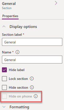
The controls on the forms can be changed from simple entry fields into touch-friendly controls. The forms can be customized to hide user interface components when running on a mobile phone. Each form component has the Hide on phone property, as shown in the following screenshot:

Figure 9.18 – Hide on phone
Tabs, sections, and fields can be turned on or off for phones. This property is off by default and all components are displayed.
Web resources, IFrames, and dashboards have a similar property, Enable for mobile. This property is off by default.
Enable for mobile refers to both phone and tablet. You will notice that some properties are for mobile, which means both types...


