Drawing with the Canvas
According to Apple documentation, the Canvas is a view type that supports immediate mode drawing. In simpler and more familiar terms, if you have previous experience with UIKit, this is a view that allows you to implement custom bidimensional graphics that you are more accustomed to by using Core Graphics. It allows you to create custom and intricate graphics that you can use in your own user interface.
The programming is basically the same as in Core Graphics. The Canvas requires you to write a closure defining its contents. This closure receives two parameters, GraphicsContext and a size expressed in CGSize that can be used to customize the size of what you want to draw.
You can think about the context as a kind of “handle” of the drawing “pencil” inside the canvas, and you determine what you want to draw by calling the different methods supported by the canvas.
These are graphical primitives that allow you to draw different shapes (outlined and filled), images, text, and even complete SwiftUI views.
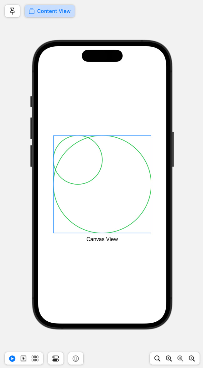
For instance, the following example will draw two circles within a square frame:
import SwiftUI
struct CircleView: View {
    var body: some View {
        Canvas { context, size in
            context.stroke(
                Path { path in
                    path.addEllipse(in: CGRect(origin: .zero, size: size))
                },
                with: .color(.green),
                lineWidth: 2
            )
            context.stroke(
                Path { path in
                    path.addEllipse(in: CGRect(origin: .zero, size: CGSize(width: size.width/2, height: size.height/2)))
                },
                with: .color(.green),
                lineWidth: 2
            )
        }
        .frame(width: 300, height: 300)
        .border(Color.blue)
    }
}
struct ContentView: View {
    var body: some View {
        VStack {
            CircleView()
            Text("Canvas View")
        }
        .padding()
    }
}
struct ContentView_Previews: PreviewProvider {
    static var previews: some View {
        ContentView()
    }
}
In CircleView, a canvas is used for drawing shapes. The canvas contains two green ellipses. The first ellipse fills the entire canvas, while the second ellipse is half the size of the first and is drawn inside it. Both ellipses are drawn with a line width of 2 and are green.
The canvas itself has a fixed size of 300 by 300 units and has a blue border outline. ContentView arranges items vertically. At the top is the custom CircleView that displays the two green ellipses, followed by a text label with the title of the screen – “Canvas View”. The result is shown in the following screenshot:

Figure 8.2 – Drawing shapes inside Canvas
Canvas allows you to add shapes, which do not offer any interactivity or any way to access the individual elements within the view. However, it may offer better performance for drawing complex shapes. It is also possible to add masks, filters, perform transforms, and control blending. You should not use the Canvas for drawing text primarily or for elements that require individual interactivity. If you need to address each view individually, it is usually better to use individual views inside ZStack or similar.
Important note – caveats on the units of measure
As with Core Graphics, you are expected to use CGFloat and CGSize to indicate typographical unit measures, and you won’t be able to use colors directly if they are needed within a context method. Instead, you will need to convert them to their CG equivalents.
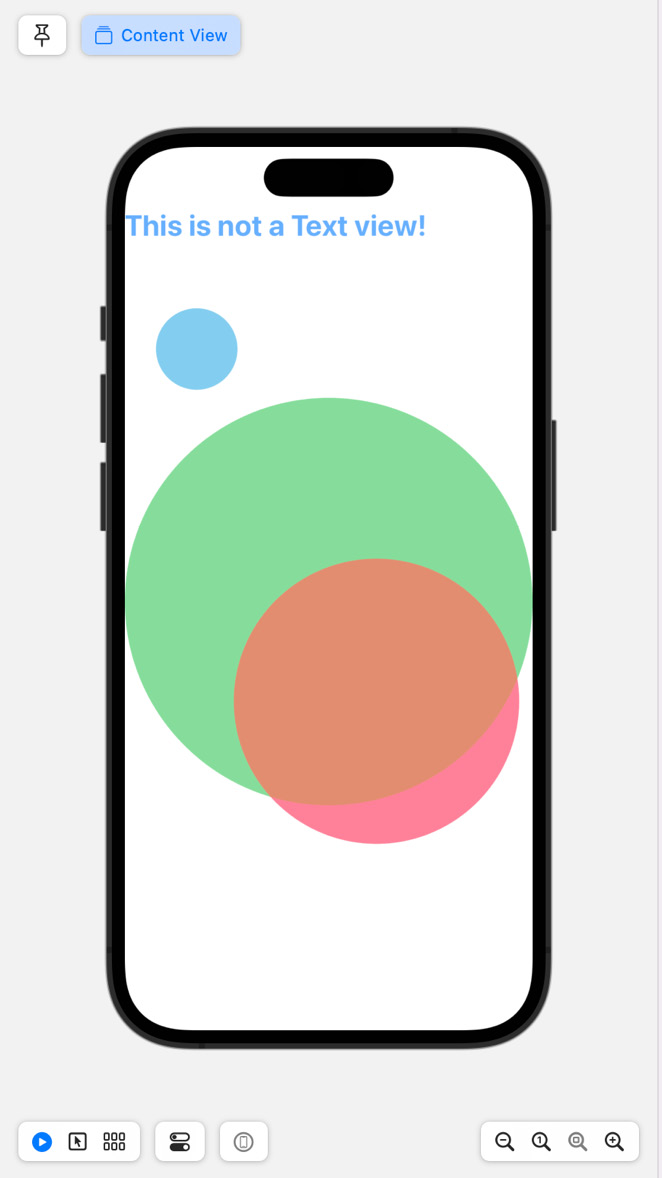
The following example shows how to use opacity, translation, scaling, and displaying text while drawing on Canvas:
import SwiftUI
struct ContentView: View {
    var body: some View {
        Canvas(
            opaque: false,
            colorMode: .linear,
            rendersAsynchronously: false
        ) { context, size in
            context.opacity = 0.6
            let rect = CGRect(origin: .zero, size: size)
            let text = Text(verbatim: "This is not a Text view!").font(.title)
                .bold()
            var resolvedText = context.resolve(text)
            resolvedText.shading = .color(.blue)
            context.draw(resolvedText, in: rect)
            var path = Circle().path(in: rect)
                       context.fill(path, with: .color(.green))
            let rect2 = rect.applying(.init(scaleX: 0.7, y: 0.7).translatedBy(x: 150, y: 300)
            )
                        path = Circle().path(in: rect2)
                        context.fill(path, with: .color(.pink))
            let rect3 = rect.applying(.init(scaleX: 0.2, y: 0.2).translatedBy(x: 150, y: 300)
            )
                        path = Circle().path(in: rect3)
                        context.fill(path, with: .color(.cyan))
        }
    }
}
struct ContentView_Previews: PreviewProvider {
    static var previews: some View {
        ContentView()
    }
}
The result is shown in the following screenshot:

Figure 8.3 – A more complex example with Canvas
You can use the canvas to not only draw images or text but also draw any View.
Before we do that, we will need to register them using the context.resolveSymbol(id :) and declare them in the symbols closure.
You need to provide an id in the symbols closure, by means of a .tag modifier, and reference it with the id parameter in context.resolveSymbol(id: ).
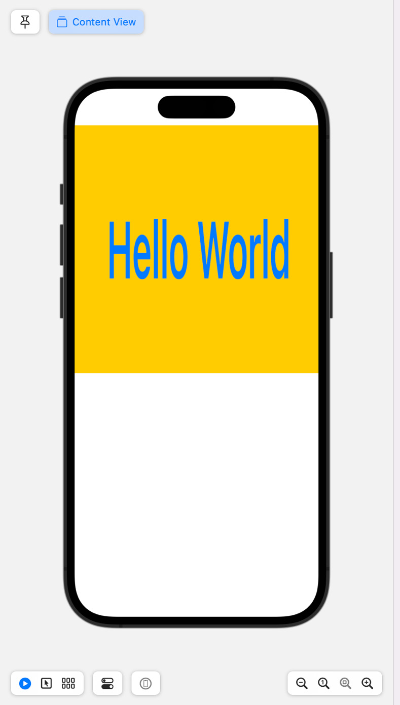
The following example uses a TextView that is drawn on the Canvas, as shown in the following code example:
import SwiftUI
struct ContentView: View {
    var body: some View {
        Canvas(
            opaque: false,
            colorMode: .linear,
            rendersAsynchronously: false
        ) { context, size in
            let rect = CGRect(origin: .zero, size: CGSize(width:400,height:400))
            if let mySymbol = context.resolveSymbol(id: 0x01) {
                context.draw(mySymbol, in: rect)
            }
        } symbols: {
            Text(verbatim: "Hello World")
                .foregroundColor(.blue)
                .bold()
                .tag(0x01)
                .padding()
                .background( .yellow)
        }
    }
}
struct ContentView_Previews: PreviewProvider {
    static var previews: some View {
        ContentView()
    }
}
The result is shown in the following screenshot:

Figure 8.4 – Rendering SwiftUI within Canvas
In the next section, I will explain how CALayers can be integrated into SwiftUI.


